William Kentridge
William Kentridge (b. 1955) is a world-renowned multidisciplinary artist whose practice spans printmaking, drawing, sculpture, writing, film, performance, music, theatre, and collaborative projects. Drawing forms the creative foundation of his work, whether it manifests as animated films, prints, collages, sculptures, tapestries, kinetic objects, or puppet-theatre pieces, resulting in an expansive and remarkably versatile oeuvre.
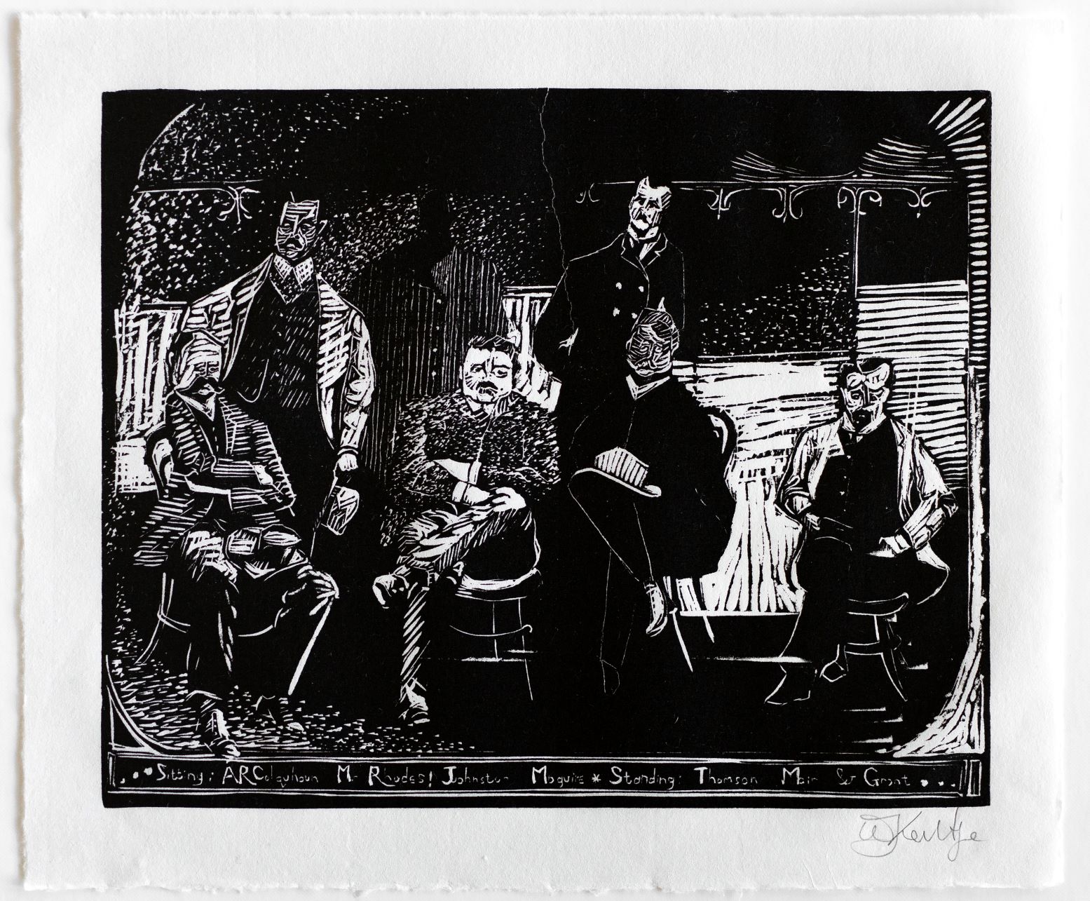
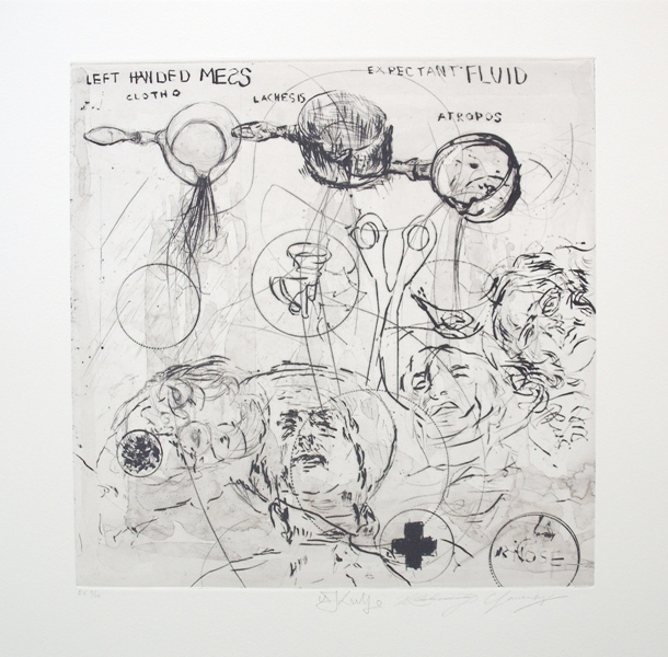
His work engages themes of politics, science, literature, and history, while simultaneously embracing contradiction and uncertainty. While many artists incorporate printmaking as a secondary aspect of their practice, Kentridge stands as a modern pioneer of the medium. Drawings and theatre projects frequently emerge from his prints, and vice versa, underscoring the centrality of printmaking within his broader practice. For Kentridge, printmaking is itself inherently multidisciplinary; he has described an etching as “an extraordinary, ridiculously complicated form of animation,” in which a single plate is continually reworked, producing multiple states over time.
- West Coast series,
- Kentridge does a DKW walkabout with Harvard University Art History postgrads,
- The Refusal of Time at The Metropolitan Museum of Art,
- Nose and Other Subjects travels to Syracuse University Art Gallery.
- Apollo Award Winners 2015,
- William Kentridge: Officially Africa’s Most Powerful Artist,
- Black & White: Interview with Kentridge,
- Kentridge plans massive, vanishing mural in Rome
- Ink | Thinking Aloud: The Prints of William Kentridge
- Billboard art makes the questions bigger
- William Kentridge: Star of the art world at Deichtorhallen
- William Kentridge: New Editions (2007)
- Swamp Eyes (2009)
- William Kentridge: The Nose (2010)
- DAVID KRUT PROJECTS CELEBRATES 10 YEARS IN NEW YORK (2011)
- Contemporary South African Prints: DKW and I-Jusi (2011)
- Conflict Zones: The Language of War (2011)
- Untitled: DKW Summer Show (2011)
- Imprint: Selected Editions and Works on Paper (2012)
- Landscape Re-Orientation (2012)
- Universal Archive (Parts 24 - 37) (2012)
- DKW Review (2012)
- THE PRINT SHOW at EBONY Cape Town (2013)
- The Benediction of Shade (2013)
- Straight From the Hellbox (2013)
- 2013 Year End Review (2013)
- Cape Town Art Fair (2014)
- MATRIX (2014)
- Group Show Presenting William Kentridge's Lekkerbreek (2014)
- Ring the Changes - A Group Exhibition (2014)
- Equinox – A Group Exhibition of New Editions and Unique Works (2014)
- UBUNTU FESTIVAL (2014)
- PRINTED at EBONY Cape Town (2014)
- Johannesburg in Print | Curated by David Krut Projects (2014)
- Do Nothing - A Group Exhibition (2014)
- The Benediction of Shade II - Arts on Main (2014)
- The Benediction of Shade II (2014)
- The Cape Town Art Fair (2015)
- Carved: Relief Print Group Exhibitions (2015)
- Baltimore Print Fair (2015)
- 1:54 ART FAIR (2015)
- MATRIX II (2015)
- 2015 Editions Showcase (2015)
- Cape Town Art Fair (2016)
- 1:54 ART FAIR (2016)
- MANTEGNA | DKW PRINTS (2016)
- UNNATURAL LANDSCAPES (2016)
- 365 Days of Projects and Collaborations (2016)
- DEBORAH BELL | WILLIAM KENTRIDGE | DIANE VICTOR (2016)
- 1:54 ART FAIR (2017)
- William Kentridge 'The Making of Triumphs and Laments Woodcuts' (2017)
- 25 YEARS (2018)
- The Making of ‘That which I do not remember’ (2019)
- Almost Sold Out & Rarities (2019)
- Treasure Trove (2019)
- Unpacking William Kentridge's printmaking (2019)
- Kind of Blue Extension (2020)
- Pictures worth a thousand words (2020)
- WILLIAM KENTRIDGE STUDIO LIFE GRAVURES (2022)
- What’s the Word? Reading Text in Print-based Art (2023)
- PROJECTS: KENTRIDGE, BEAUCHAMP, VAN DER PLOEG & VAN HAVER (2023)
- Printer’s Picks: A Look at Priorities and Processes (2024)
- William Kentridge: New Gravures 2022 - 2024 (2024)
- South African Artists in New York (2024)
- In Every Moment (2024)
- Brooklyn Art Fair (2025)
- Latitudes Art Fair (2025)
- David Krut Artspace x Kalashnikovv Gallery at the 1-54 Contemporary African Art Fair (2025)
- South African Artists in New York x Kalashnikovv Gallery (2025)
- Man-made: A Group Show (2025)
- William Kentridge: 33 Years of Collaboration with Master Printers, Published by David Krut
- STILL LIFE: A CONTEMPORARY ARRANGMENT (2025)
- A Year of Mark Making: Collaborations 2025 (2025)
- David Krut Arts at the Brooklyn Fine Art Print Fair (2026)
Artworks (428)
Westcoast Series
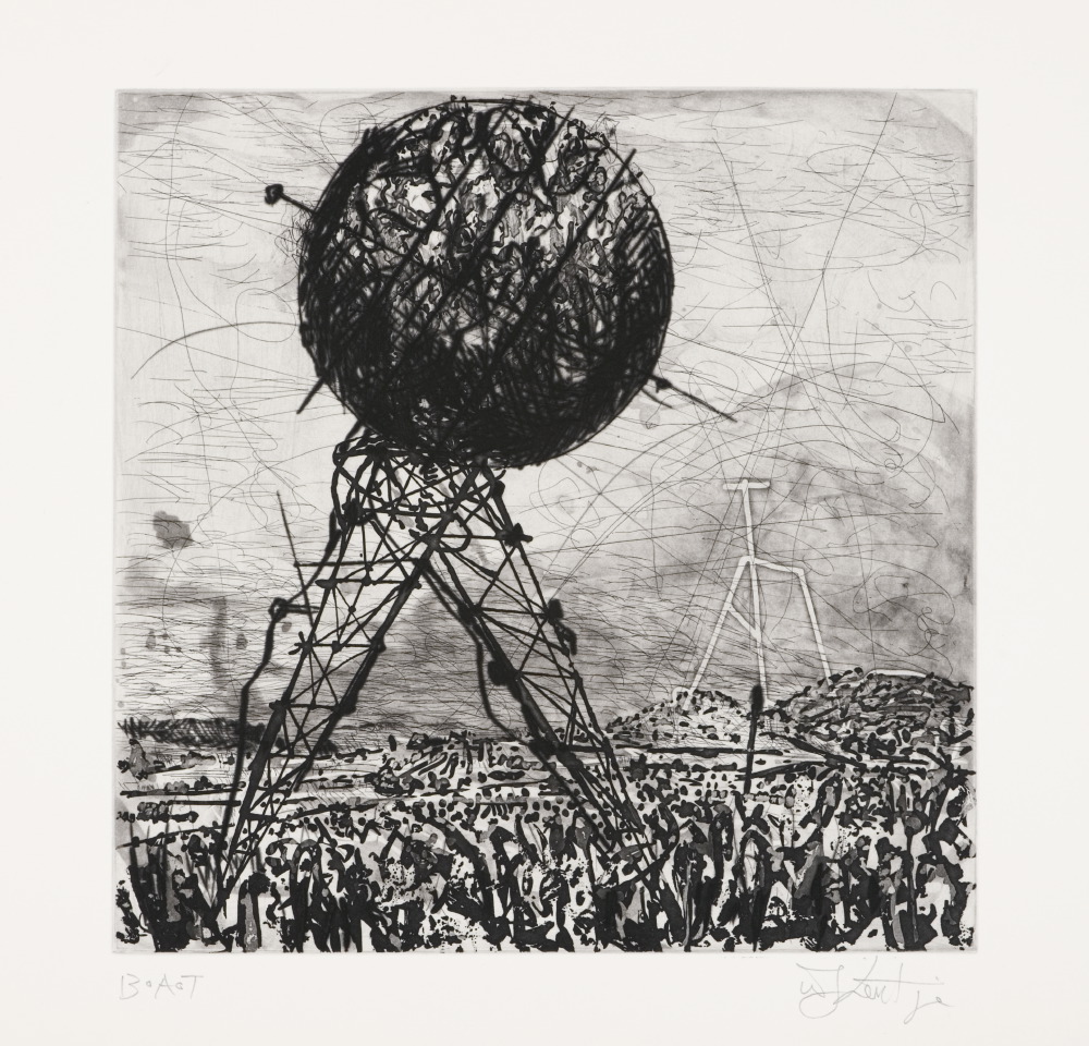
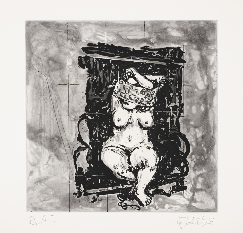
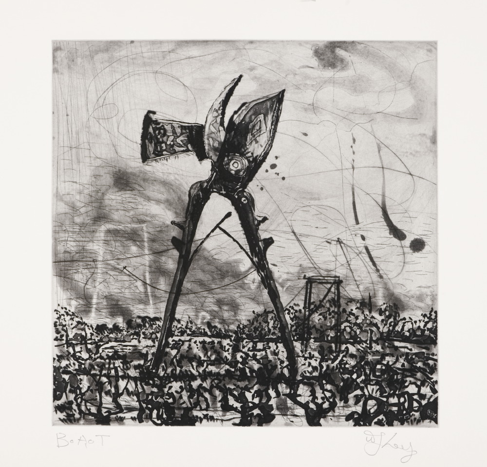
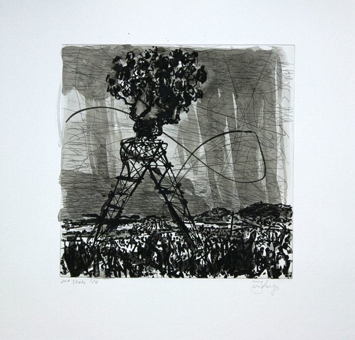
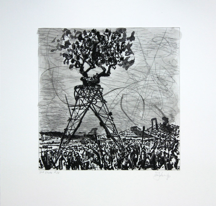
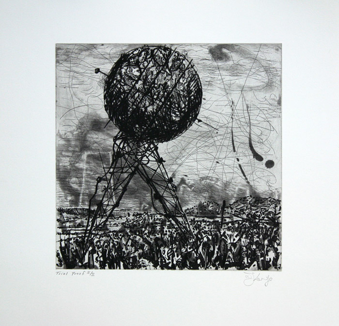
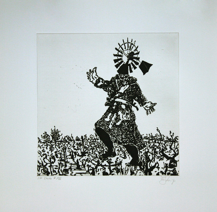
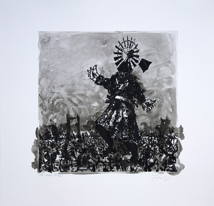
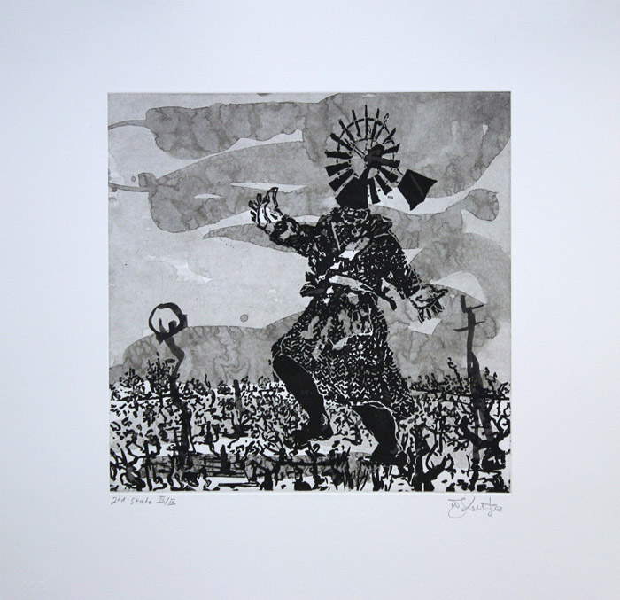
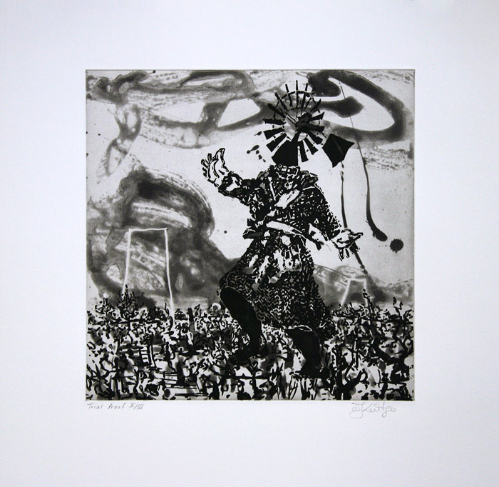
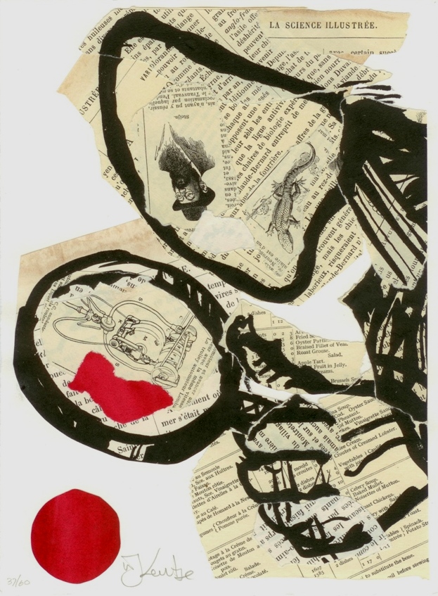
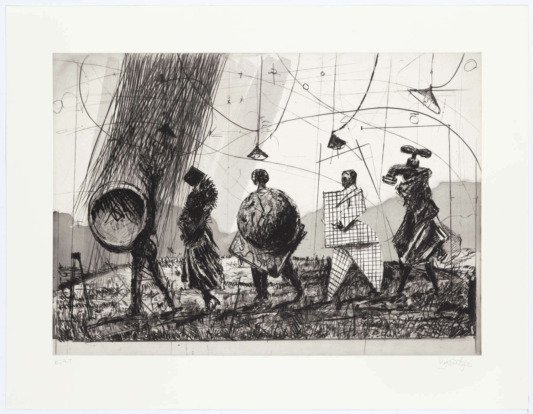
In 2010 Eben Sadie of Sadie Family Wines – a small, prestigious winery based in the southern Swartland, inland from Elands Bay on the Cape West Coast of South Africa – released a limited edition of six wines made using grapes harvested from vines that were planted in around 1900. The wine collection is called the Ouwingerdreeks (Old Vine Series) and the winery approached William Kentridge to create labels that would correspond with the fineness of the wines. The six images that Kentridge created for the labels are a combination of ink wash drawings and collage. In January 2010, Kentridge came into the David Krut Workshop to discuss the possibilities of translating the drawings into series of etchings with Master Printer Jillian Ross – a movement between media that is common within Kentridge’s practice. The five etchings that resulted build upon and modify the drawings on which they are based.
Read more ▼The imagery in these prints is inspired by the visual and historical landscape of the Swartland region, and other valleys far up the West Coast in the Olifants Rivier region, where the vines were located. The prints were created through the full utilisation of techniques available to a printmaker. Delicate drypoint lines swirl through washes and splashes of pale grey spitbite aquatint, combined with the deep and solid marks of sugarlift aquatint and hardground etched lines. Handpainting, burnishing and attached fragile chine collé resolve the prints.
Some of the imagery of the prints will be familiar to followers of Kentridge’s work; the anthropomorphic objects proceeding across the landscape are reminiscent of works such as Portage (2000) and those of L’Inesorabile Avanzata (2007). In this series, Kentridge has reimagining these object-figures within the landscape of the Swartland and the tools of wine-making: the secateurs used to harvest the fattened bunches of grapes; the windmill that pumps life-giving water to the maturing vines; the world marching through the landscape on electric pylon legs. In Untitlted (Skurfberg), the landscape is untouched and unoccupied, and the use of hand-painting by the artist ensures variation within the edition. Finally, a nude female figure – perhaps an embodiment of the landscape pre-colonisation – undresses within the encircling arms of an imposing black chair.
Read Wine writer Tim James’s article about his experience of the visit to the Swartlands with Kentridge, Sadie and Kruger.


The Nose
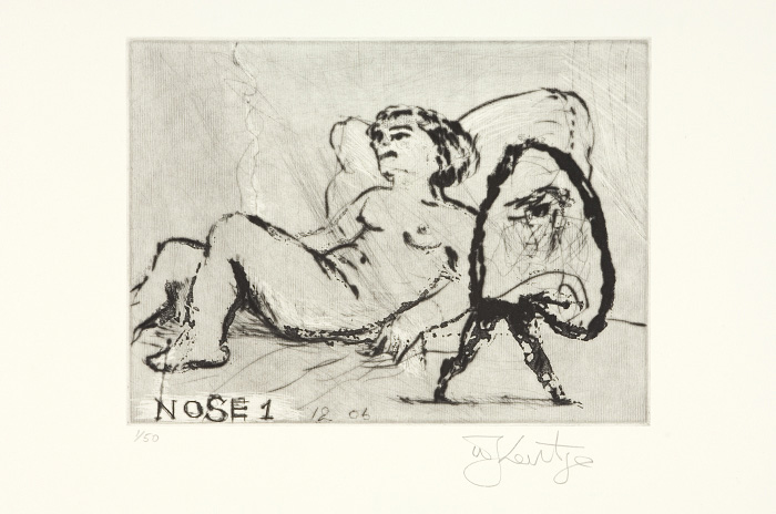
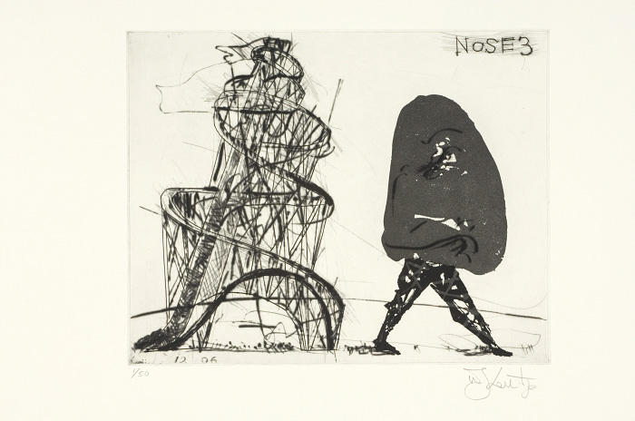
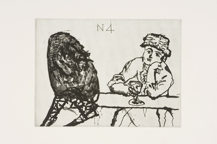
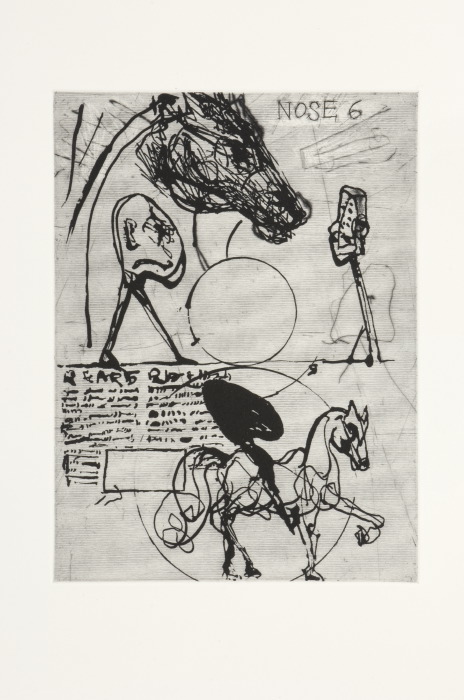
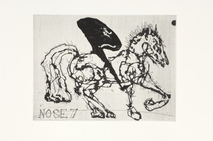
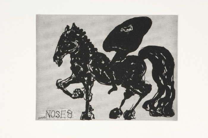
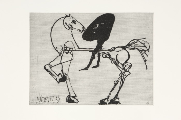
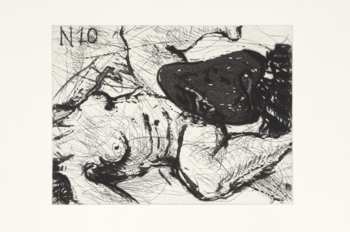
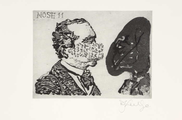
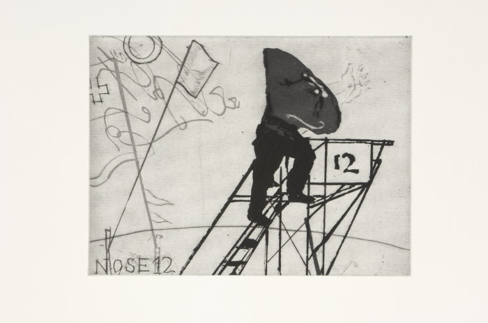
In December 2006 Jillian Ross, Master Printer of the David Krut Workshop (DKW), began her collaboration with William Kentridge on a series of prints that was to elaborate on Kentridge’s work on the Shostakovich opera The Nose, commissioned by the Metropolitan Opera, New York, to premiere in March 2010. Shostakovich’s opera is based on one of the most famous stories in Russian literature, Nikolai Gogol’s The Nose, published in 1867.
In William Kentridge Nose, published by David Krut Publishing in 2010, William Kentridge explains the story, and its relationship to the prints, as follows:
"In 1867, Nikolai Gogol published his short story The Nose. The story is about a middle-ranking Russian bureaucrat, Collegiate Assessor Kovalyov, who wakes one morning to find his nose missing. In its place is only a ‘pancake- smooth expanse’. The narrative follows Kovalyov’s attempts to locate and re-attach his nose. Anton Chekov described The Nose as the finest short story ever written.
Kovalyov wanders the streets of the city in search of his nose and eventually catches a glimpse of it entering a cathedral. He follows it inside and tries to reason with it and persuade it to return to him. But his nose is now a higher-ranking bureaucrat than he is and will have nothing to do with him. As The Nose goes its own way, Kovalyov is left to contemplate ‘that ridiculous blank space’ again.
This set of prints follows—or makes—the journey of the independent Nose."
The prints reflect on music, ballet, the history of Western art and the various fortunes of the Communist parties in South Africa and the Soviet Union.
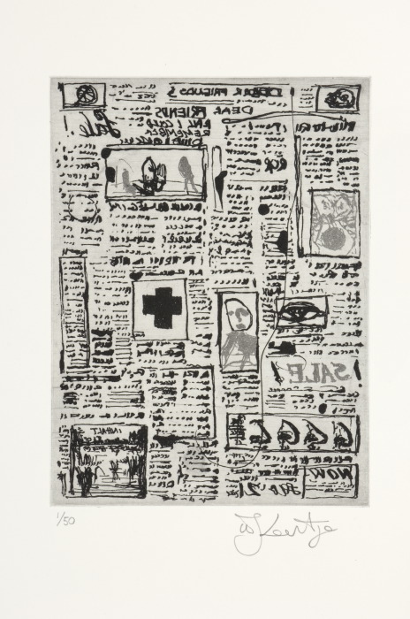
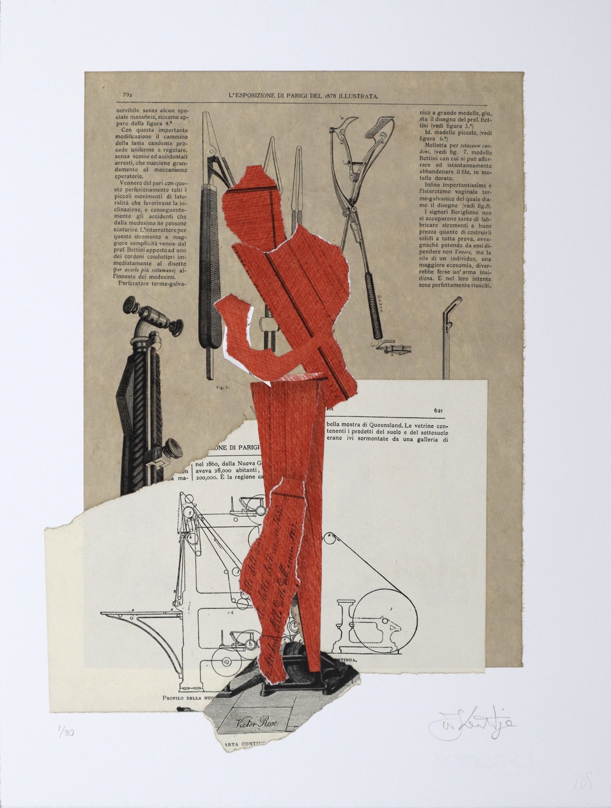
Read more ▼In his interpretation of Gogol and Shostakovich, Kentridge has projected the story forward to the 1917 Russian Revolution and the Russian avant-garde, and then into the twentieth century to include allusions to Stalin’s purges of the 1930s. But he has also cast his eye back to consider some of the literary influences on Gogol such as Lawrence Sterne’s Tristram Shandy and even Cervantes’s Don Quixote. Drawing on these and other texts, including excerpts from Russian newspapers, clips from Russian films of the 1920s and 1930s, pages from Russian encyclopaedias, and parts of a transcript of a 1937 meeting of the Central Committee of the Russian Communist Party in which the theoretician Nikolai Bukharin is being interrogated, Kentridge created not only his opera production but several other works, including the Nose suite of etchings.
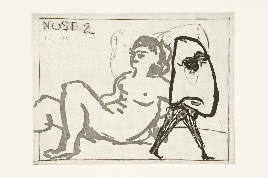
Nose is a suite of thirty prints, each measuring roughly 15 x 20 cm (5 x 8 in) and printed in an edition of 50. The prints explore a number of techniques but rely primarily on Kentridge’s strong drypoint marks, softened by sugarlift aquatint and punctuated, in several plates, by a strong Constructivist red. Each plate is engraved with a number signalling its place in the series.
Please note the following works are only available as part of the complete set of thirty prints: Nose 1,3,7,9,26,29 and 30.
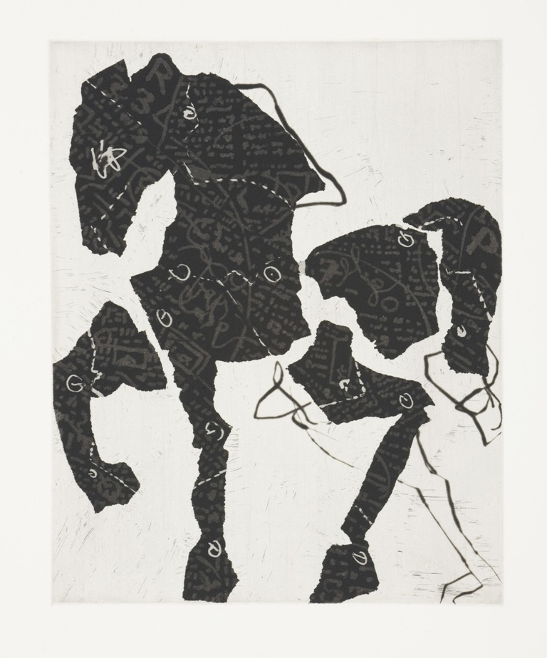
Five subsequent prints were published, known informally in the workshop as the “Nose Extras” – El Lissitky, Mirror, Odalisque, Chaise-Longue, and Nose on a White Horse. For various reasons, Kentridge did not consider these works a good fit for inclusion as part of the Nose suite of 30 etchings which, although each print is available individually, is designed to be understood as a single work in its own right. They were, nonetheless, well-loved by Kentridge and so they were published separately as stand-alone images.
The Universal Archive
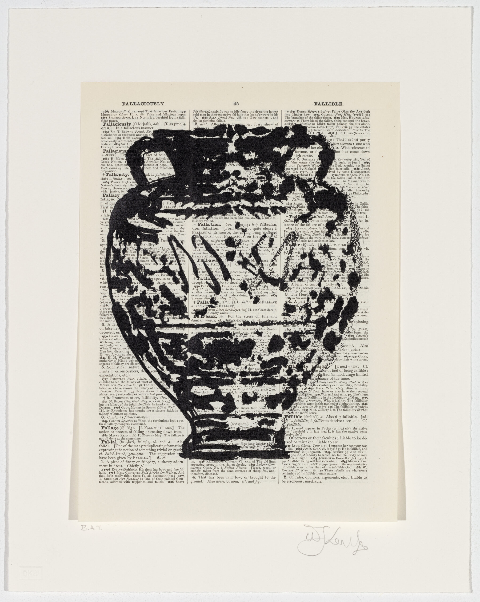
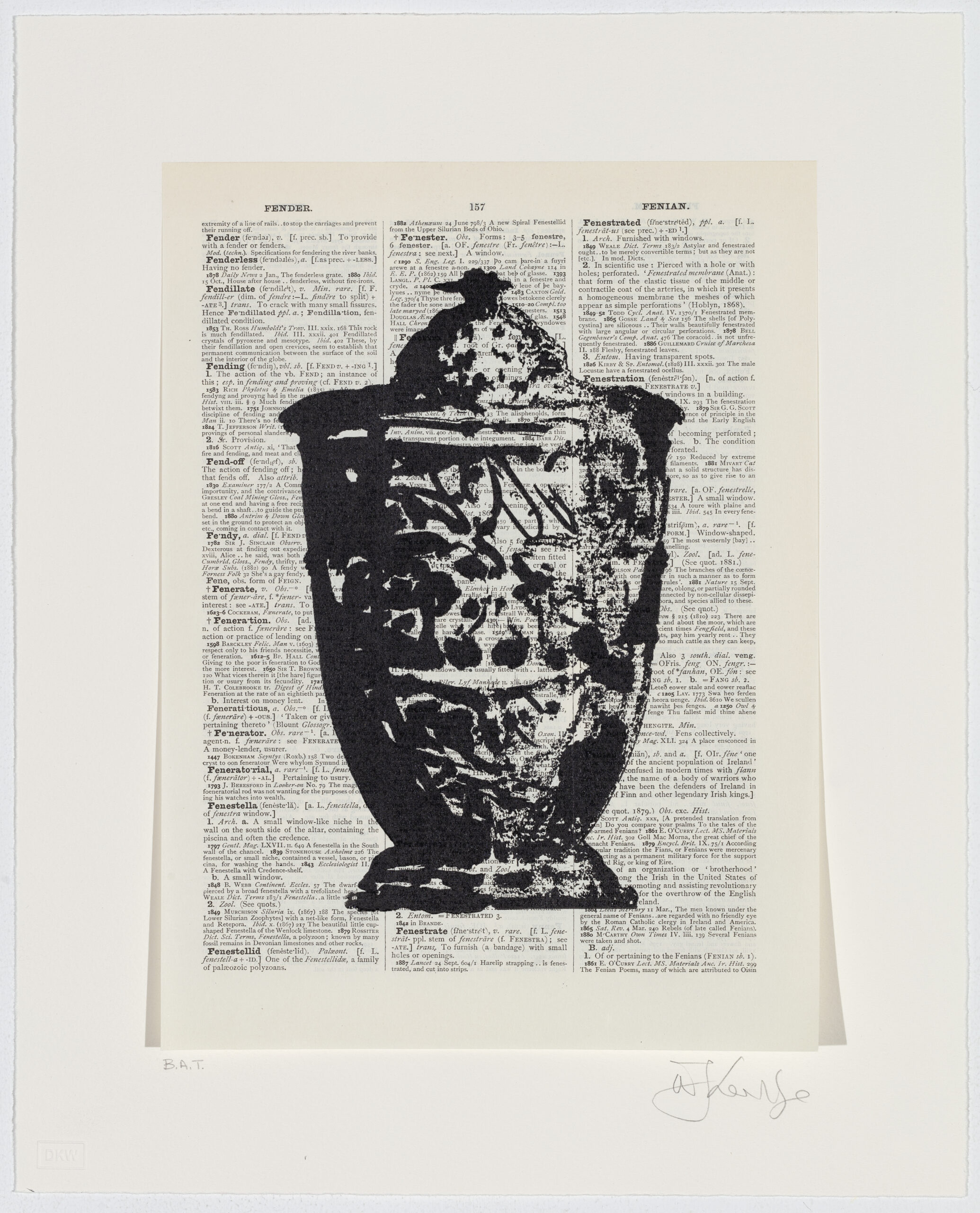
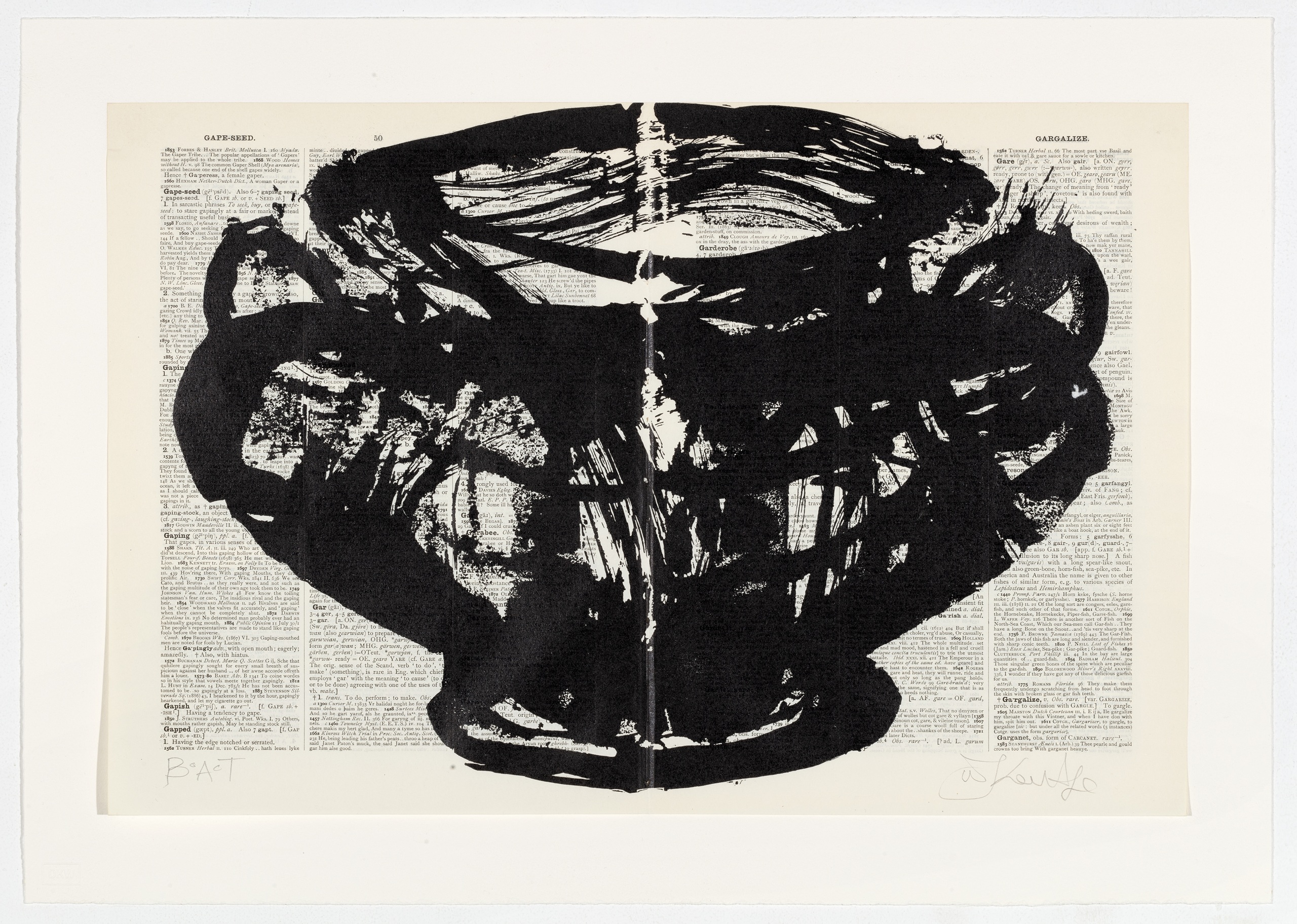
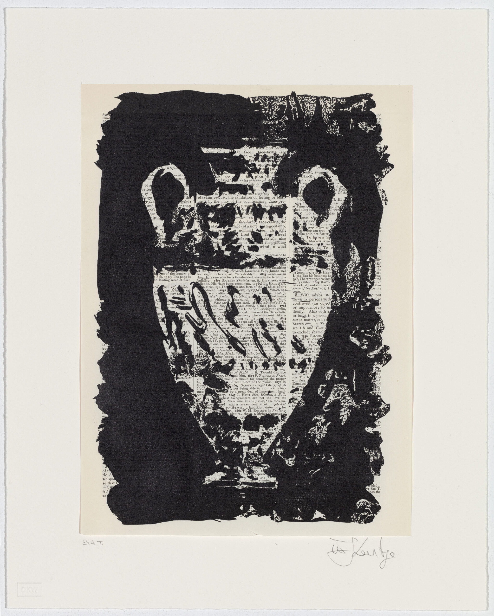
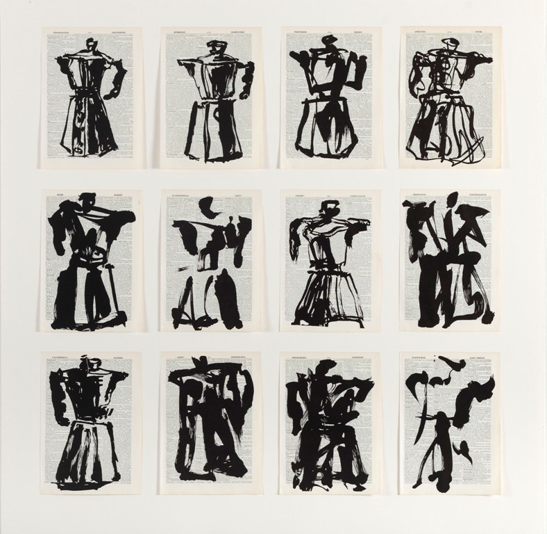
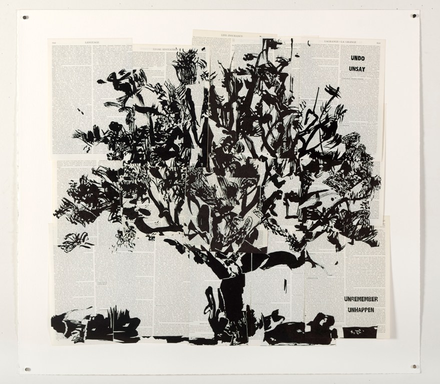
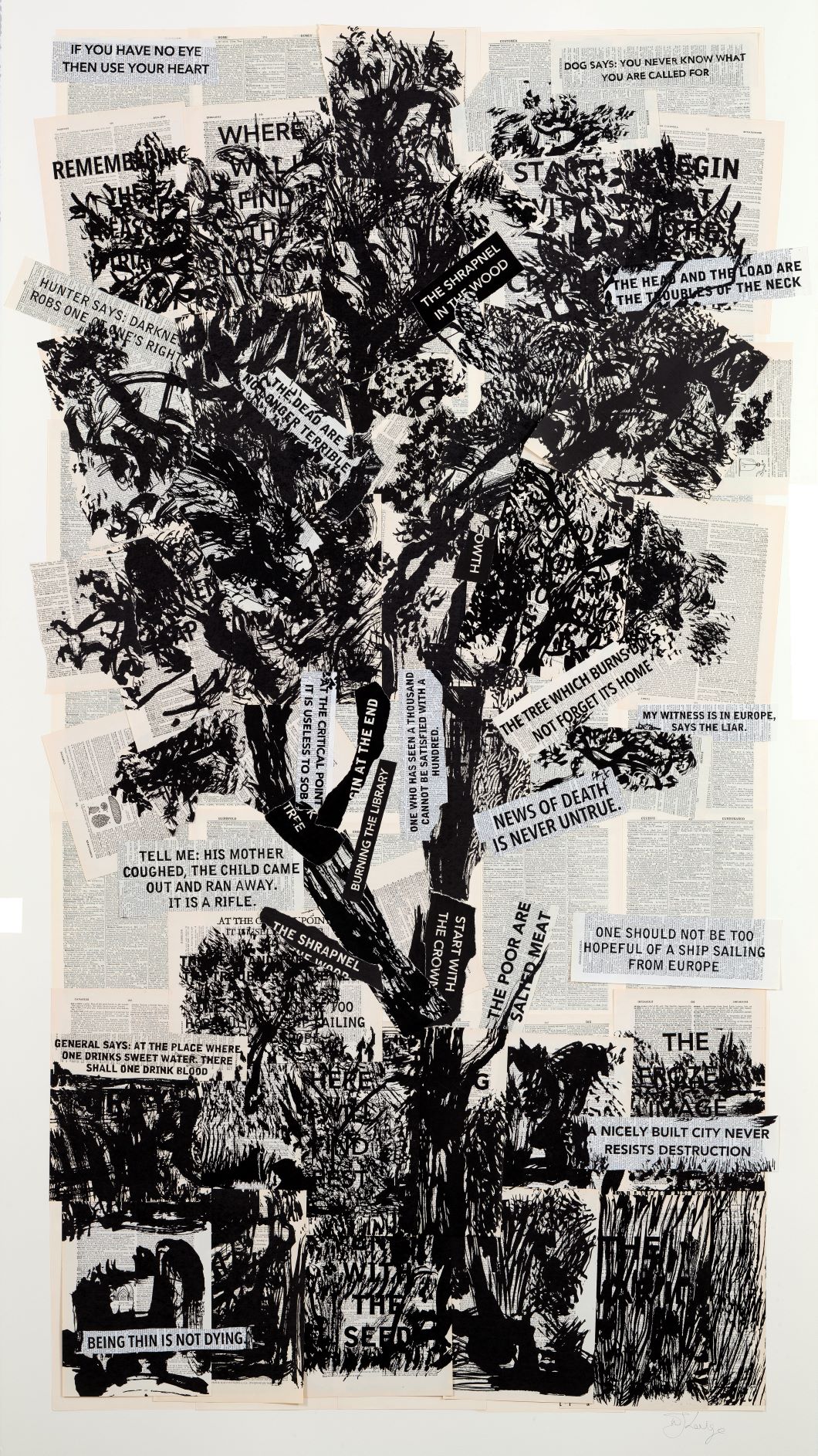
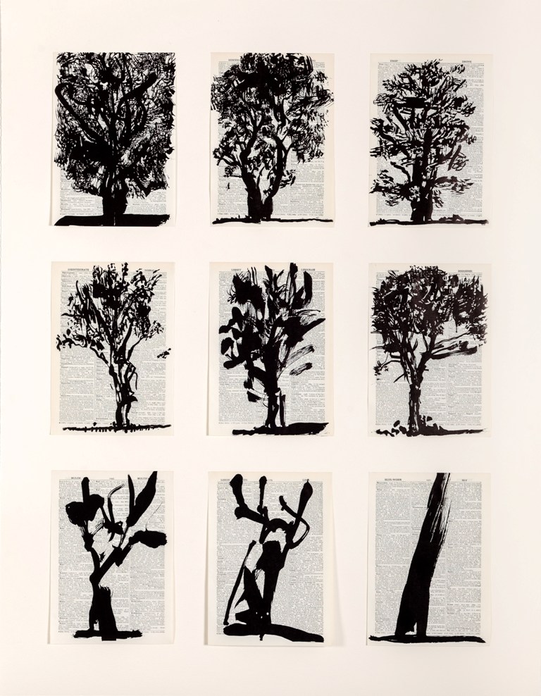
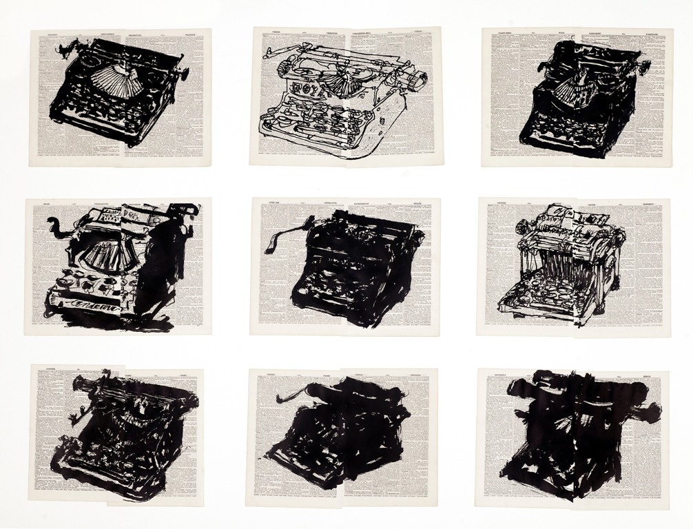
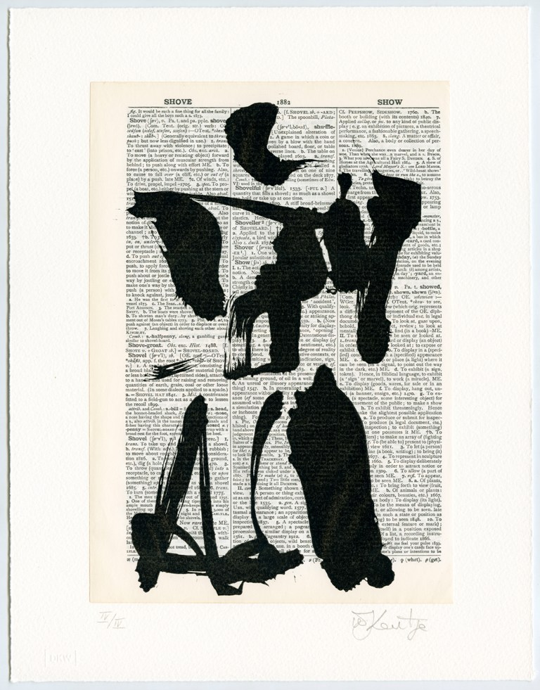
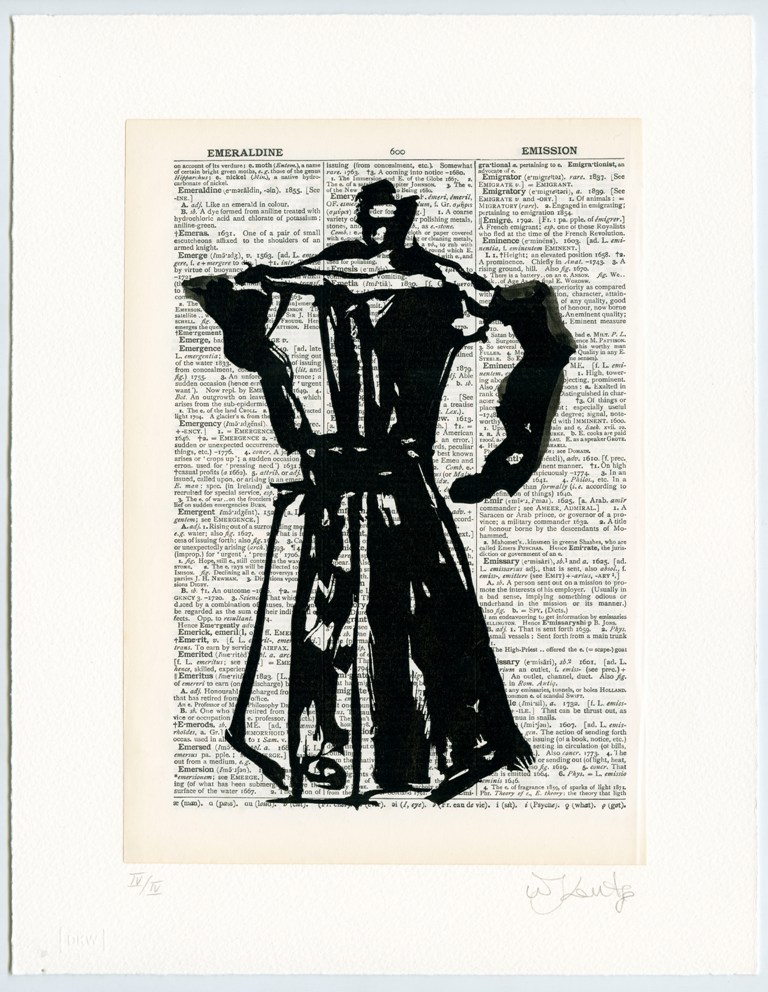
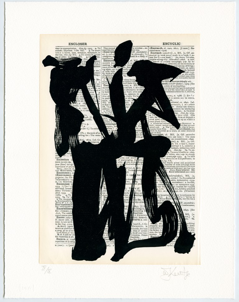
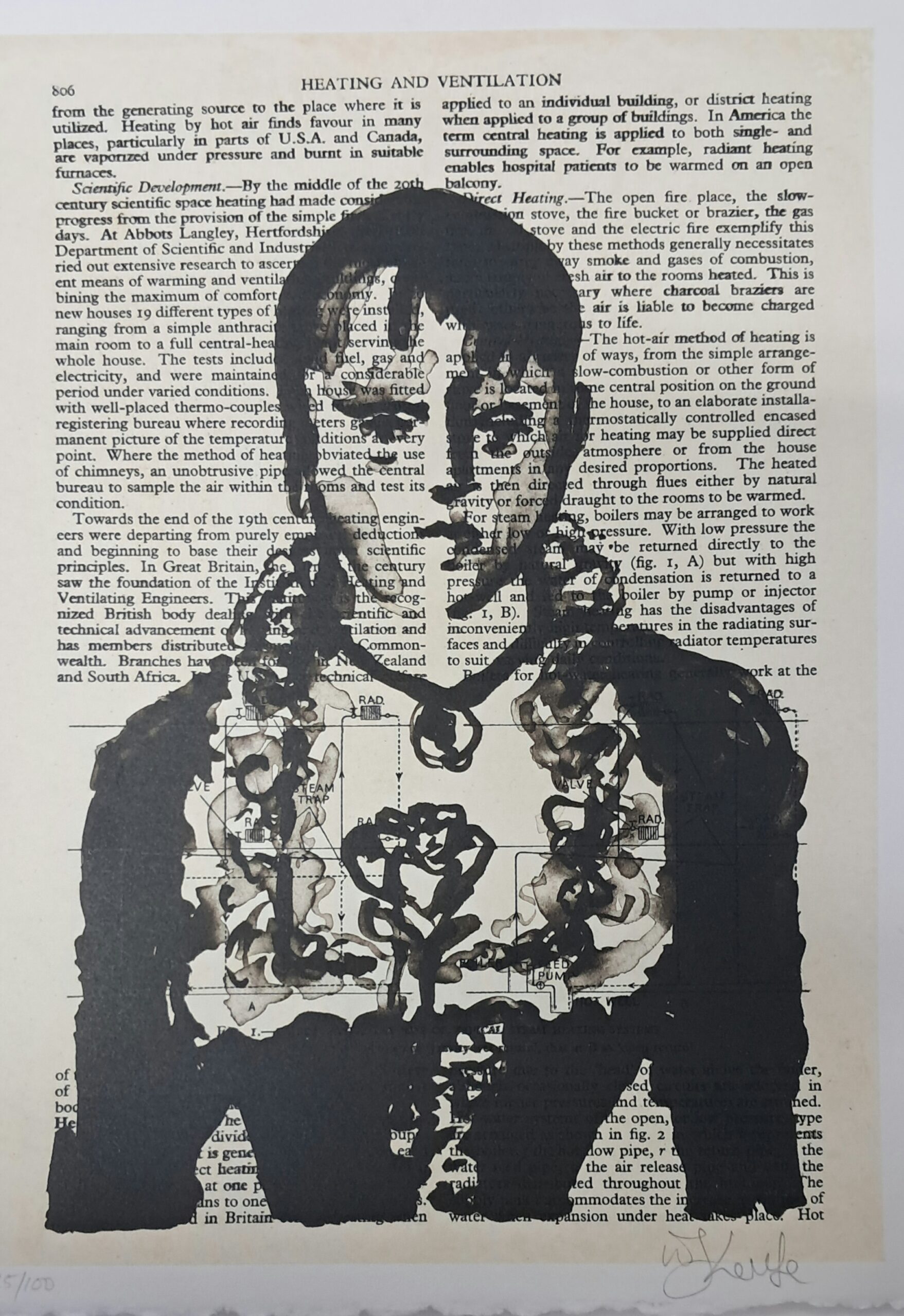
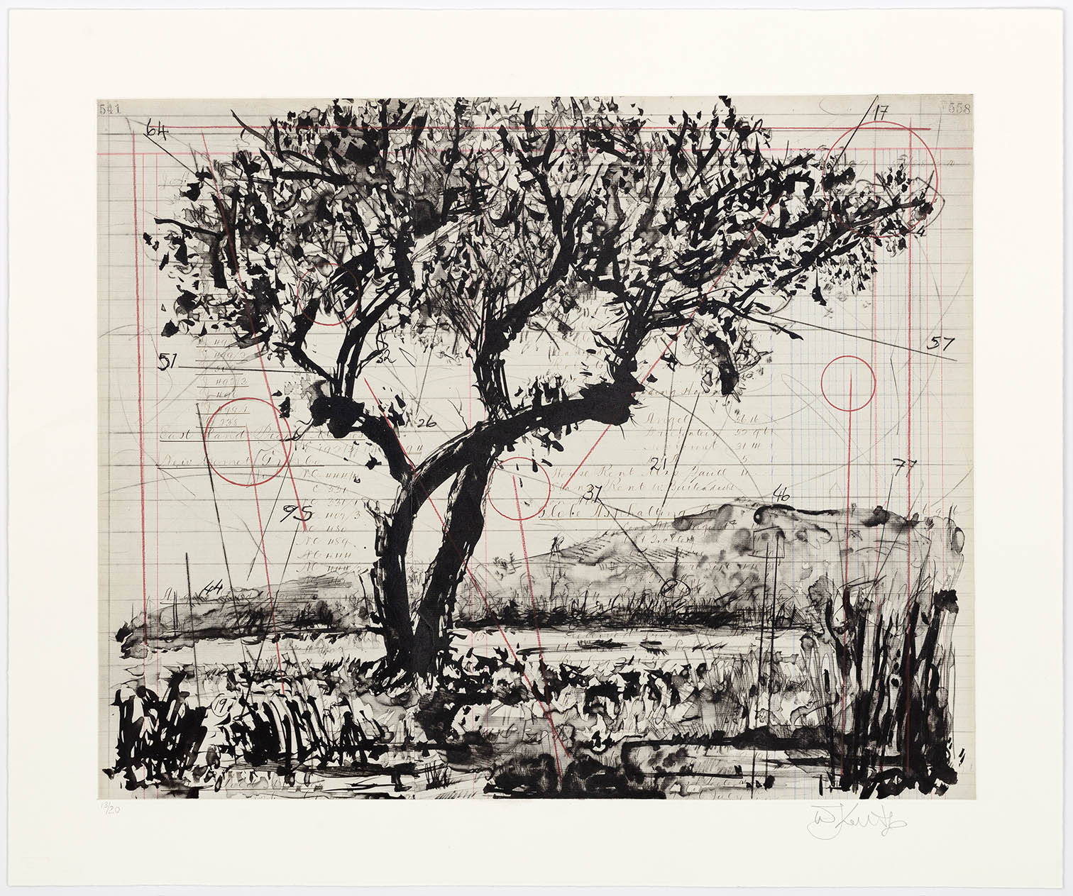
The Universal Archive began at the David Krut Workshop in 2012 and is made up of linocuts printed onto non-archival 1950s dictionary and encyclopaedia paper. The series contains over 70 individual images. Many of which represent recurring motifs commonly seen in Kentridge’s art, ink drawings, sculptures and stage productions. They depict everyday images, such as coffee pots, trees, cats, female nudes, typewriters, horses and birds.
Read more ▼The Universal Archive linocuts began as a series of small Indian ink drawings, created in a state of what Kentridge refers to as “productive procrastination” during the time that he was preparing his Norton series of lectures, presented at Harvard University in 2012. The drawings were made on pages of old dictionaries, using both old and new paintbrushes. The former refers to the pristine new brush, which gives perfectly intentional lines. The latter has damaged, splayed bristles which gives a less certain mark. It is the worn, mistreated brush that artists tend to discard but Kentridge embraces for its individual qualities. Hence, the images are made up of both solid and very fine lines, with an unconstrained virtuosity of mark-making. The ink drawings were initially attached to linoleum plates and painstakingly carved by the DKW printmakers and the artist’s studio assistants. Master Printer Jillian Ross speaks of the exacting process as “a giant puzzle constantly solving”. As the project expanded, the images were photo-transferred to linoleum plates in order to preserve the original drawings. The images have been printed onto pages from various books, including dated copies of the Shorter Oxford English Dictionary and Encyclopaedia Britannica.
The use of dictionary pages for this project is both unusual – considering the paper’s non-archival qualities – and significant – in terms of the manifold associations that spring up within each work as a result of the spontaneous overlap of image and text. The philosophical implications of this choice have been expounded superbly by Kentridge, in a publication produced in collaboration with Jane Taylor:
“A dictionary is not the same size as a head, although it is quite close, and the thousands of pages in the dictionary do not even begin to match the uncountable number of thoughts, associations, flashes of ideas that zoom around inside the head. But nonetheless there is something of the weight and pages enclosed within the covers of a dictionary that has an association with the memories, the thoughts, the knowledge of different kinds, that we have inside our heads. And the drawings on the different pages of the book do not try to give a map of the way they think, but rather put a marker for the processes, unpredictability and marvels of association that we produce in our heads all the time.”
As a result of the meticulous mechanical translation of a gestural mark, the linocuts redefine the characteristics traditionally achieved by the medium. The identical replication of the artist’s free brush mark in the medium of linocut makes for unexpected nuance in mark, in contrast with the heavier mark usually associated with this printing method. Furthermore, the paper of the nonarchival old book pages resists the ink, which creates an appealing glossy glow on the surface of the paper.
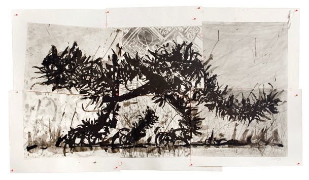
Many of the images are recurring themes in Kentridge’s art and stage productions: cats, trees, coffee pots, nude figures. While some images are obvious, others dissolve into abstracted forms suggestive of Japanese Sumi-e painting. Image mis/identification is core to Kentridge’s practice and is richly explored in this series. The parallel and displaced relationships that emerge between the image and the text on the pages relate to Kentridge’s inherent mistrust of certainty in creative processes. This becomes part of a project of unraveling master texts, here questioning ideas of knowledge production and the construction of meaning. Aside from the numerous individual images created, there are prints assembled from pieces: cats torn from four sheets, a large tree created from 15 sheets. Groups of prints featuring combinations of individual images – twelve coffee pots, six birds and nine trees – show the artist’s progressive deconstruction of figurative images into abstract collections of lines, which nonetheless remain suggestive of the original form. The process by which the viewer projects meaning is sincerely rattled. This movement from figuration to abstraction and back, along with the works’ close relationship to Kentridge’s stage productions, suggests that this body of work holds an intriguing place in Kentridge’s oeuvre on the edge of animation and printmaking.
Ross, who has worked with Kentridge since the early 2000s, stresses that an in-depth understanding of the series requires knowledge of the multiplicity inherent in many of Kentridge’s projects, in which the same imagery recurs in varying forms. “Because he often works on a number of projects at once, his ideas for one project tend to fuel another. Images that you see in Universal Archive overlap considerably across many mediums.” Ross adds that she sees the title as “a reference to his personal ‘universal archive’ – the themes and images that he repeatedly draws on to animate his work.”
Text by Jacqueline Flint, 2020



Triumphs and Laments Woodcuts
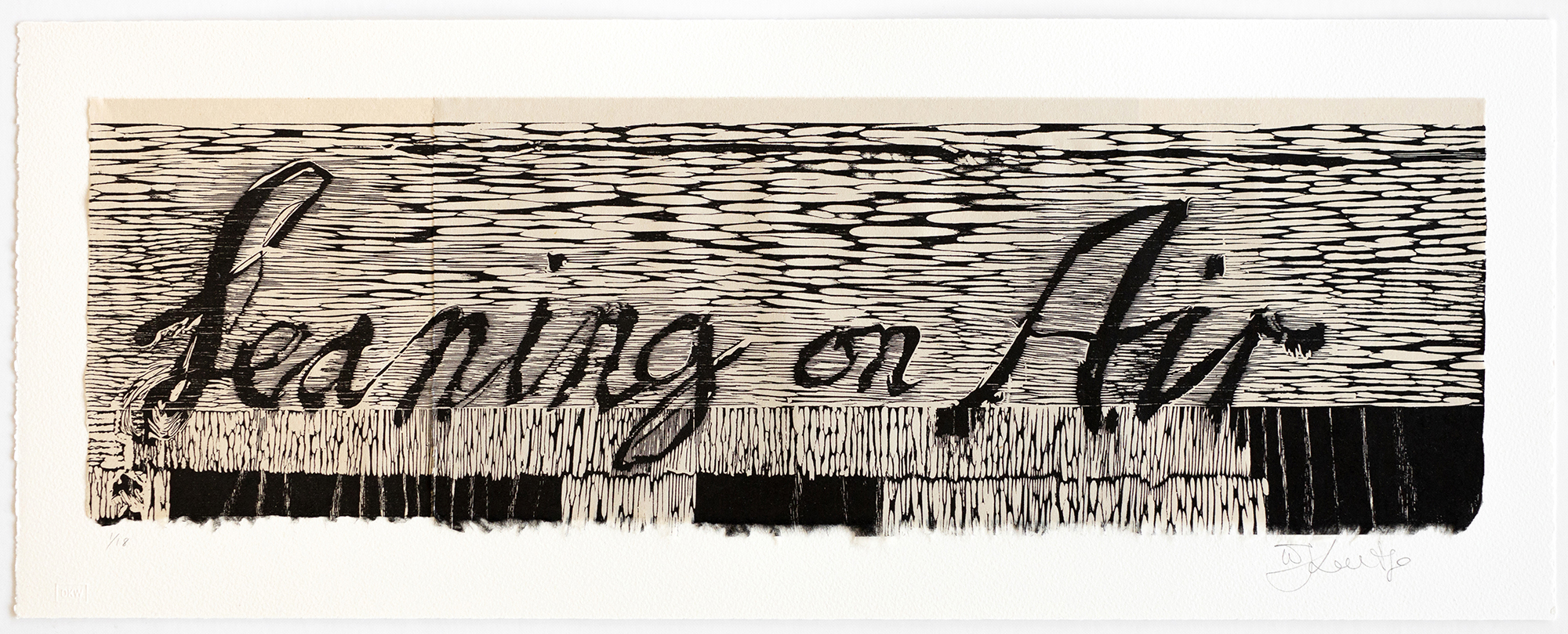
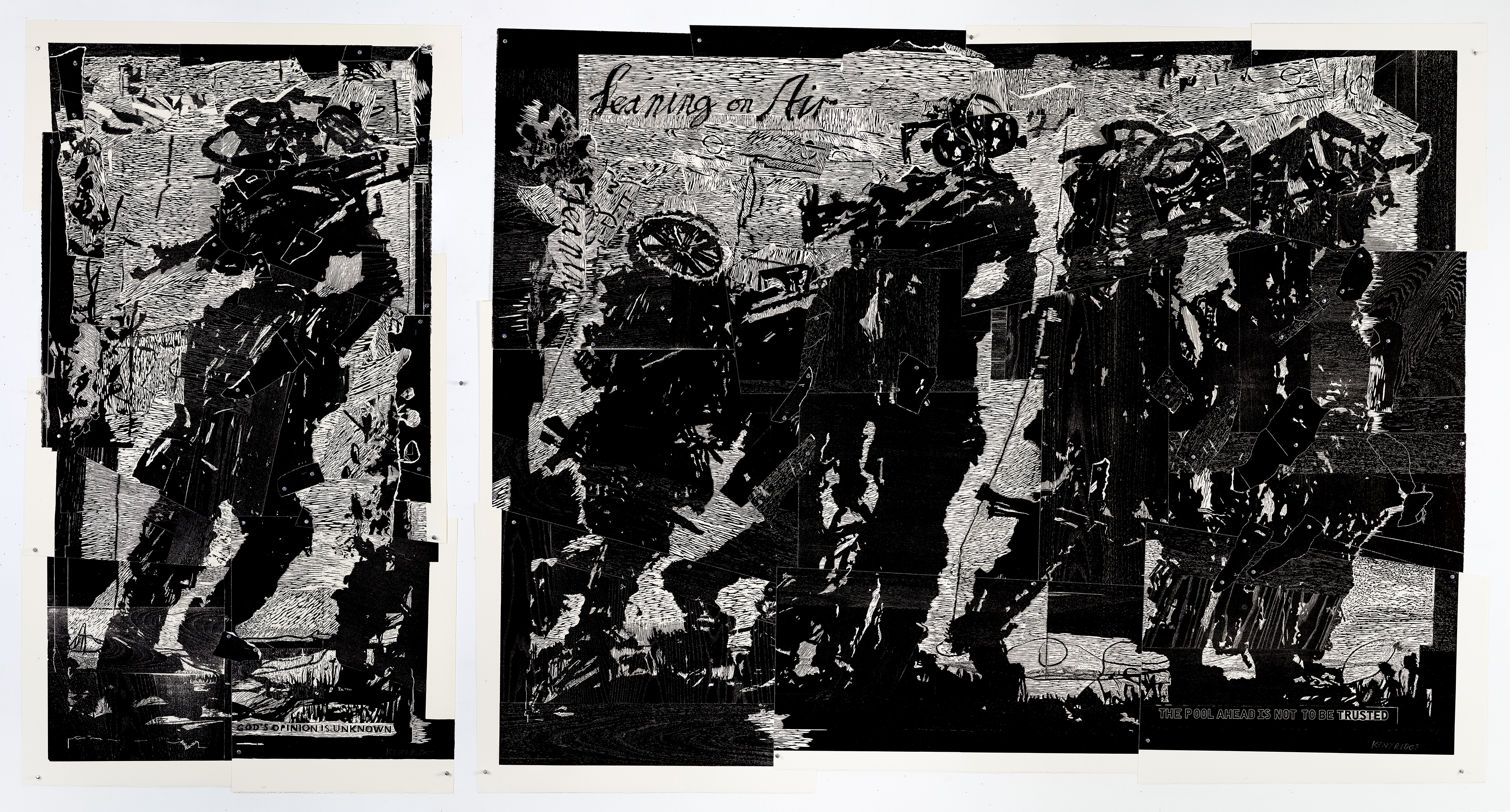
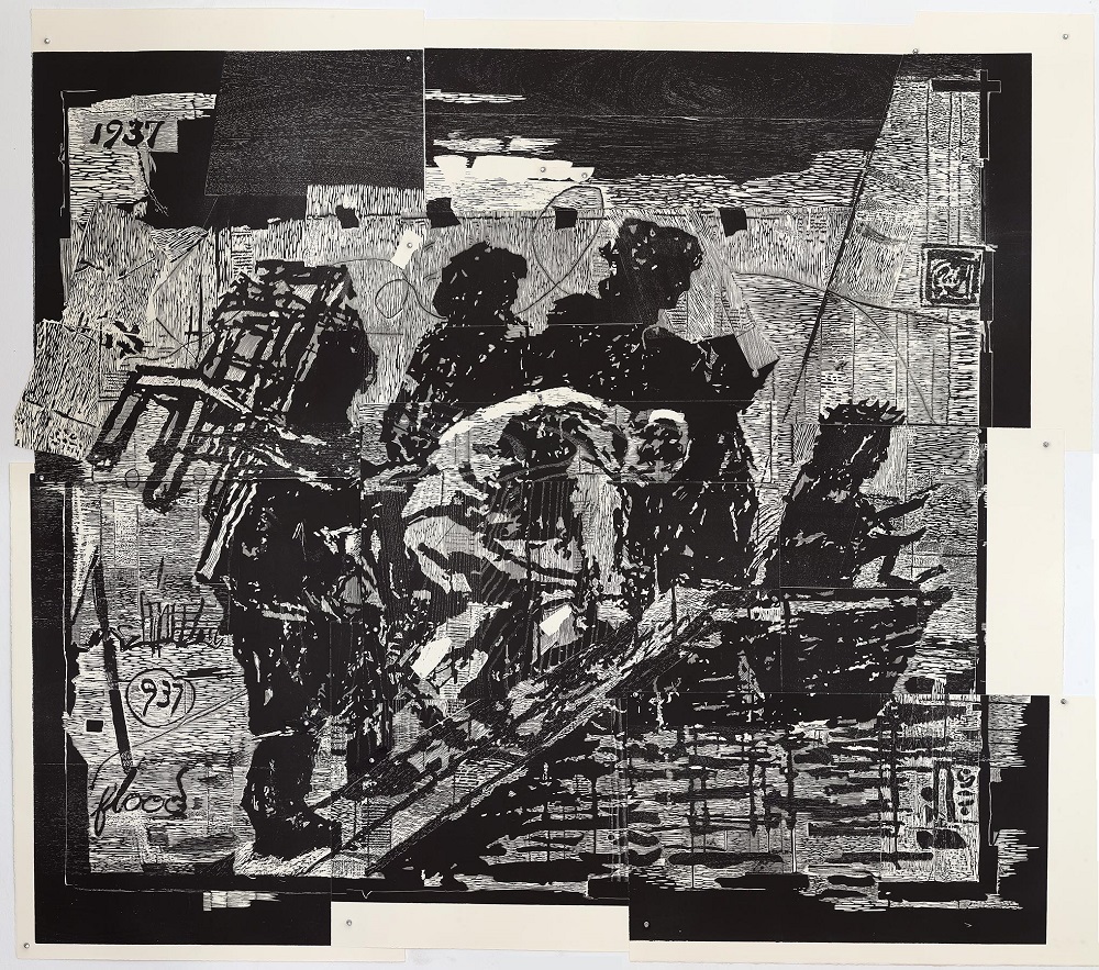
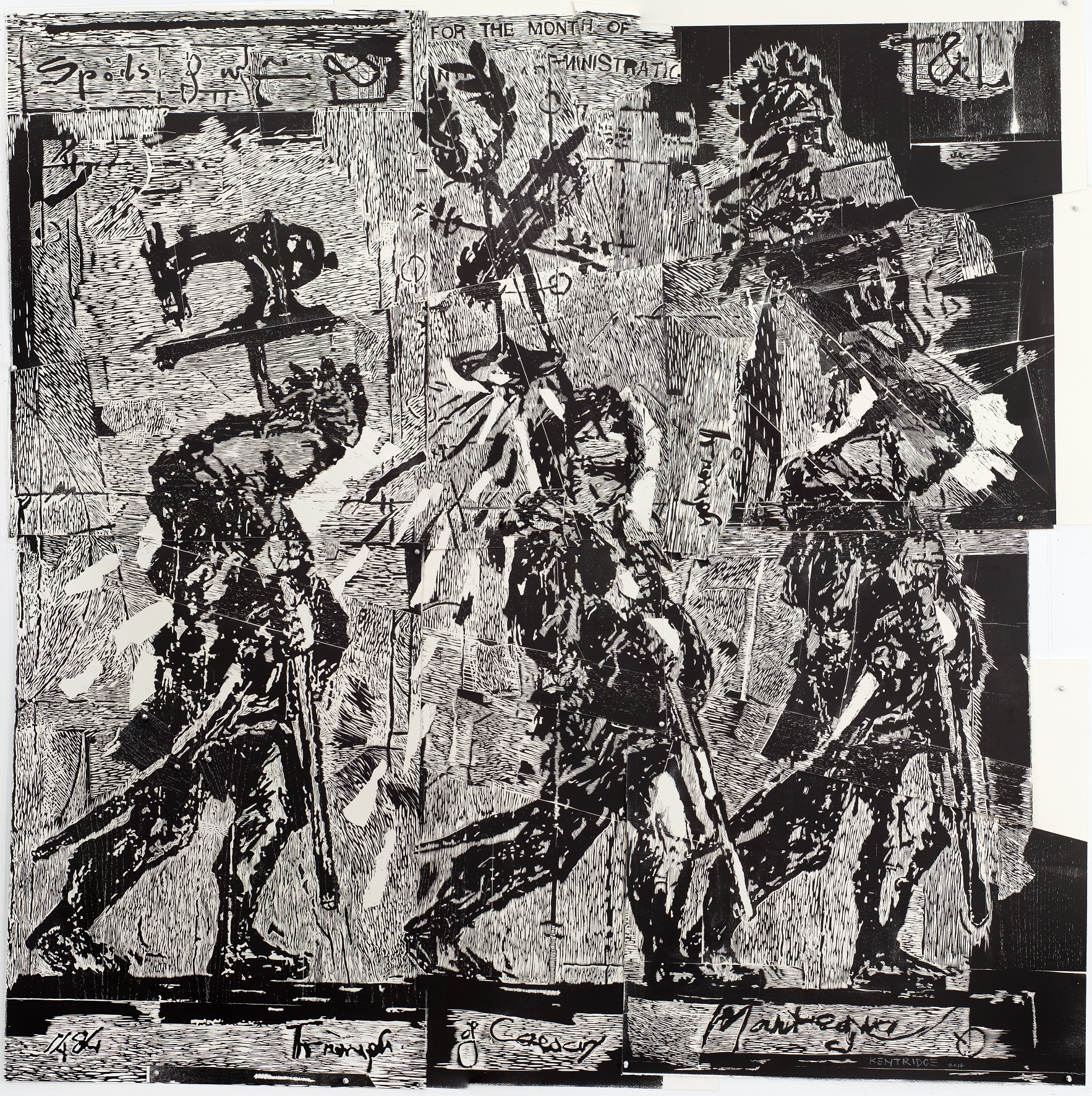
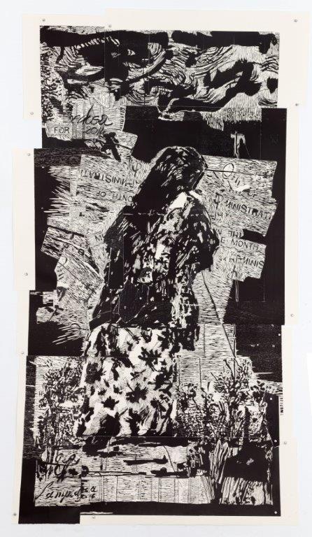
In 2016, and for some years prior, William Kentridge was at work on a monumental frieze, called Triumphs and Laments: A Project for Rome, to be installed along the banks of the Tiber River. The work was designed to span 550 metres of an embankment of the river on Piazza Tevere: a procession of 55 drawings delving into the history of Rome from ancient times to the present, integrated with references to current world happenings, which open up conversations about the nature of history and how it is recorded; our capacity to remember, and to forget. For each drawing a stencil was created around which the surface of the wall was pressure-cleaned, leaving behind an image drawn in residue grime. As the natural environmental effects of pollution and bacteria amass once again on the wall, the images are erased.
Read more ▼In January 2016 Jillian Ross, Master Printer of Johannesburg’s David Krut Workshop (DKW), was invited to spend an afternoon in Kentridge’s Houghton studio. At the time, preparations for the frieze project were in motion, the walls and surfaces of the studio covered with proposed layouts, scale tests, preliminary drawings and plans. Ross and Kentridge began exploring the idea of using these drawings as the basis for a print collaboration.
A number of different avenues were investigated, and Ross left mulling over a few ideas. For Ross, an important considerations was the ability to build on the skills acquired in previous projects so as to go beyond what had been achieved before.
Considering that the images stencilled onto the Tiber wall are ultimately fugitive, in time all that will remain of the project are the outcomes of collaborations that happened alongside and as a result of it. The Tiber River procession was an extraordinarily ambitious pursuit and the print collaboration needed to do justice to the scale and intent, albeit in a different arena. Woodcut was finally settled upon as the medium – a challenge in itself, having not worked together in the medium before. And so they embarked on a journey that led to the creation of a series of six almost-life-size, multi-sheet, multi-timber woodcut prints, which unfolded over the course of three years.
The Triumphs & Laments Woodcut Series has been shown extensively, as a whole and in parts, over the course of the years in which it was made.
2019 saw two large-scale retrospective exhibitions of Kentridge’s work – in Cape Town, at the Zeitz Museum of Contemporary Art Africa (MOCAA) and at the Kunstmuseum Basel – which presented the artist with an opportunity to review a selection of his work spanning the last 40 years. The Triumphs & Laments Woodcut Series was included in both these exhibitions as a pinnacle project for Kentridge in terms of his dedication to print media. The series, and its relationship to the Triumphs & Laments frieze project in Rome, is also an excellent acknowledgement of Kentridge’s dedication to impermanence and contingency in terms of making sense – of politics, of social commentary, of history.
Text by Jacqueline Flint, 2020
Each print comes unassembled with the following contents included:
- a black linen portfolio box that houses
- an instructions manual
- a booklet on the making of each artwork
- the number of prints found in the finished work
- the number of aluminum pins found in the finished work
- two acetate sheets with registration notes (life size)


Posters
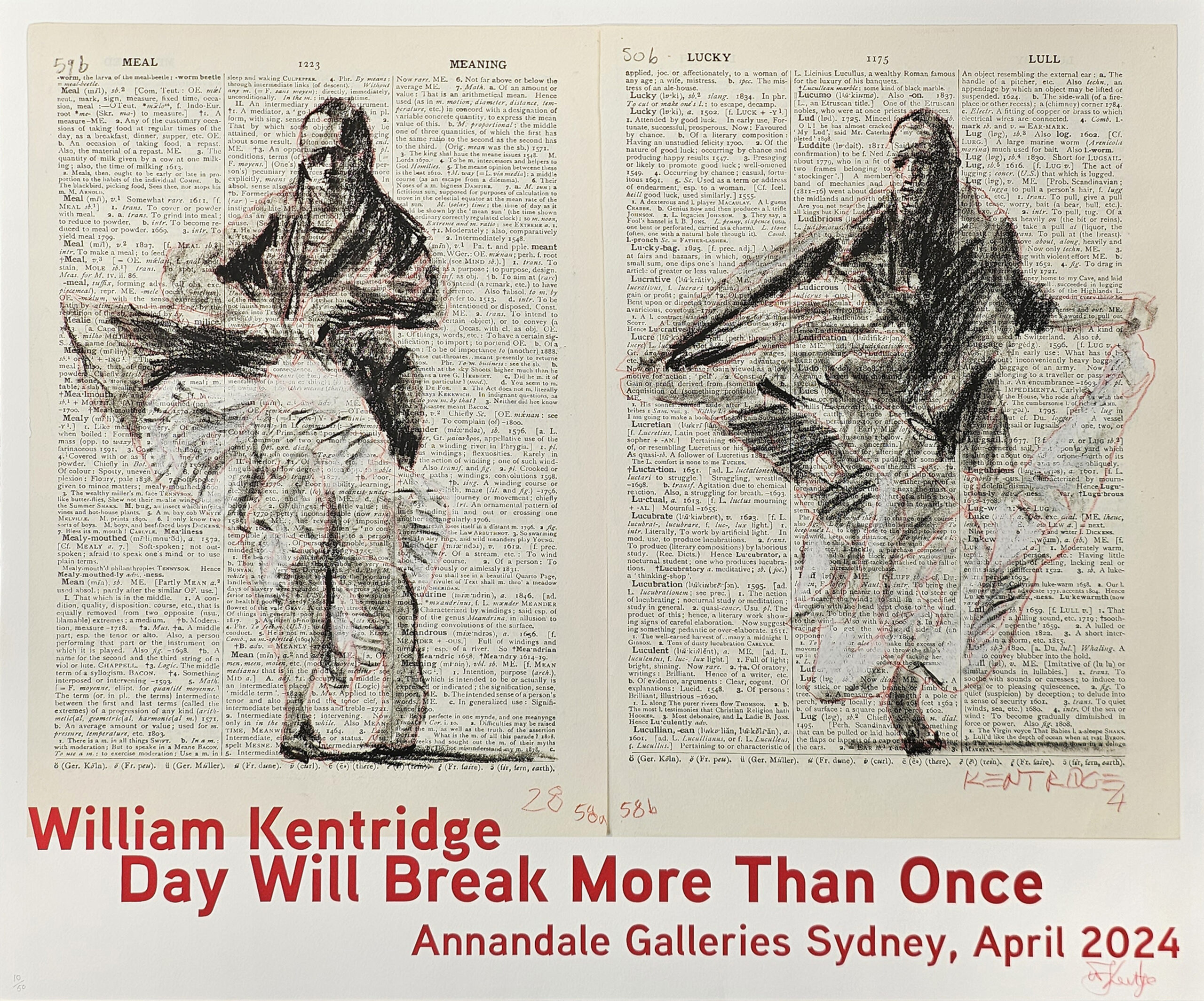


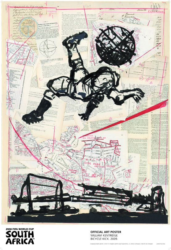
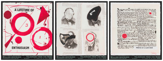
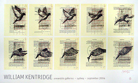
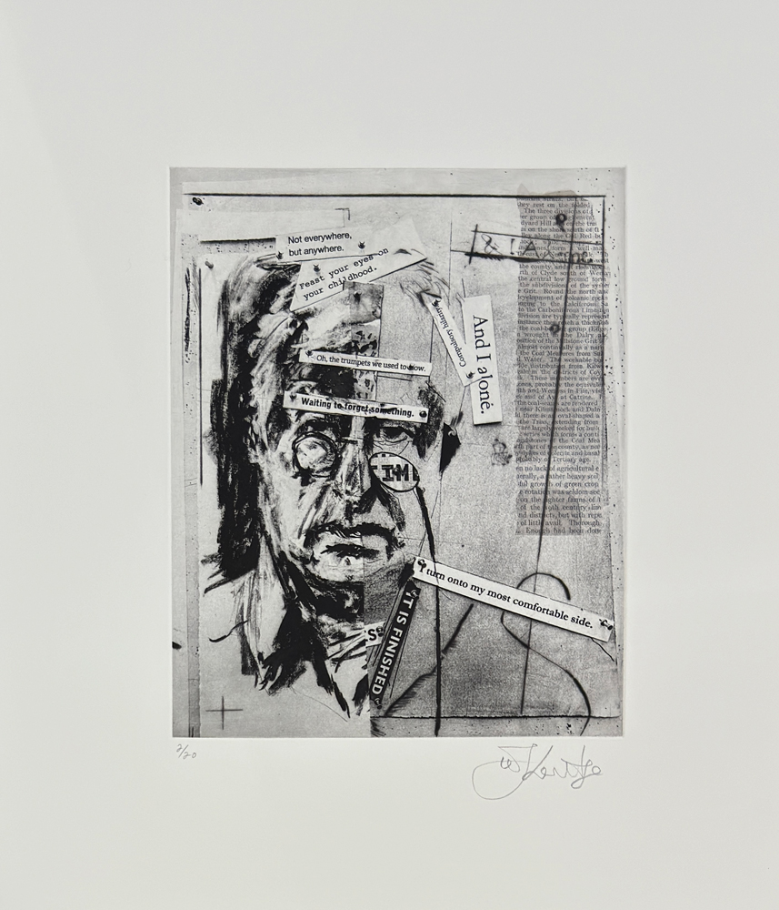
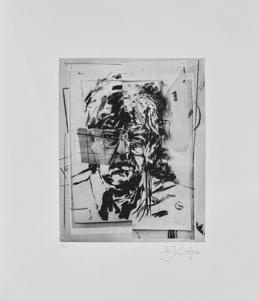
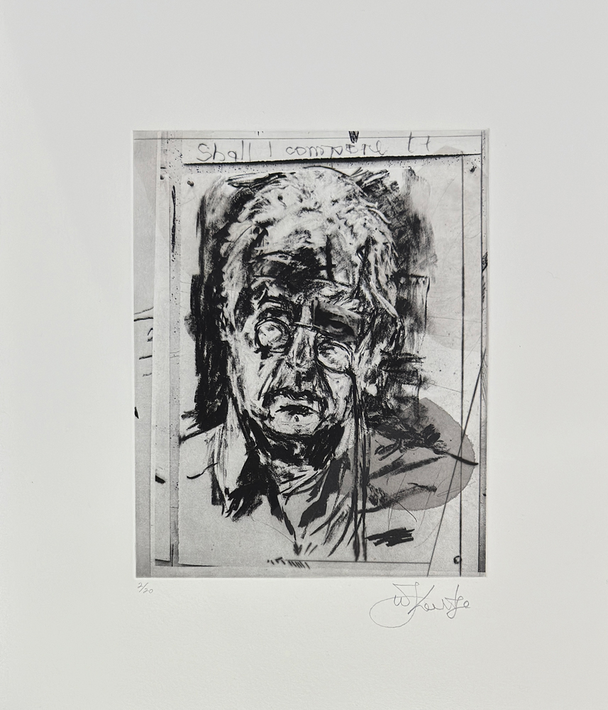
Studio Life Series
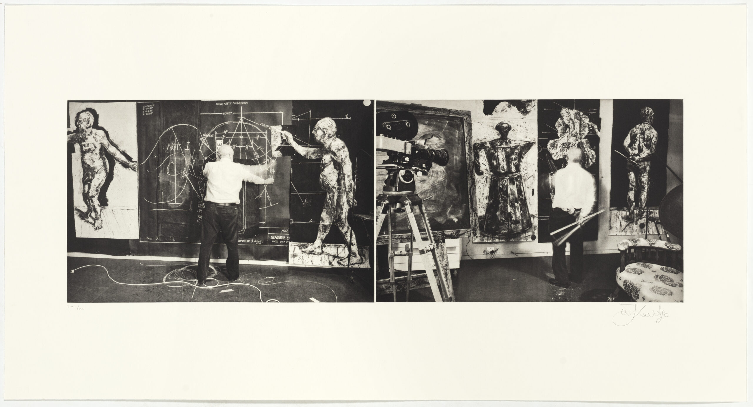
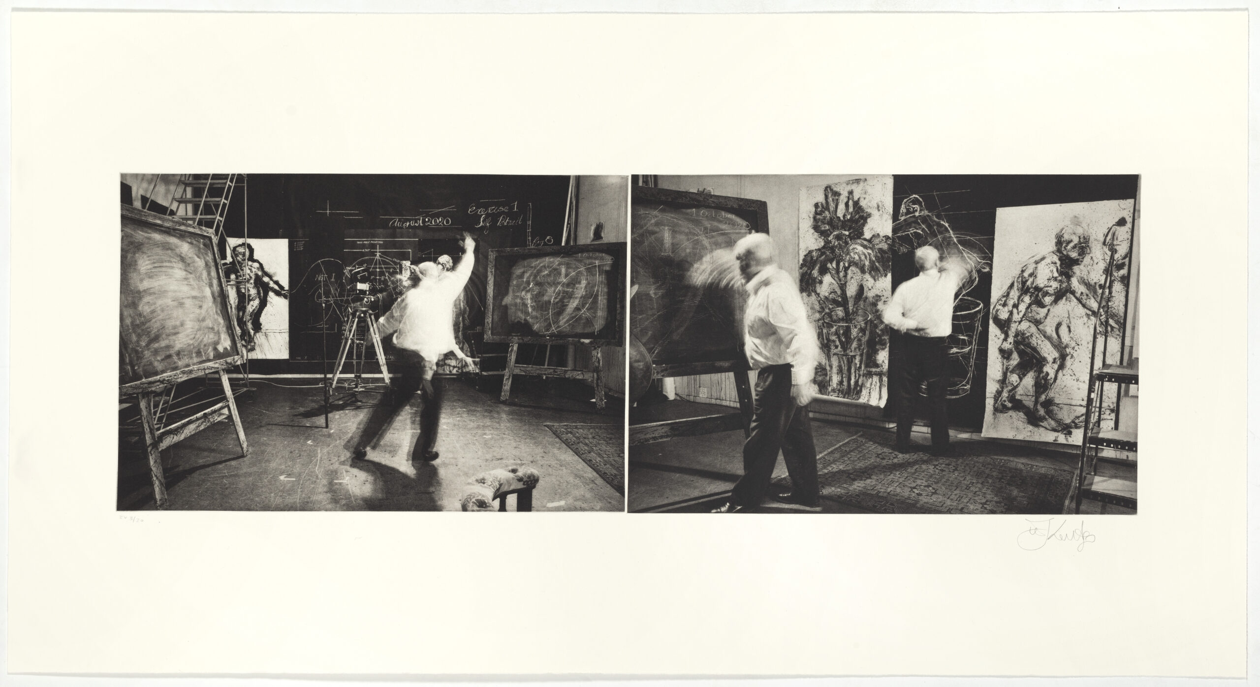
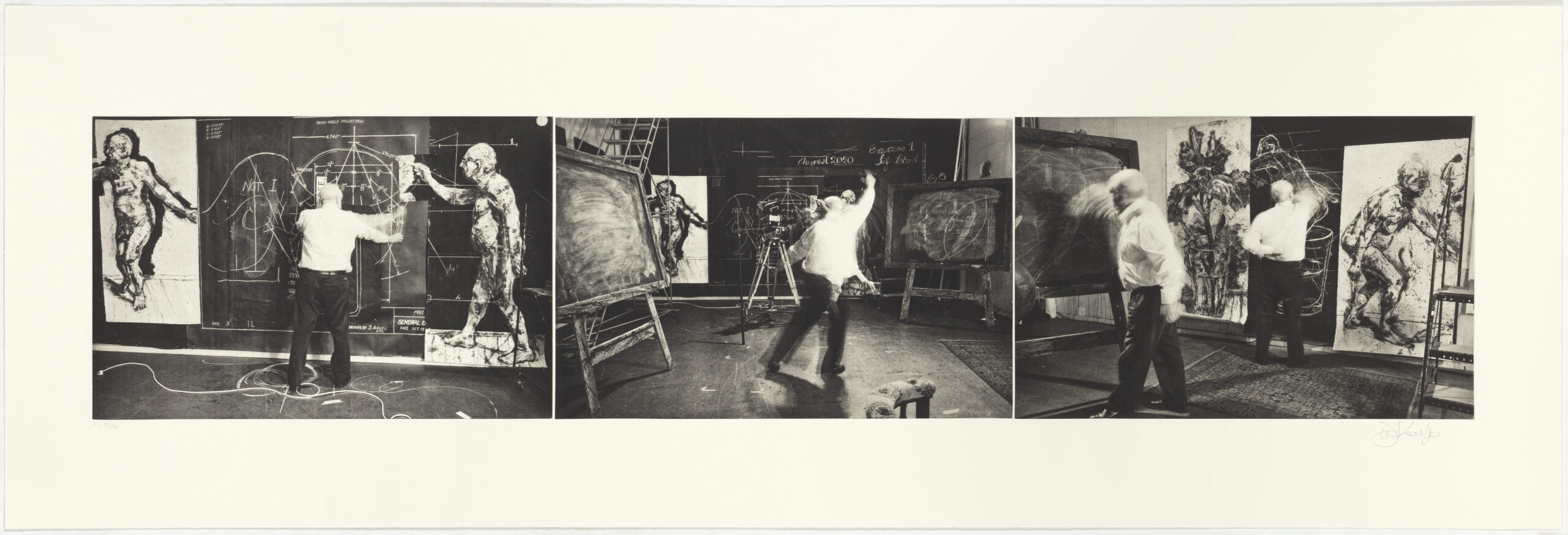
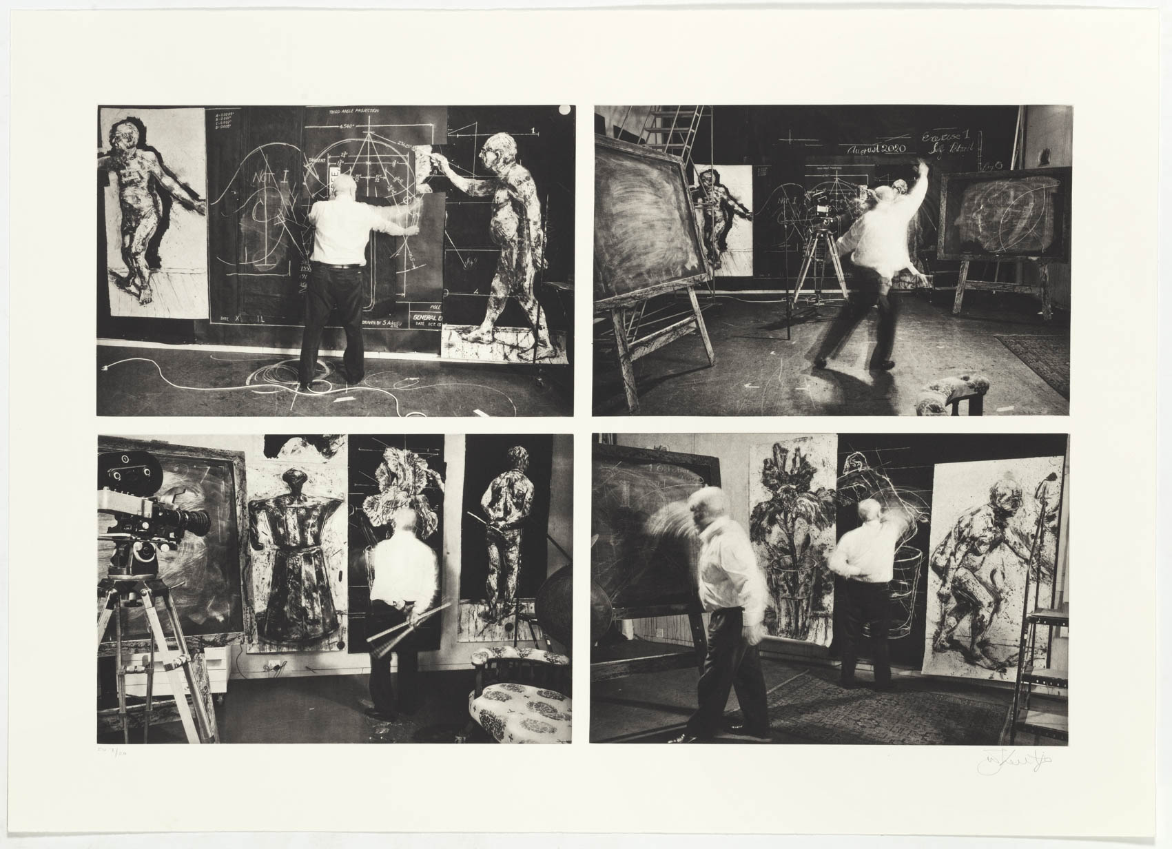
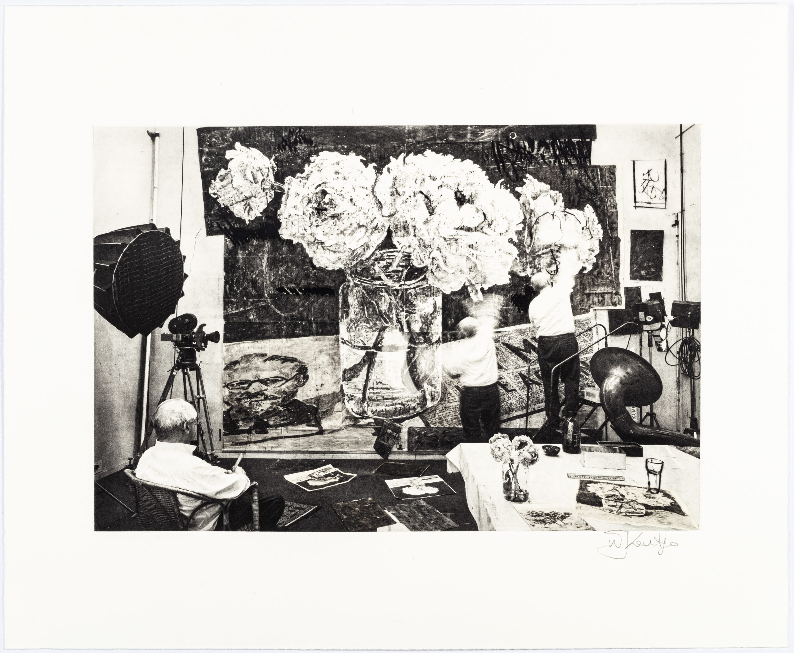
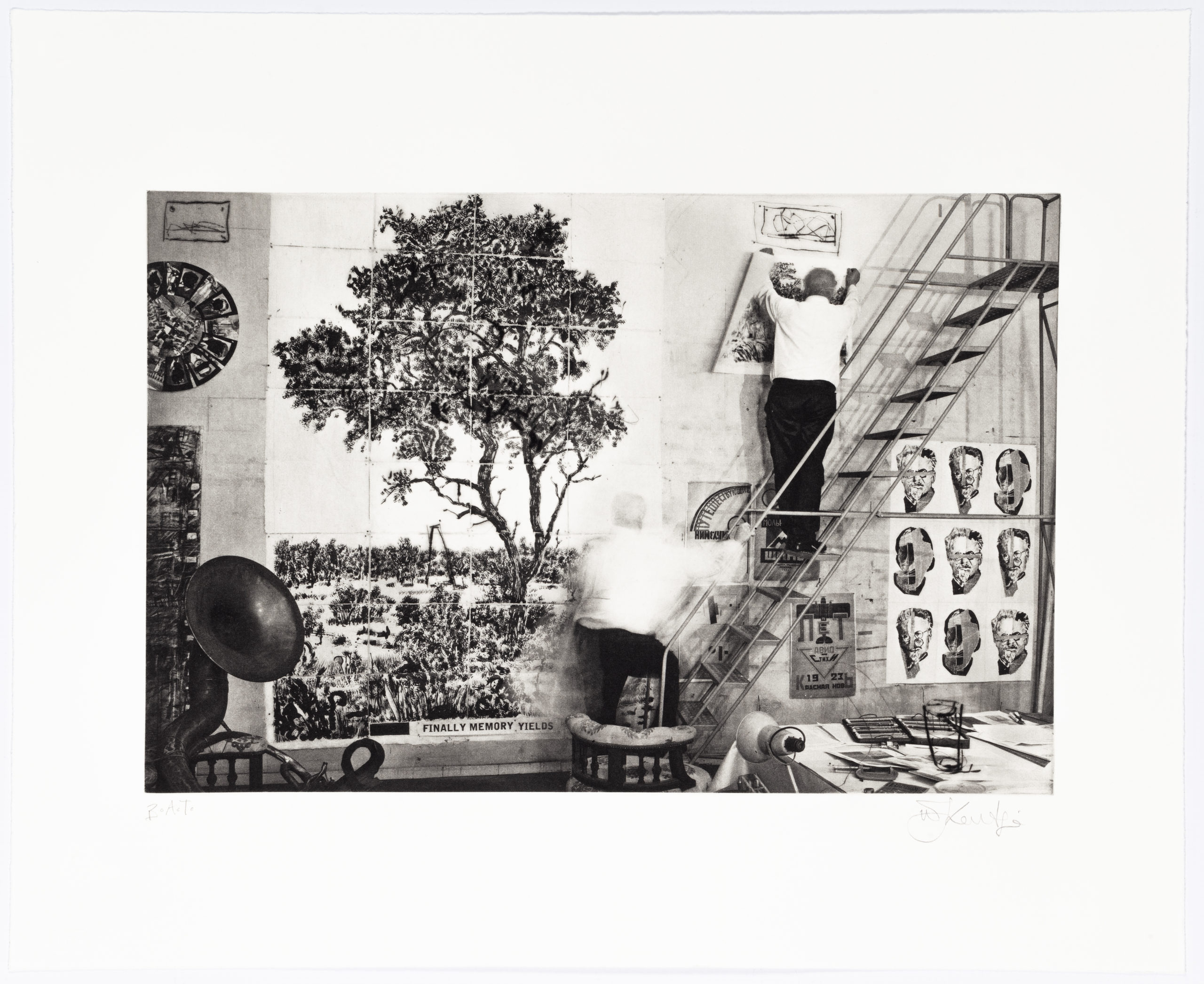
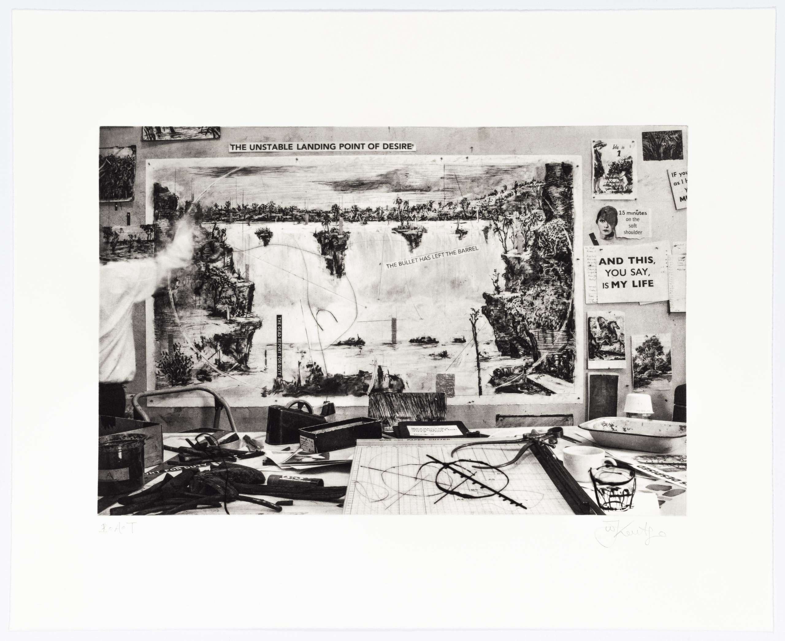
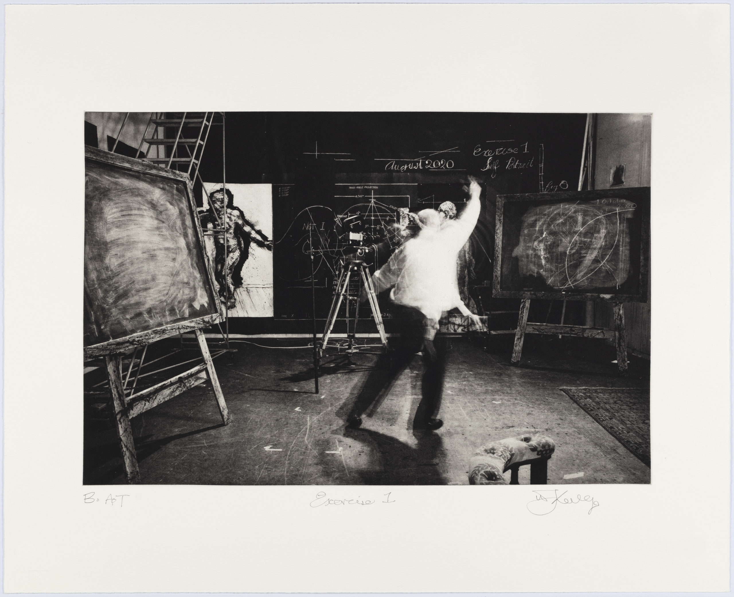
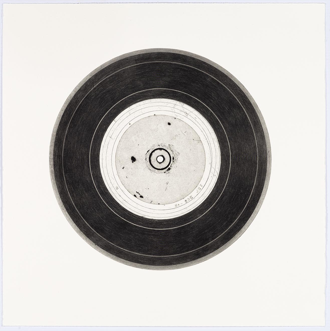
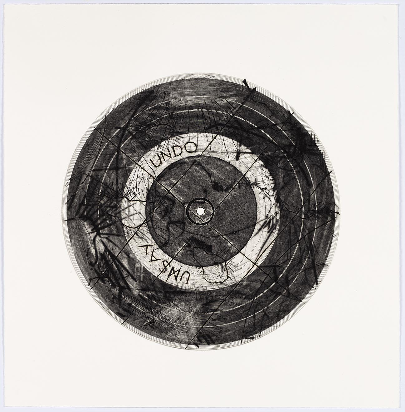
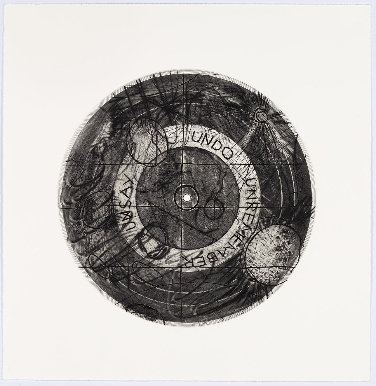
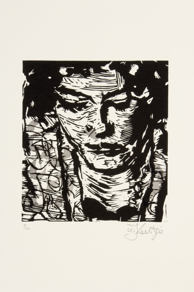
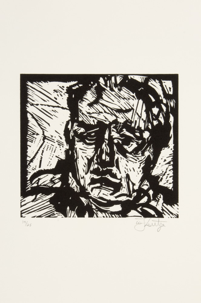
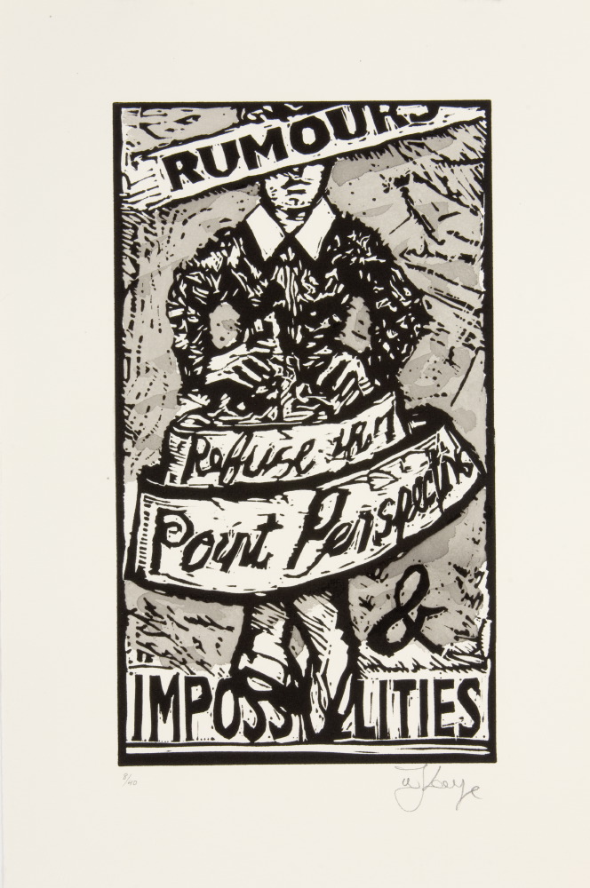
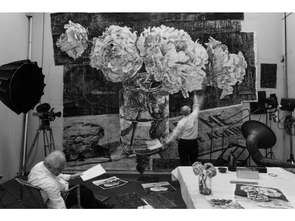
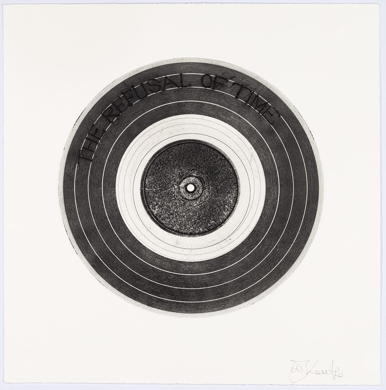
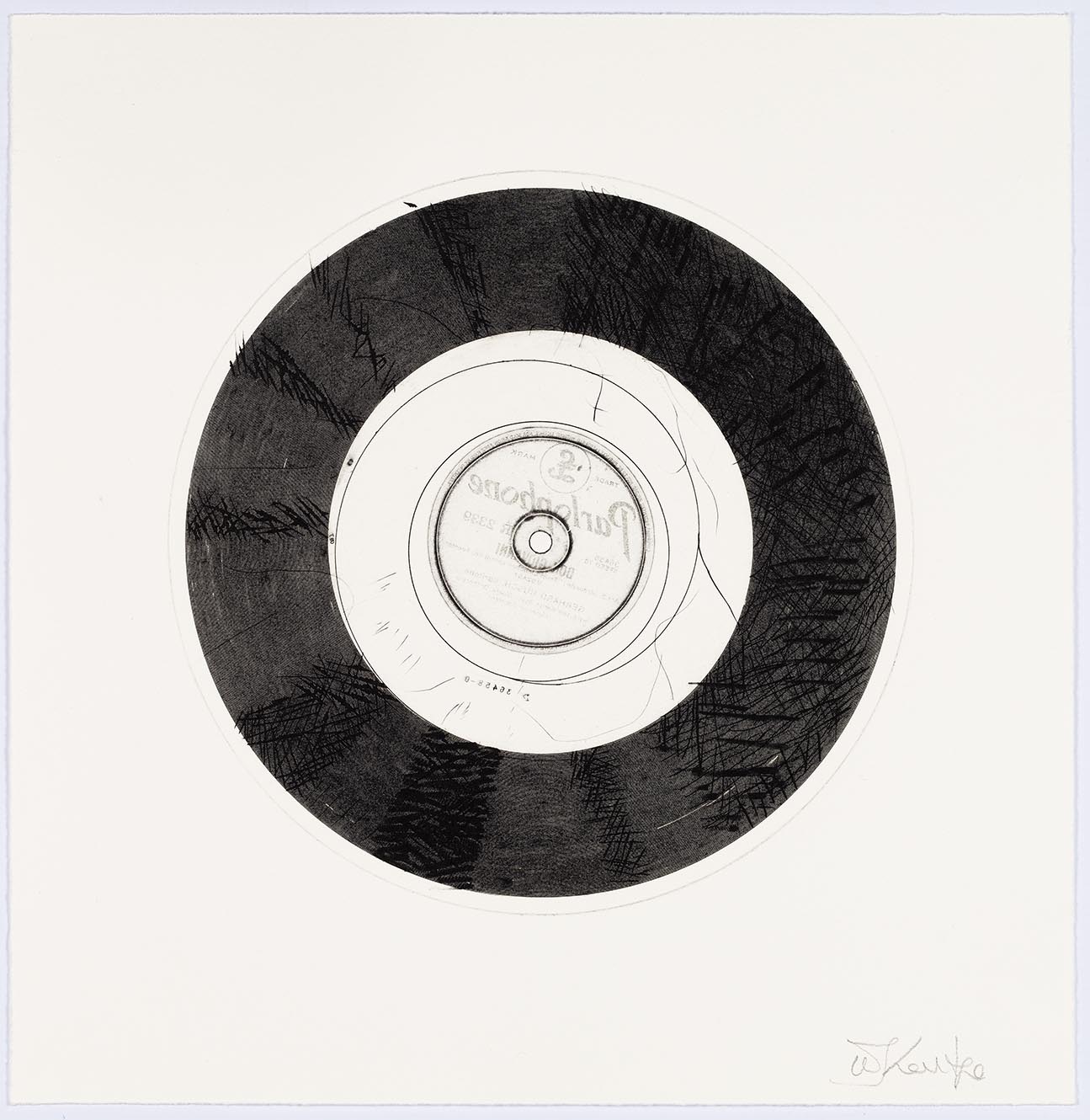
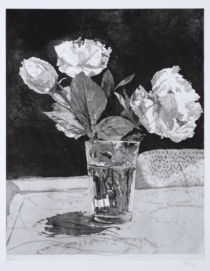
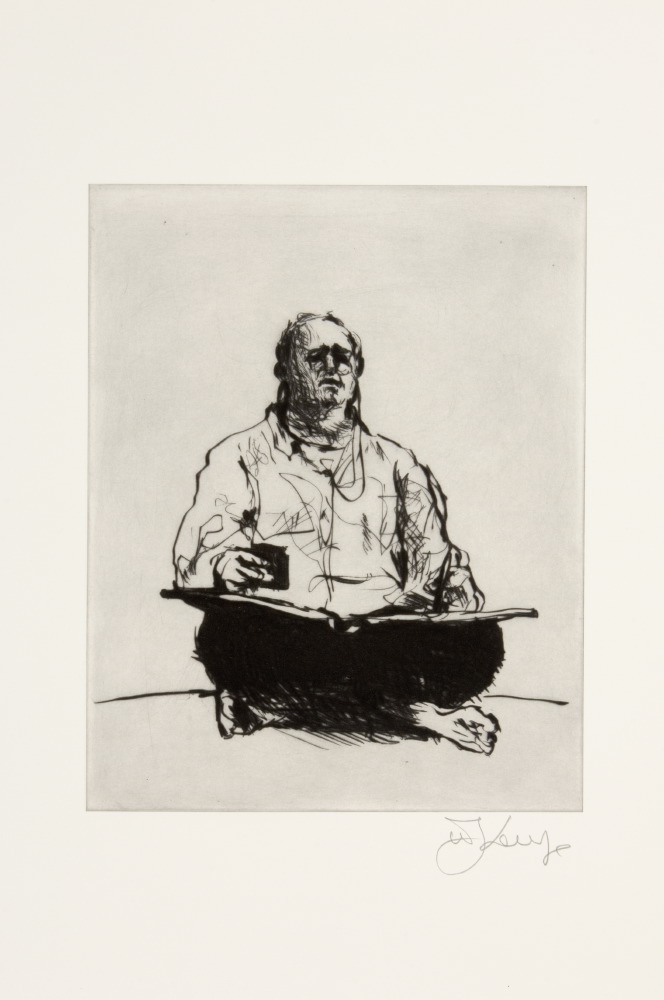
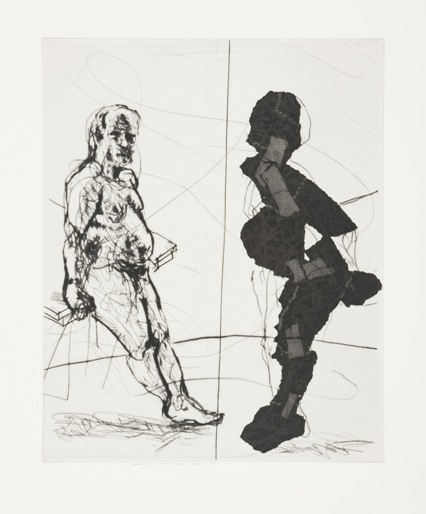
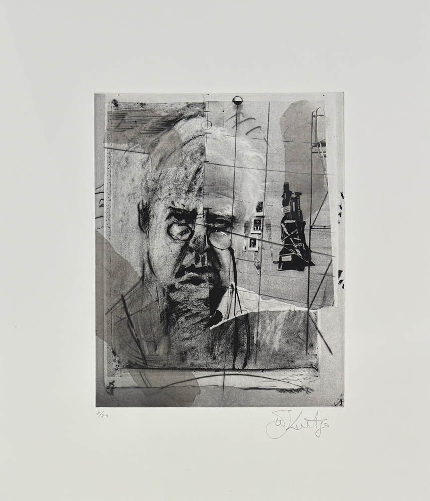
Studio Life Series consists of twelve photogravures which draw on stills from a nine part film series titled Self-portrait as a coffee pot. The imagery shows how he creates intricate, wall-sizes charcoal drawings of the vistas from his studio home in Johannesburg. Three of the films were screened at the recent Toronto International Film Festival (TIFF). The photogravure images start from the beginning of lockdown in South Africa and continued while he was preparing for his Royal Academy exhibition which opened in London in September 2022
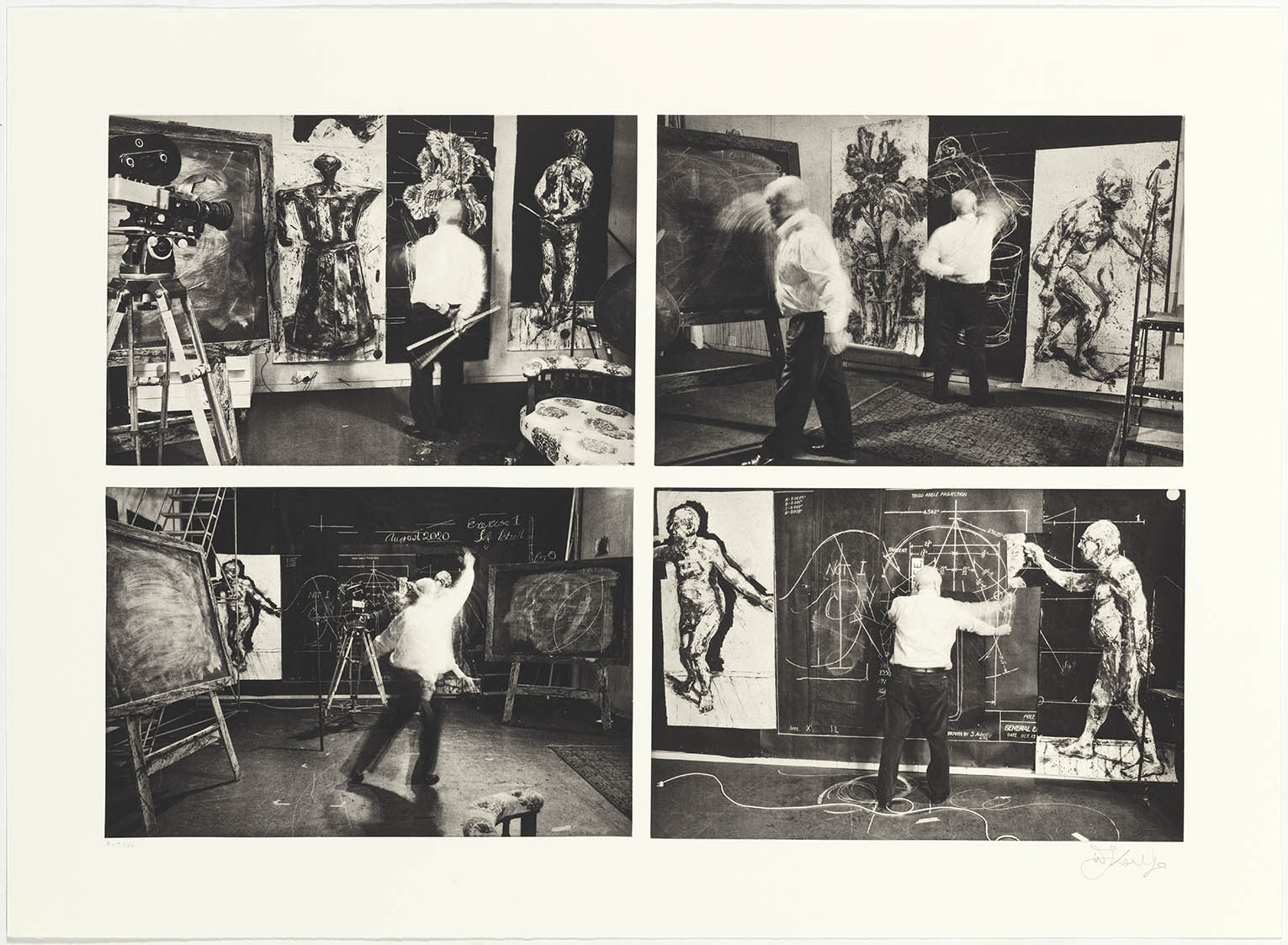
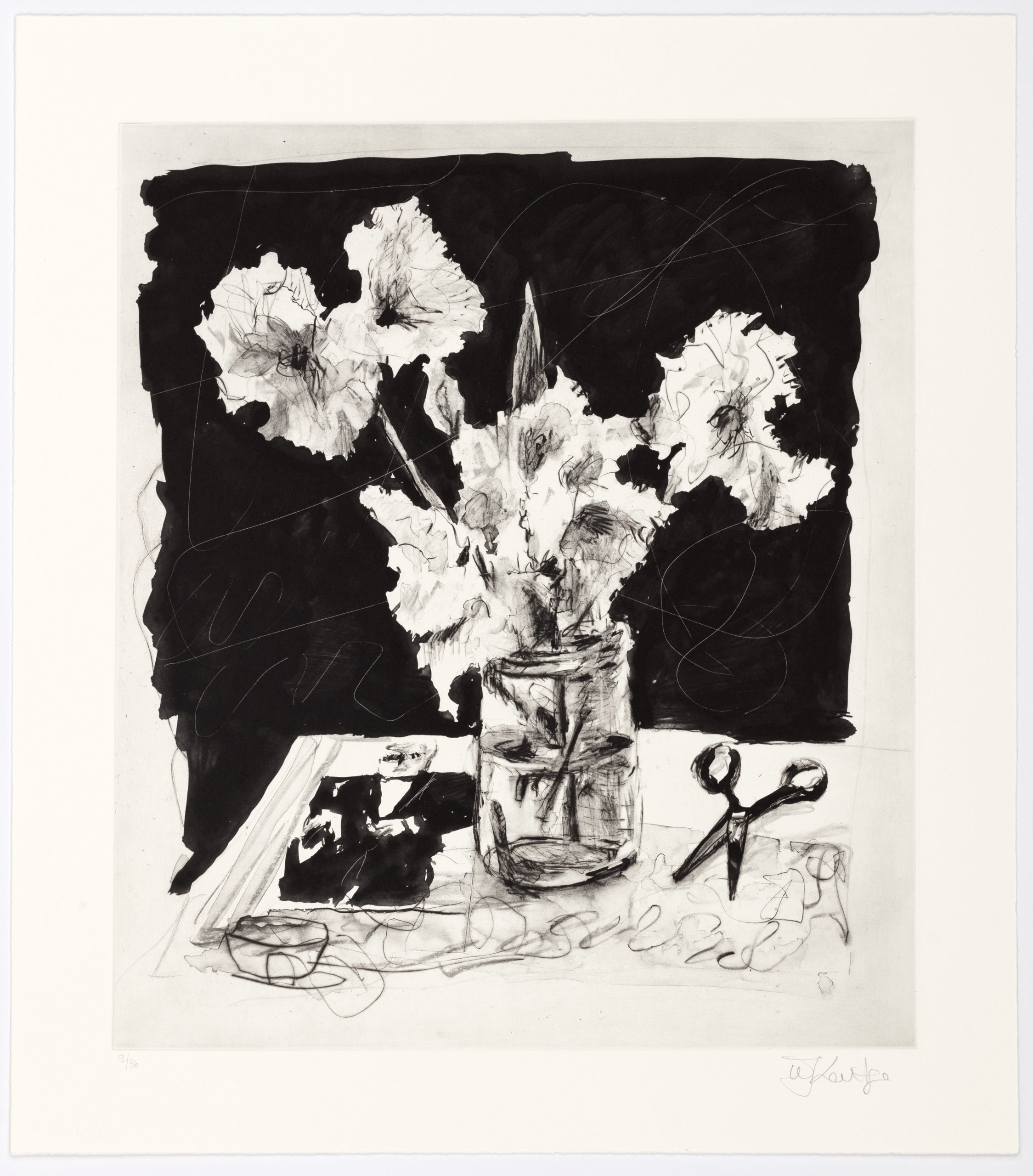
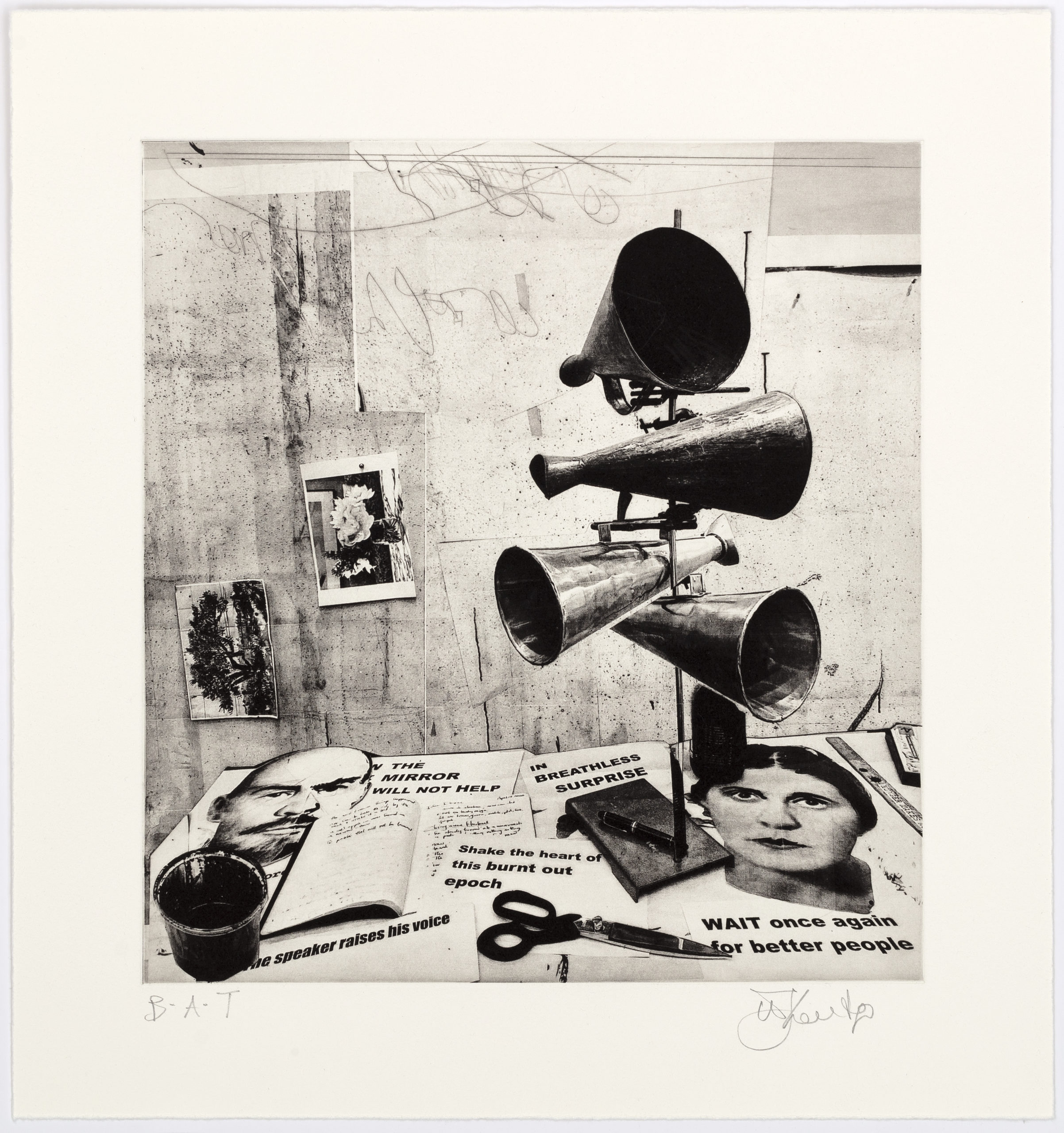
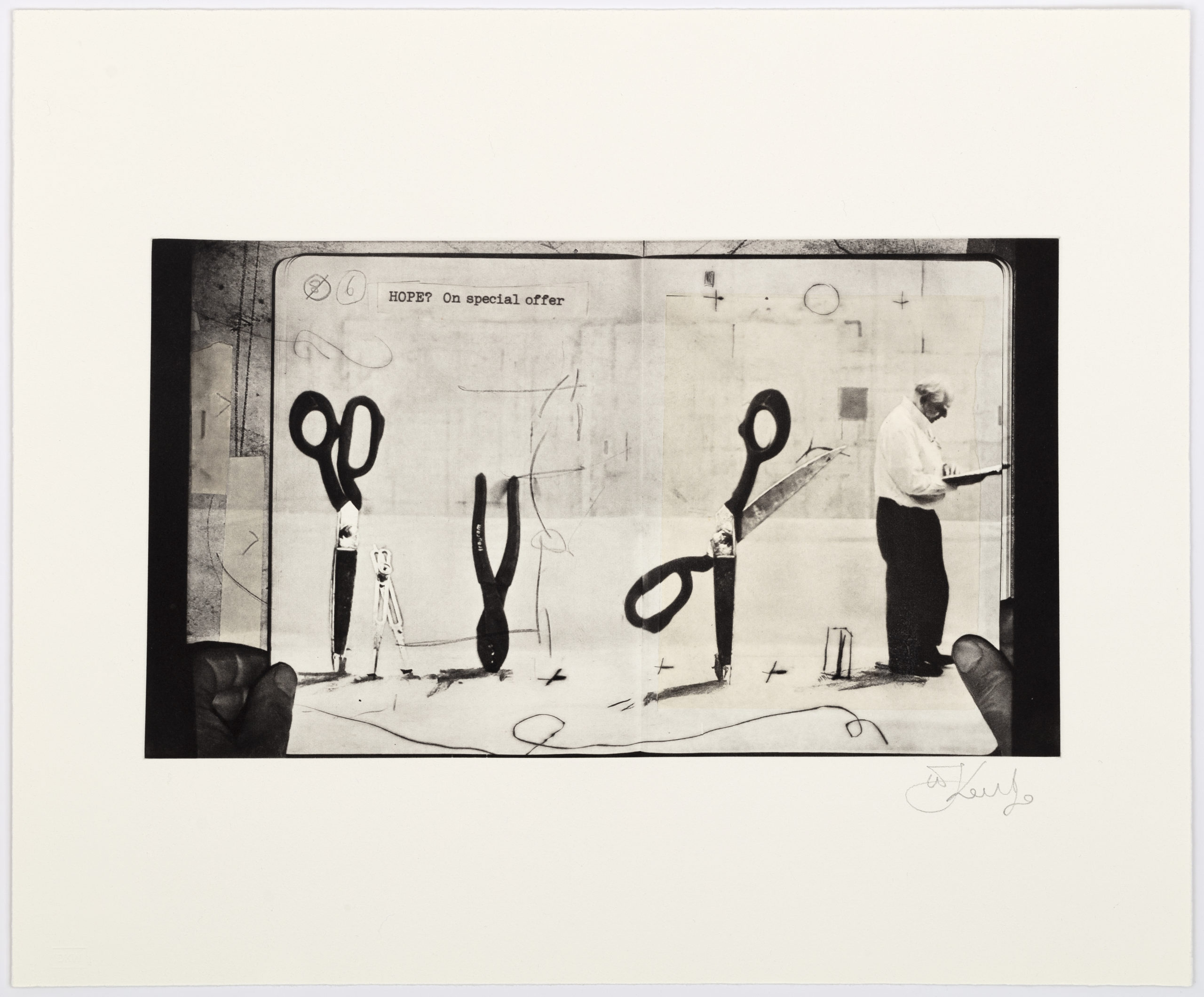
Available Prints In Series

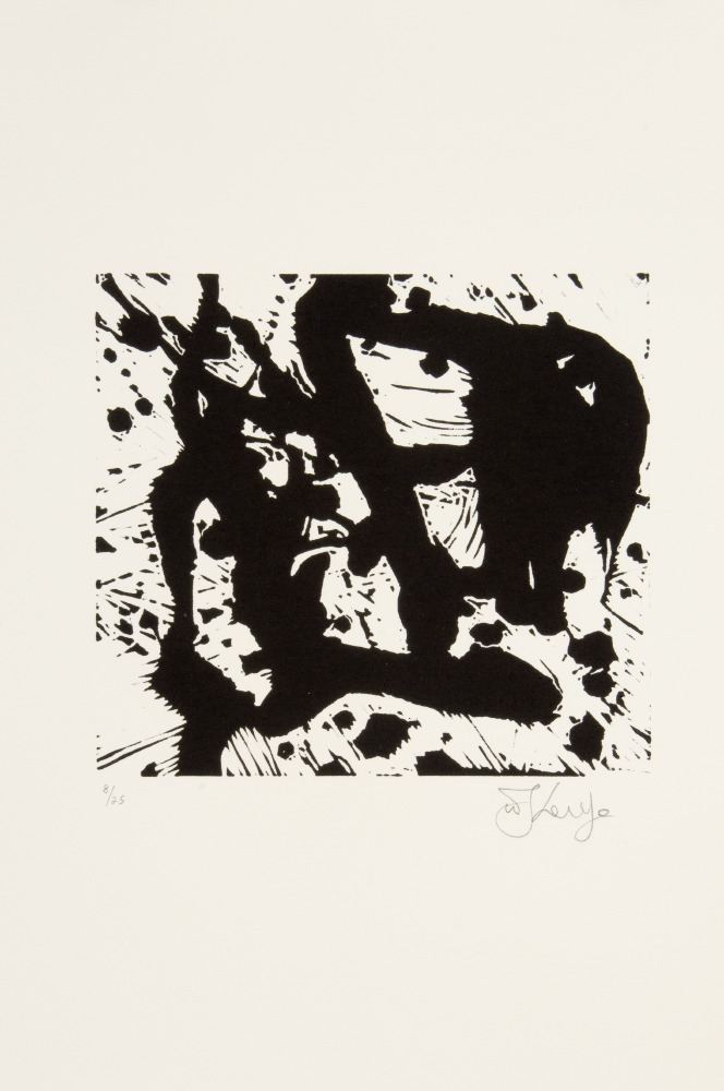
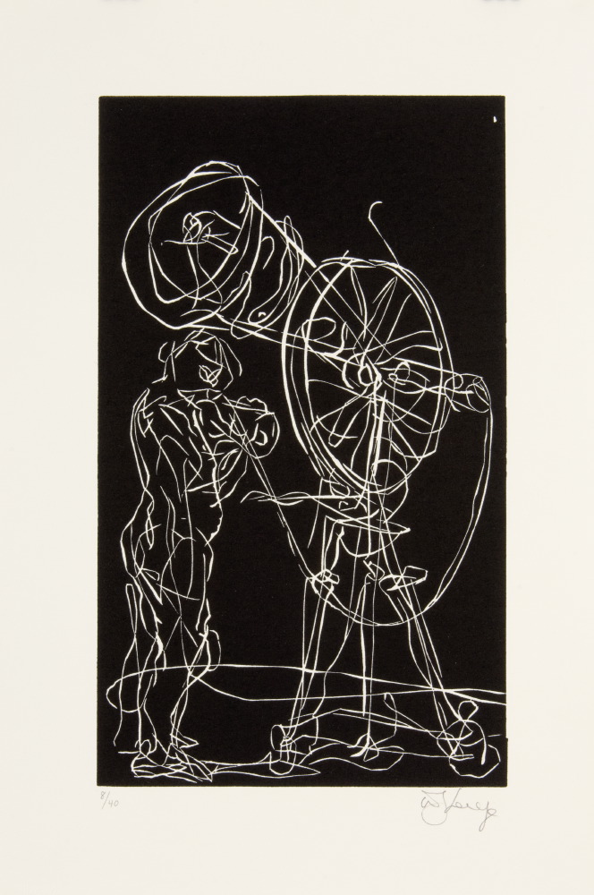
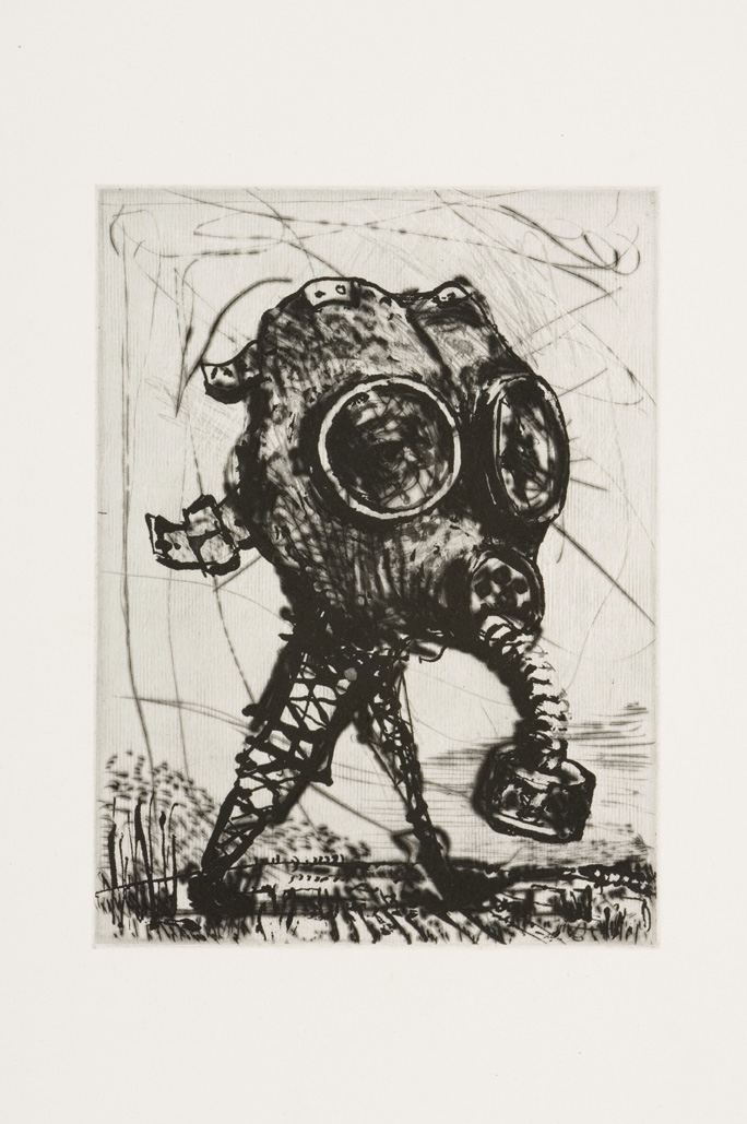
Archived Editions
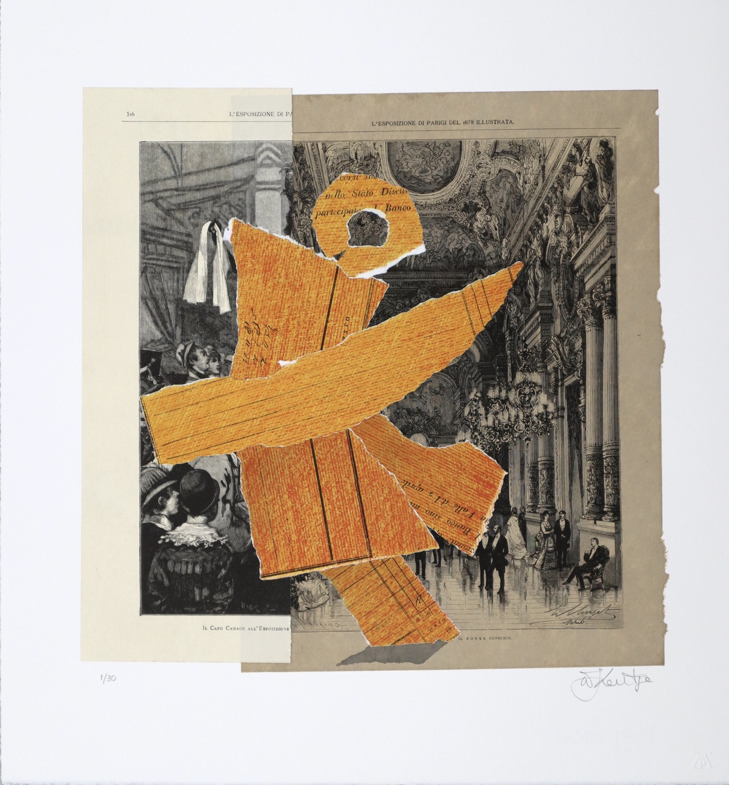
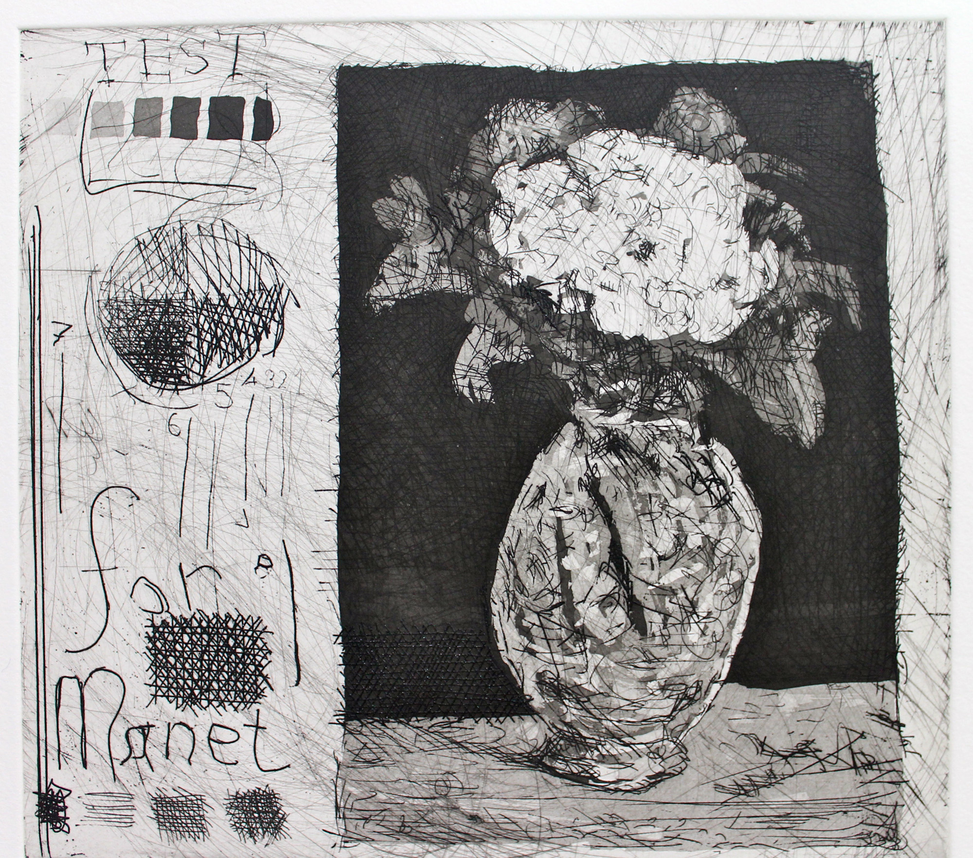
This selection lists editioned work by William Kentridge that is no longer available on the primary market.
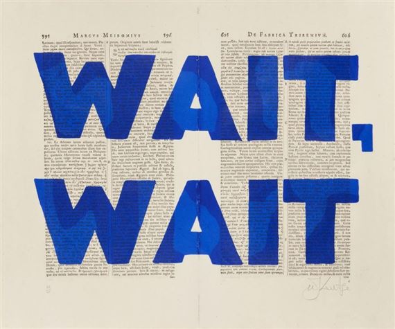
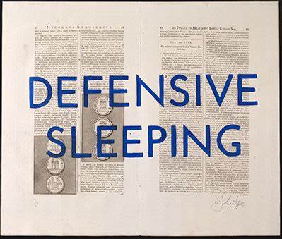
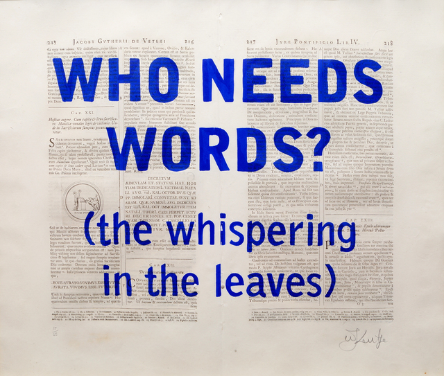
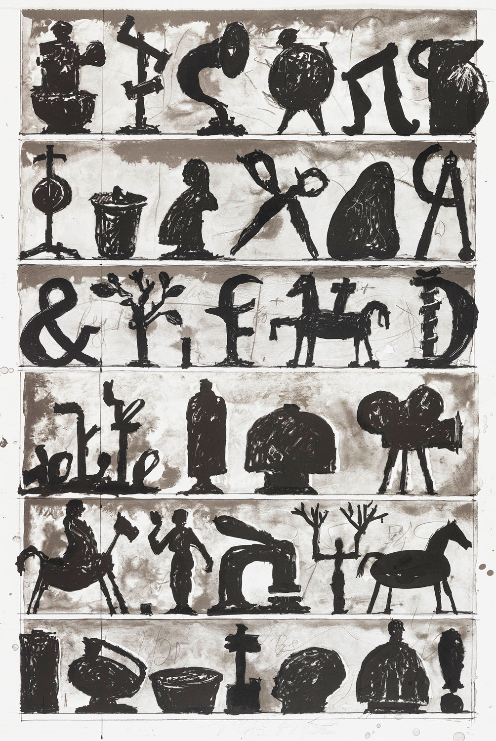


Other Available Prints
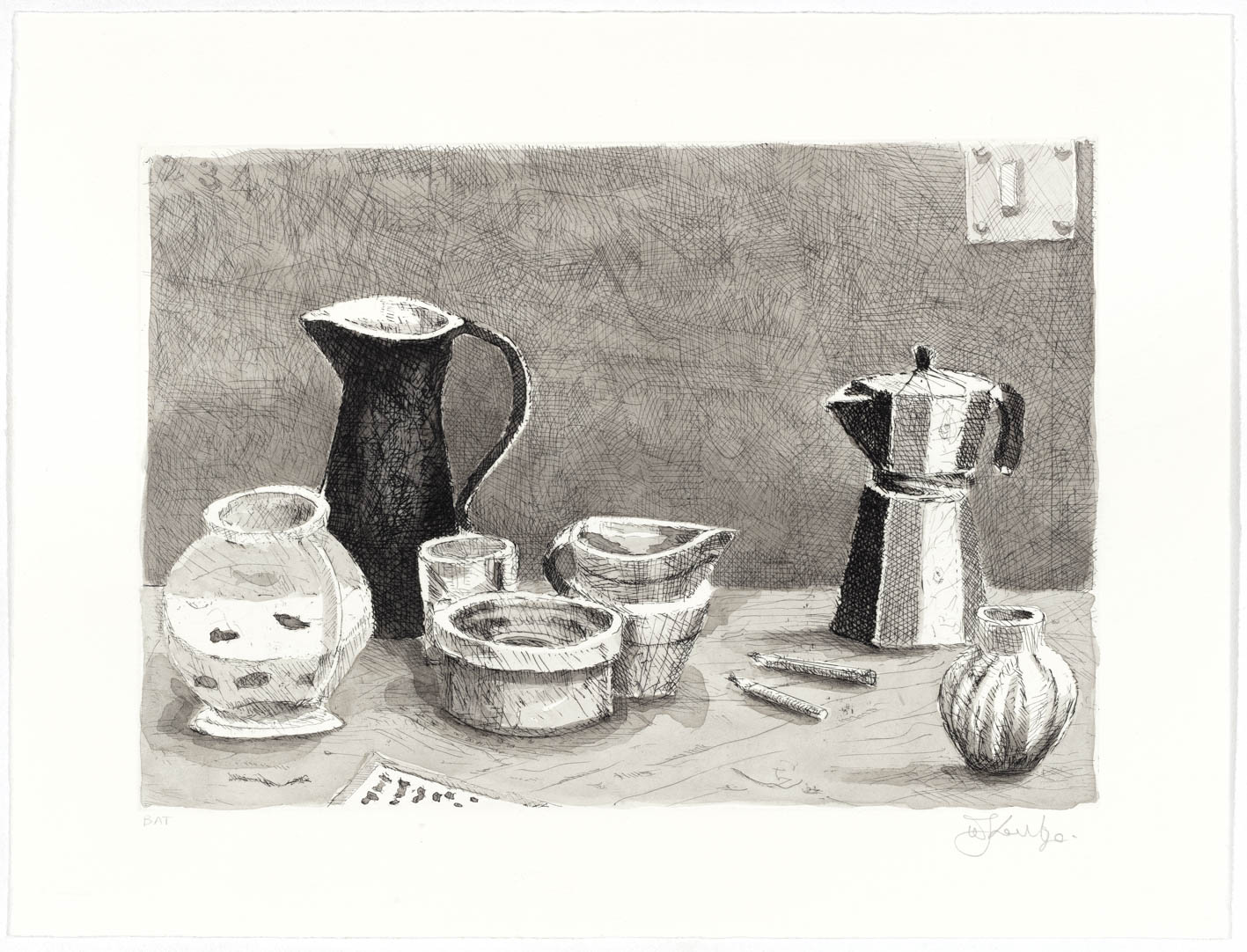
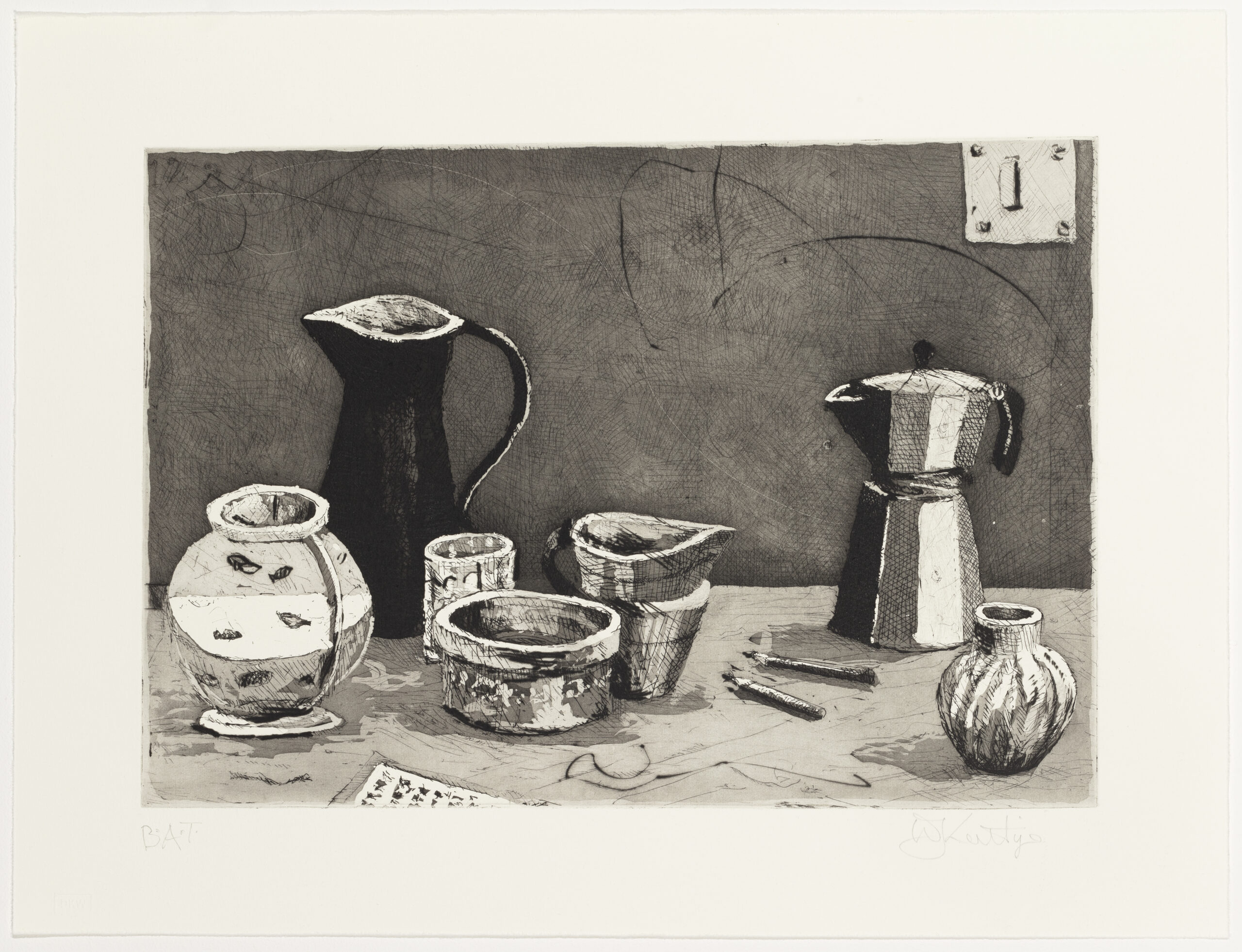
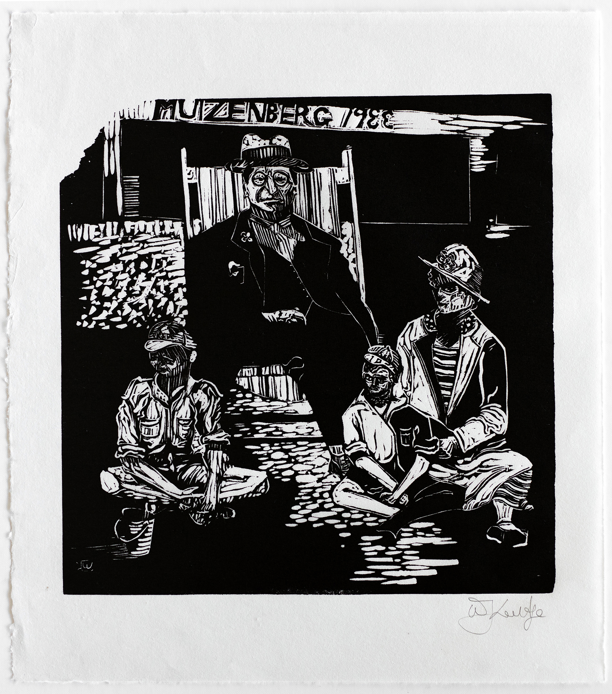
This selection lists all of the editioned works by William Kentridge that are not in selected series.
Headlines
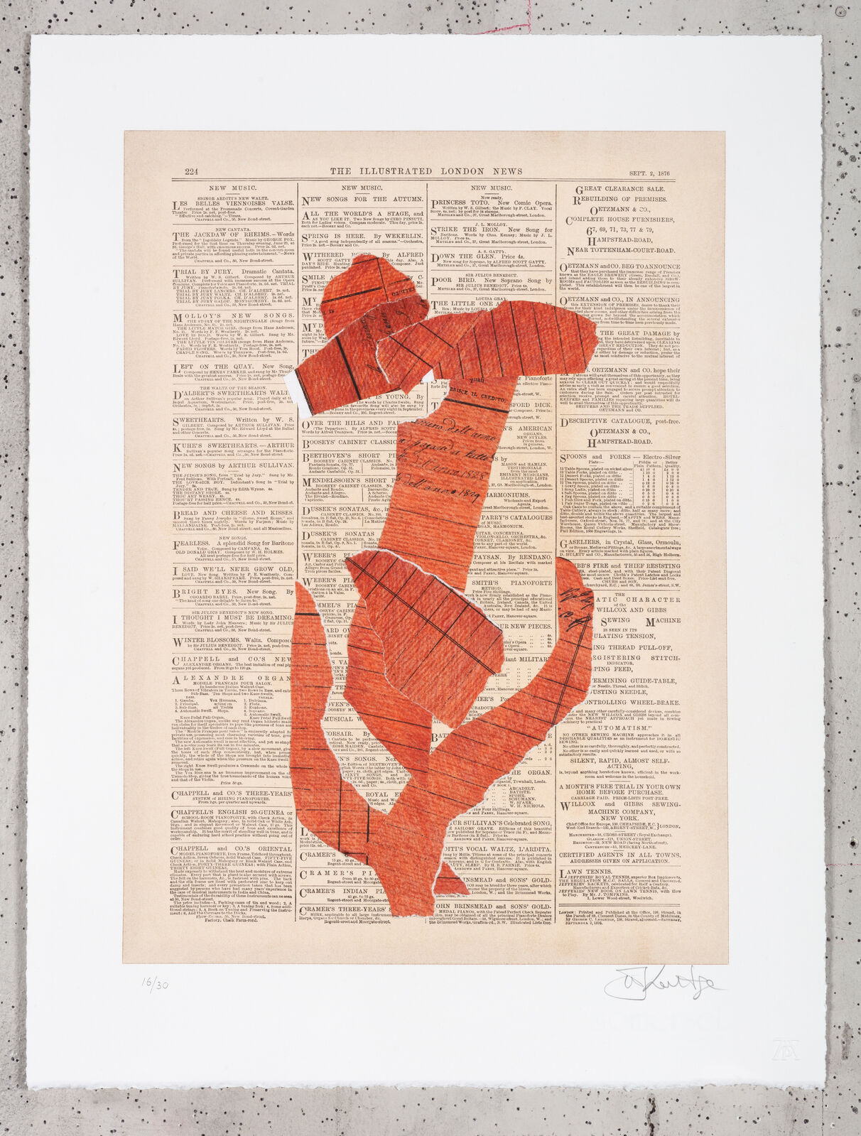
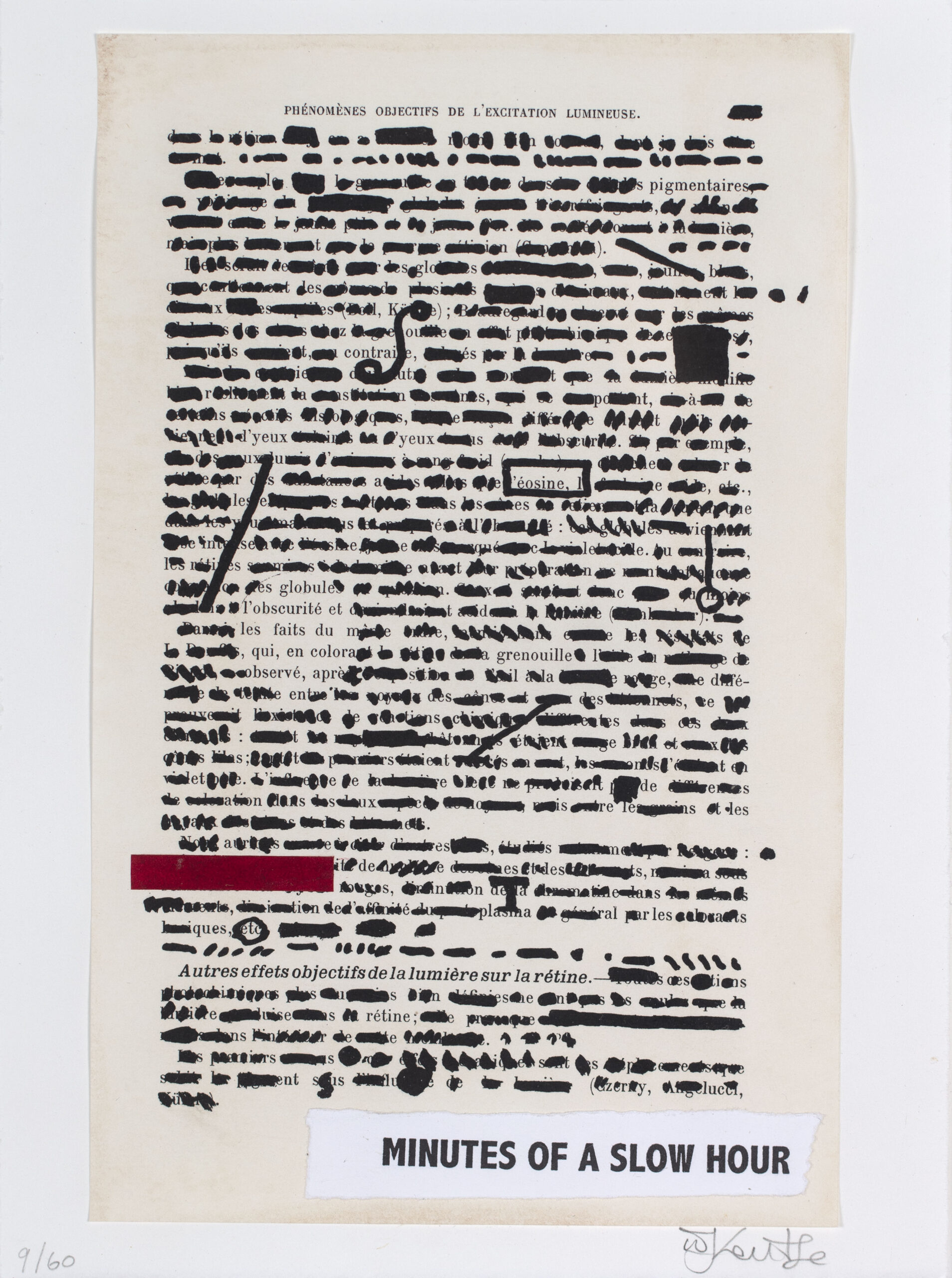
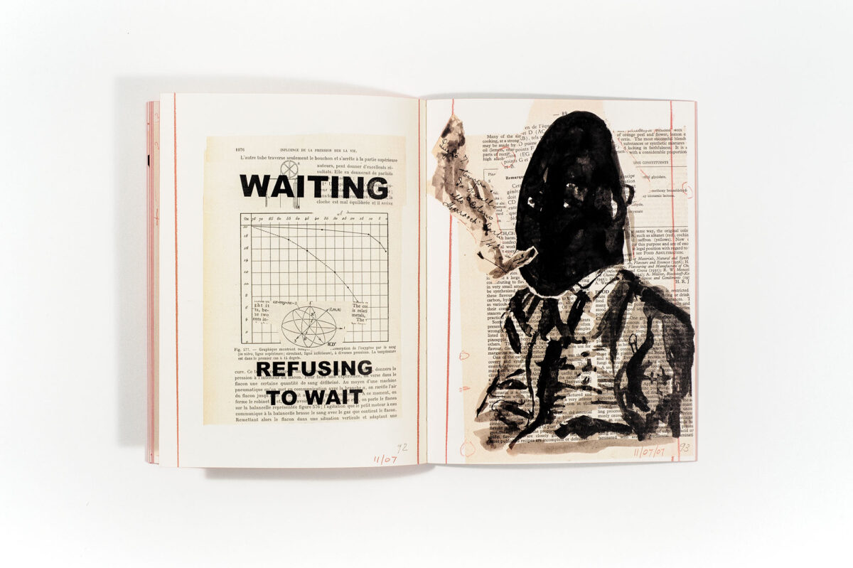
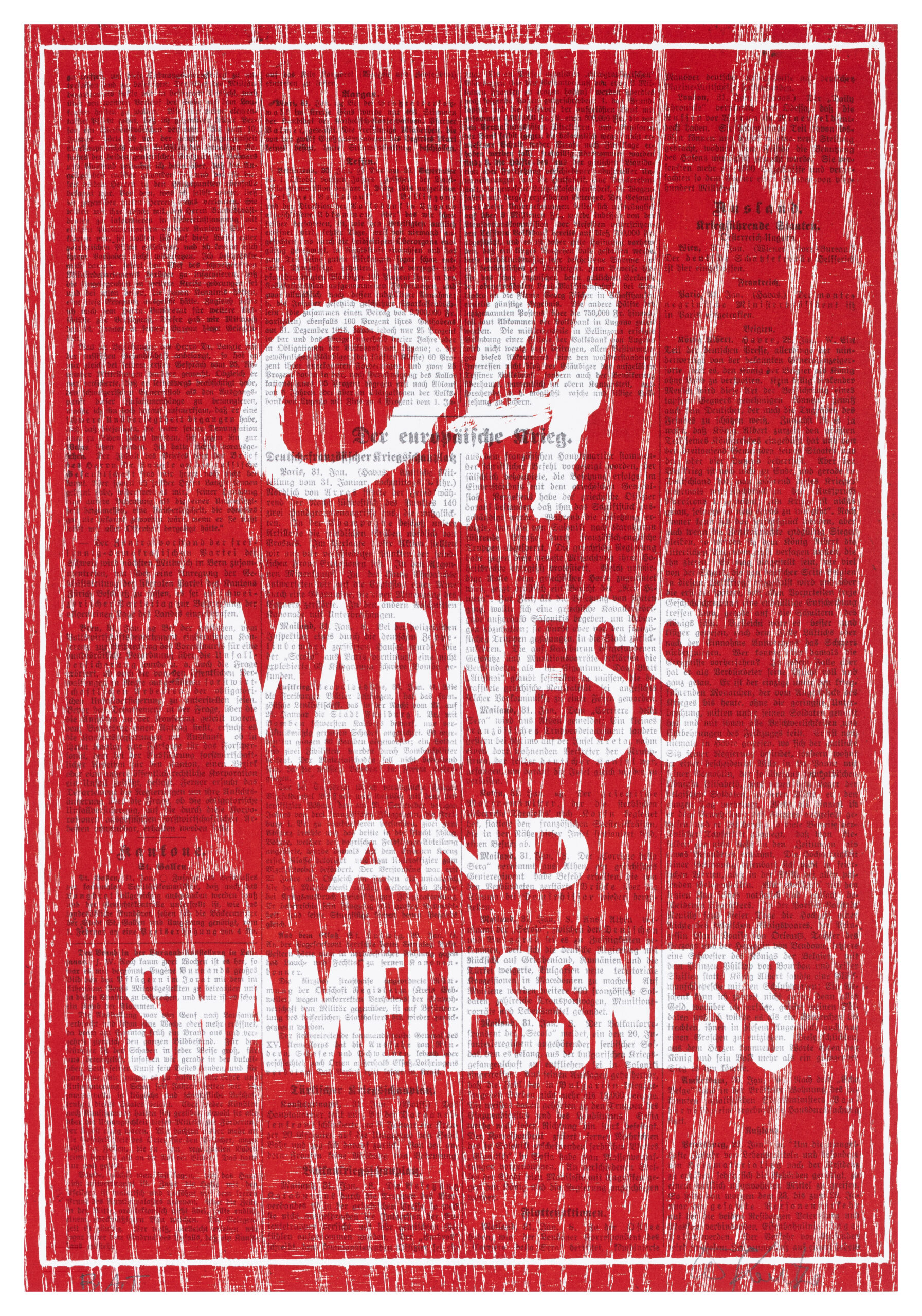
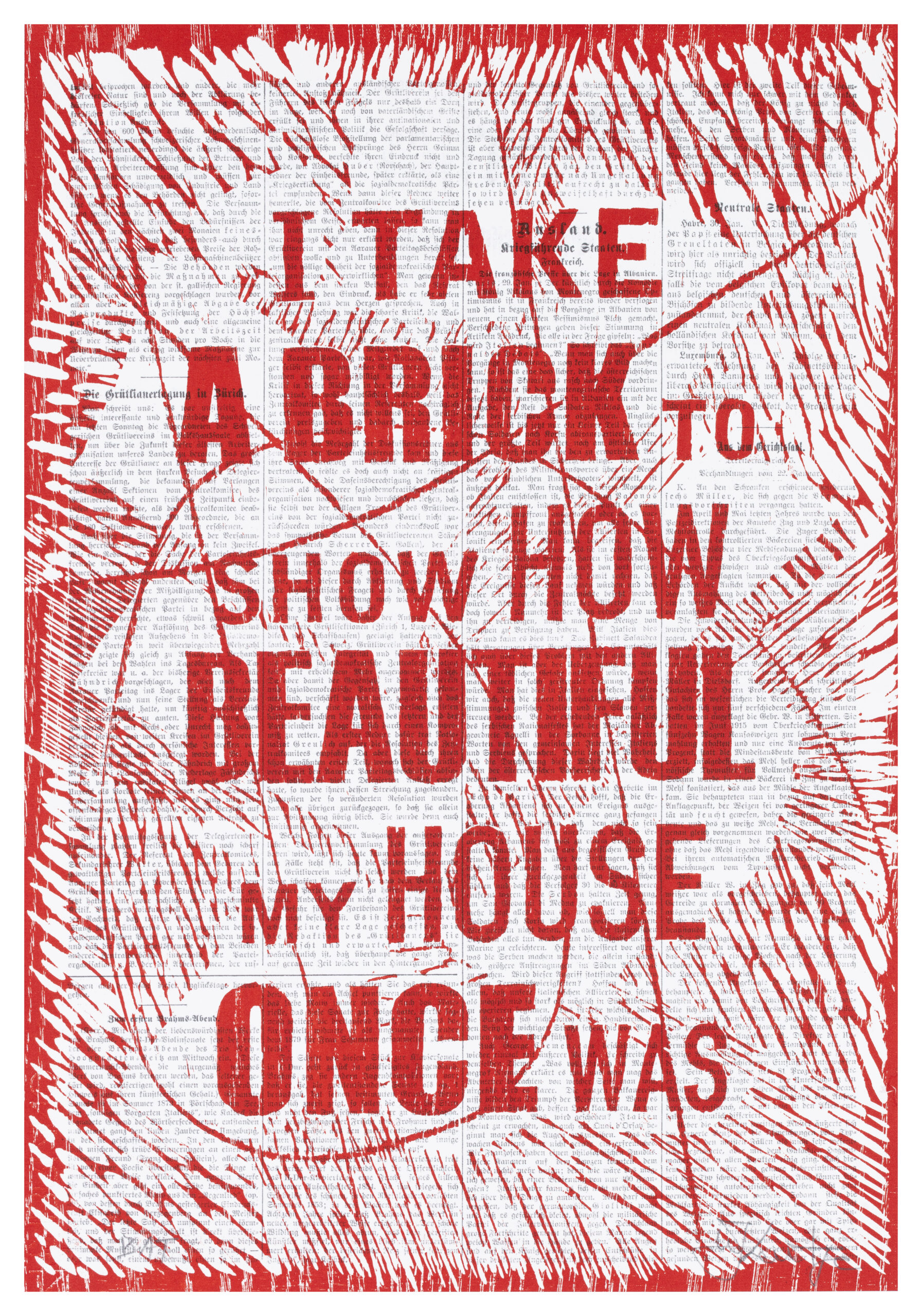
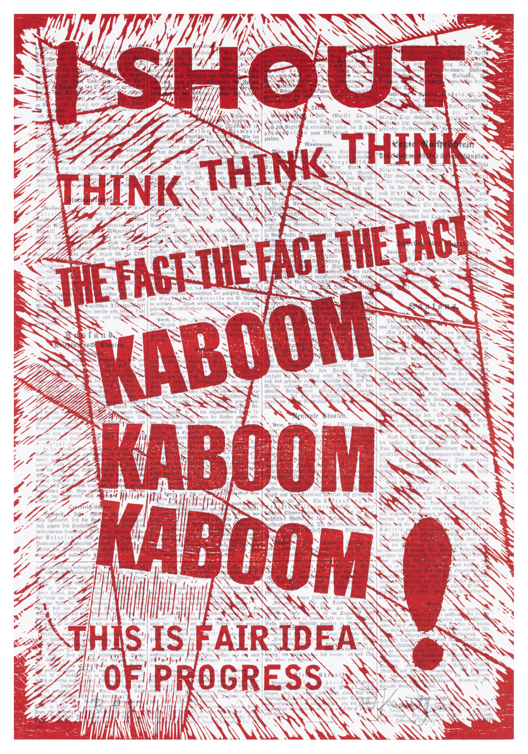
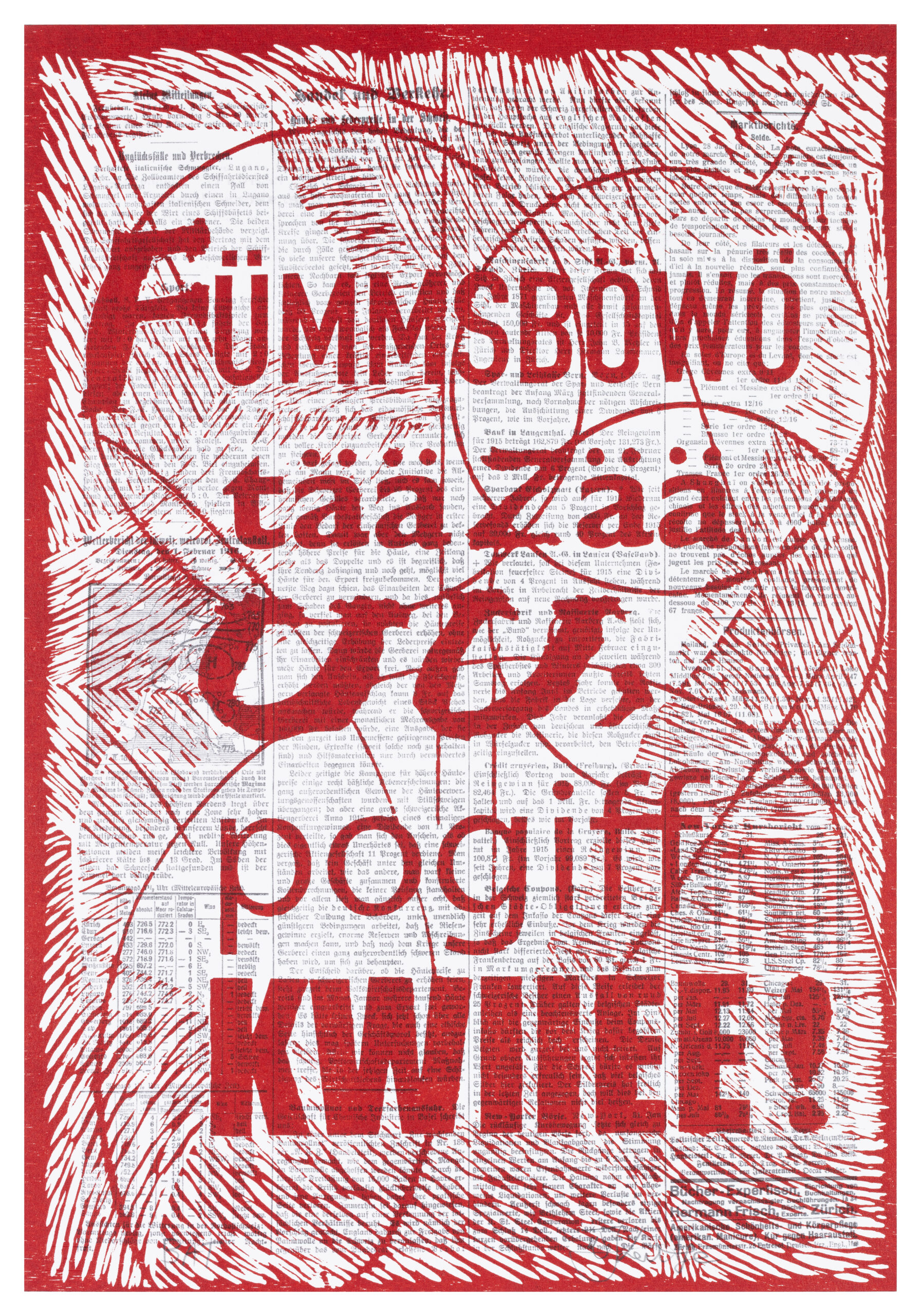
In 2025 William Kentridge began exploring the makings of what would later be referred to as the Headlines series in collaboration with the David Krut Workshop, Lightfarm Studios as well as Neue Zürcher Zeitung. The collaboration was coordinated through an international art organisation based in Hamburg that aims to inspire the public called P-ART.
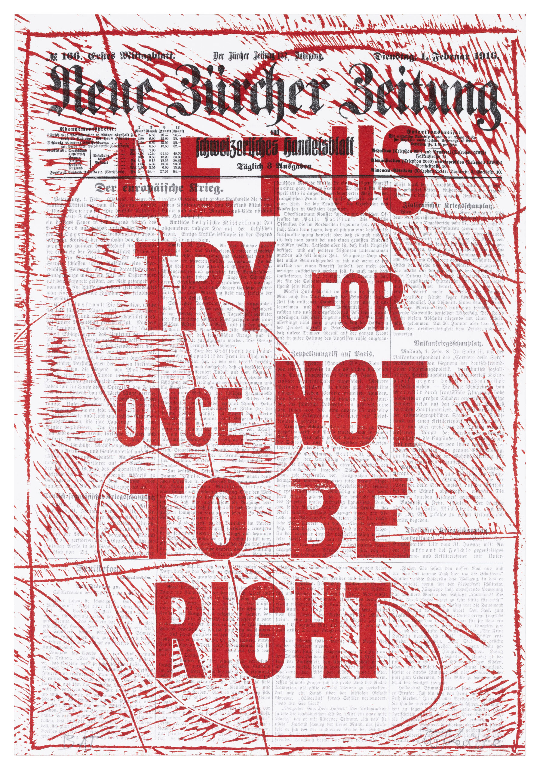
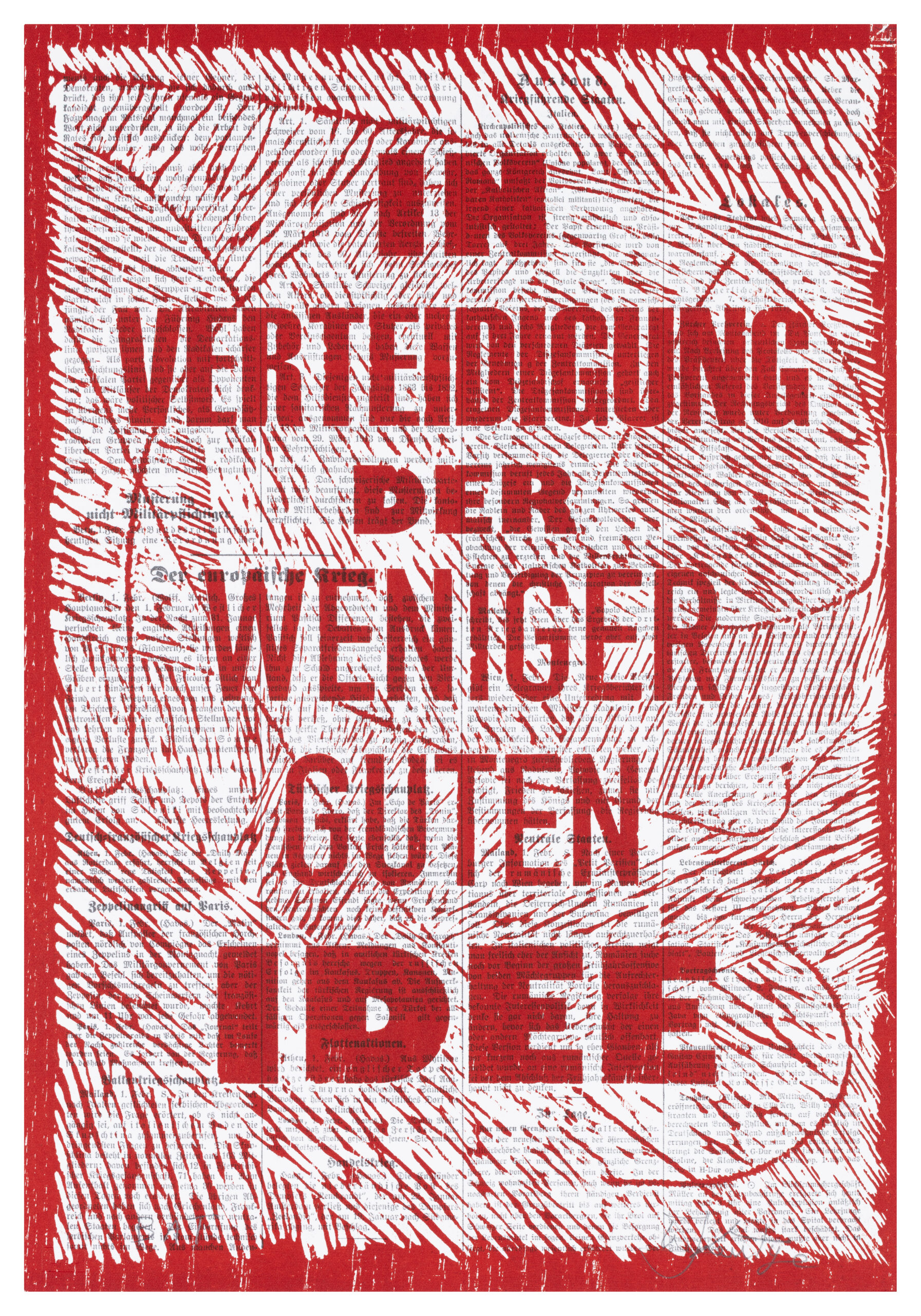
The series consists of 6 text-based woodcuts (Let Us Try For Once Not To Be Right, In Verteidigung der Weniger Guten Idee, Oh Madness and Shamelessness, I take a brick to show how beautiful my house once was, KABOOM KABOOM KABOOM!, Fümmsböwö tää zää) made from white ash and oak wood; all hand carved apart from one block (In Verteidigung der Weniger Guten Idee In) which was laser engraved around the lettering of the text, but hand carved everywhere else as a visual alternative for Kentridge to choose from.
The woodcuts were printed in a red ink mix (Charbonnel Madder Lake, Hanco Fire red, Hanco process Black) which was modified with Handschy, Setswell compound and Renaissance graphite arts, Inc. Litho Varnish No.3.
The base images printed by Lightfarm Studios, serve as backgrounds onto which a woodcut impression was applied. The image consists of Neue Zürcher Zeitung (NZZ) articles published in 1916, sourced from the Swiss National Library. These articles reference the Cabaret Voltaire, recognized as the birthplace of the Dada movement in Zurich, Switzerland. Kentridge reinforces the connection between the Headlines series and the Dada movement through his choice of titles.
Collaborations

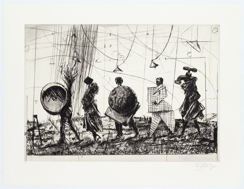

For L'Orfeo
“Greek vessels always form such a large component of our understanding of antiquity and as references for images of Greek myths” - William Kentridge