
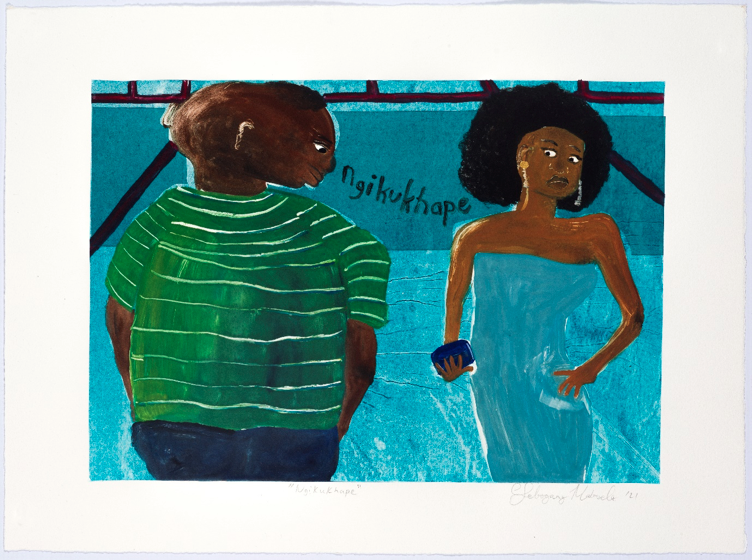
2-layer Oil based monotype, 39.4 x 26.9 cm
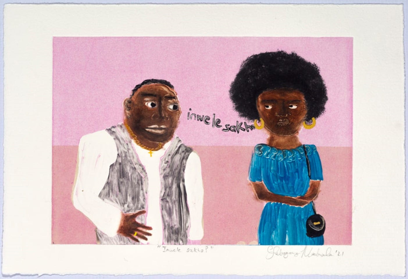
Lebogang Magul Mabusela recently created a series of monotypes as part of a collaborative project with the David Krut Workshop. These works speak to the experience of women out and about on the streets of Johannesburg who face cat-calling and harassment on a daily basis. Lebo takes a humorous approach by depicting these scenes in oil monotypes.
Ushadile? is one of Lebogang Mogul Mabusela’s darker works, both literally and figuratively. Instead of the often lighthearted way in which Lebo depicts everyday scenes of cat-calling and street harassments, Ushadile? depicts the cat-caller himself, thus directing the gaze back onto him, making him the spectacle and not the spectator. The carefully selected combination of colours creates a high-contrast field which gives this work a more grave feel compared to the lighter pinkish tones of the other works in this project.
For more about how Lebogang Mabusela works and what her artworks speak to, continue reading to see how David Krut team member Lukanyo Mbanga experienced the recent demo that Lebo presented:
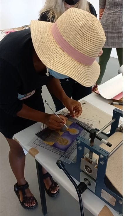
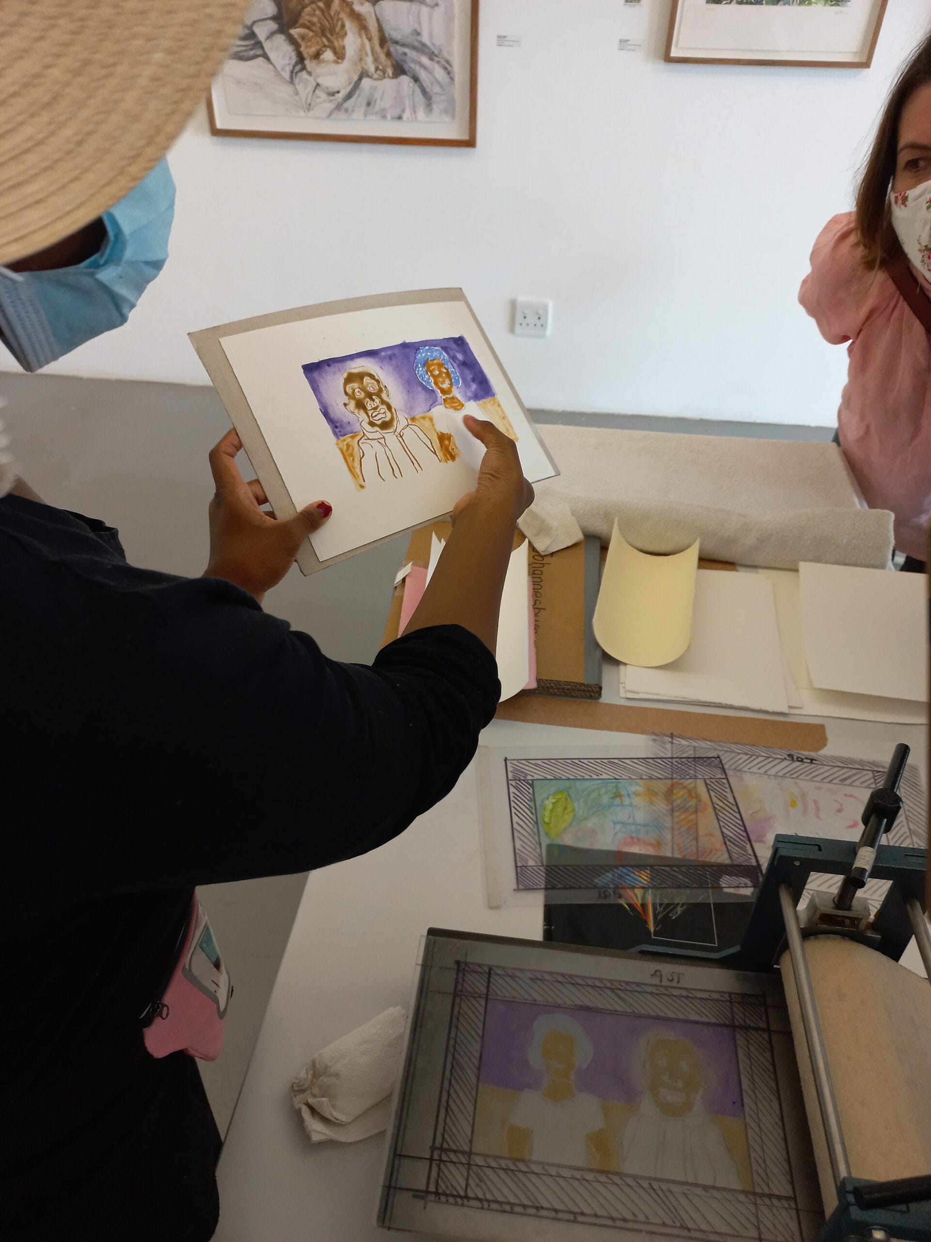
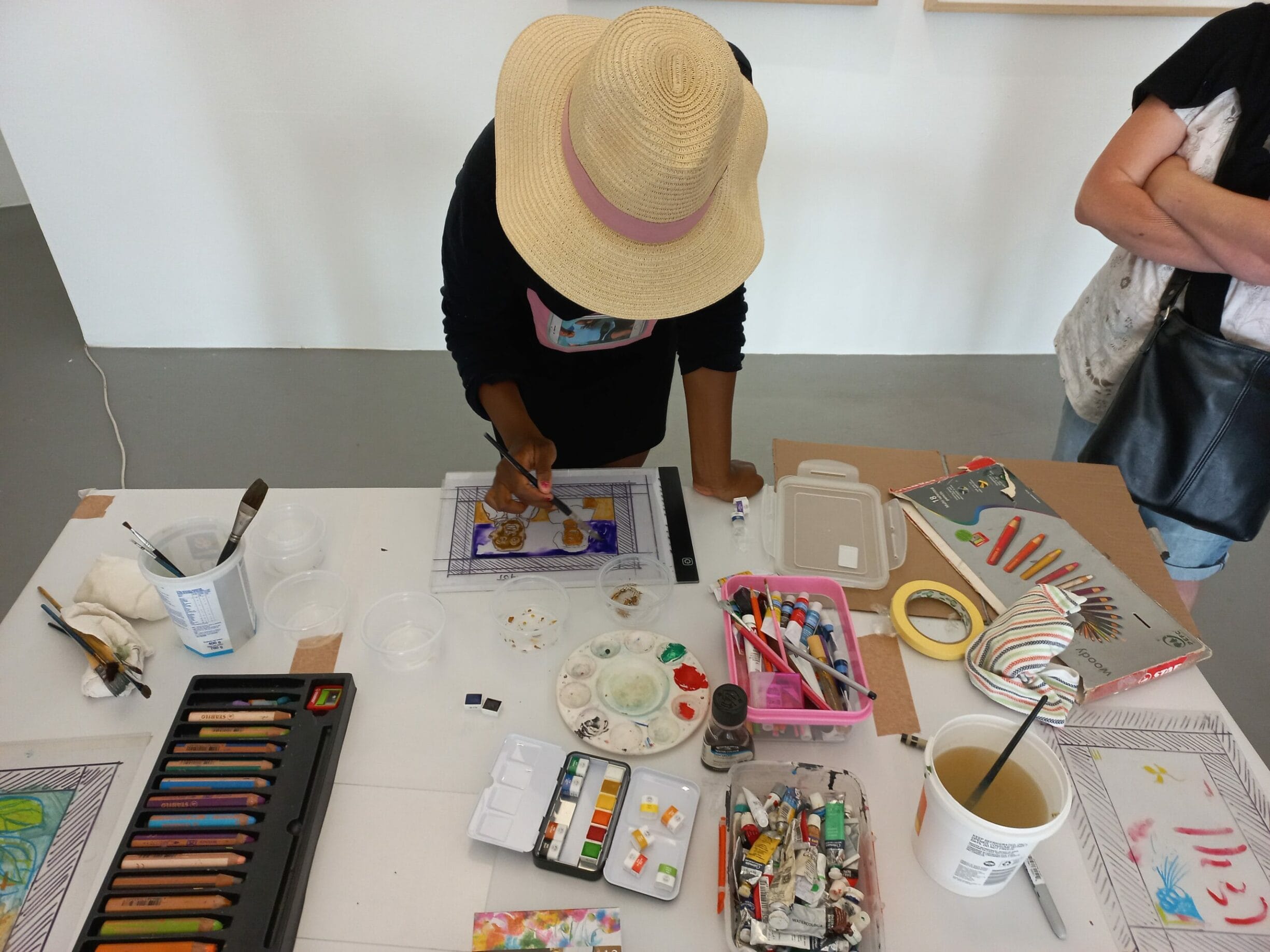
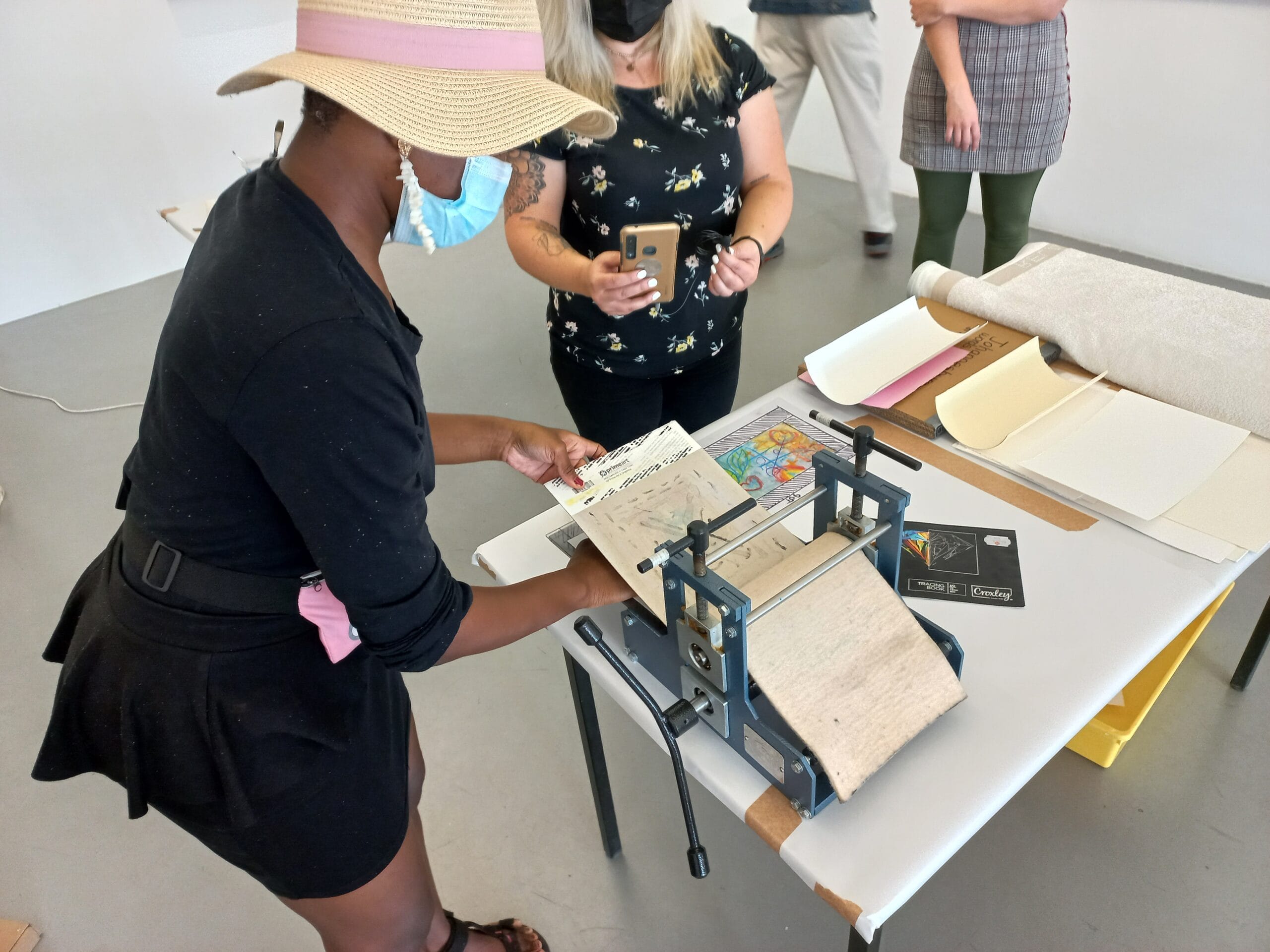
On February 5, 2022 I got the honour of viewing a live demonstration hosted Lebogang Mabusela also known as Monotypebabe at the David Krut Art Gallery. Bright, quirky and intelligent reflects in Lebogang ’s art as much as it does in her personality. Hearing her personal insights, seeing her at physically at work on the plate and learning more about how and why she uses her mediums transcended my respect and admiration for her work.
When Taking a Look…
Amply satirical? Quirky? Maybe even peculiar? Many thoughts come to mind when met with Lebogang Mabusela unique prints. One that can’t escape is: Memorable. In a small frame she gives a simple but gripping narrative that perfectly portray social tropes of the vibrant city we know as Johannesburg.
Feminism and Capturing the City
From the CBD to her studio at the Bag Factory, Lebogang’s monotypes series are drawn from her experience of walking in the city and “having men catcall you at every corner or sometimes even try grab you.” As a woman who get’s around by foot and with taxis this couldn’t be more relatable. Or more infuriating. But in place of fury, there’s a sense of graciousness with how Lebogang tackles the issue of female objectification:
”We all don’t experience spaces in the same way because of gender, race and class and hearing people’s visitations of Joburg often involve beautiful architectures, nice spots to hangout and observing people in the city and within that discourse and archive of Johannesburg artworks, I wanted to add a contradictory view of what Johannesburg is like from my experience as a young black feminist.”
Caution Behind the Comical
I was captivated to learn the intent behind her cartoonish portrayals of a larger and more serious issue. When asking her, she replied that, “we grow up in society that laughs at what people do without thinking that it could be painful to someone else.’’
But instead of using humor to dismiss the issue, she uses it to call attention to how these harmful behavioral patterns are so prevalent in our everyday lives that they’ve even been normalized. The comicalness allows her to portray the woman’s discomfort in their facial expression and also the men’s grotesqueness in their subtle but inflammatory captions.
What I love about her work is that it’s cultural but not divisive. The daily happening of walking the streets and knowing that you’re no longer just woman but a visual feasts waiting to be preyed on, is something many if not all women in South Africa can relate with. Yet these comical representations lessen the heavy weight that conversations like these often carry. Warmed by the quirk and satire, we feel freer to converse. I remember visiting the opening of the Alone of it’s Kind exhibition, where these works were featured and a man came up to me and asked, “Well, then how are we supposed to approach a woman we find attractive?” Shocked but also grateful that he was brave enough to show how clueless he is— it showed me how these conversations can be opened. Lebogang doesn’t address issues by pointing fingers but by simply observing how harmful behaviors have become normalized.
So, Why Watercolours?
Being a predominantly independent artist, Lebogang does most of her prints in a home-based studio. With watercolours being essentially non-toxic, their a cleaner medium for both the environment and her living space i.e.- inhaling toxic fumes and cleaning up her workstation. Among many reasons why mediums and materials could be used, Lebogang’s often boils down to accessibility. From wiping the ink-absorbent gum onto the plate with a dishcloth to using a feasible acetate plate instead of the pricier perspex sheets, I realized that an artist when driven by a need to just create, doesn’t need all the whistles and bells— they just need what they have and what they can get. It’s a pretty motivating outlook: not being hindered by limitations.
Whether it was the fluid and gentle appeal of seeing the watercolours in their pallets, watching her pull out a checkered dishcloth or just Lebogang’s warm nature as a whole— There was a feeling of hominess when watching her prepare the plate. For someone whose normally intimidated by the processes of printmaking, the feeling was awesome.
Does Size Really Matter?
As much as we appreciate scanning our eyes widely across a work of art, there’s something that draws you to Lebogang’s small-scale prints. We focus more on what makes up the art: the techniques, mediums and the story told. Using a press that can only print on paper smaller than A4, again, she decides to view it as a challenge rather than a limitation. As a result she’s created a body of work that’s accessible and engaging for the viewer.
More Behind the Captions
Stemming from the Johannesburg Word Series, Lebogang’s monotypes are classically known for their cheeky one-liners. The subtext, the spontaneity, the fact that three in five woman have heard at least one of those statements makes this my favourite feature. It’s connects us, makes people ask questions like, ‘hey, what does this mean?’ or bond with, ‘ omg, this literally happened to me on my way here.’ I was fascinated to learn that her main source of inspiration was Robert Hodgins because of the way he is able to depict human beings, “simple and phenomenal with so much movement.” One that particularly struck out to her was a work
done in the 90s depicting a bustling crowd waiting for transport and above them are cluster of words likely to be spoken in any South African city context.
Fun fact! Lebogang would have to write backwards on her perspex sheet so the words appear the right way on the sheet.
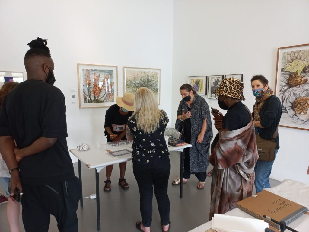
Still a novice to the world of printmaking, I’ve always been somewhat tentative to give my two cents in an artist-space. It sounds weird to say but it’s wonderful to see how human the whole experience is. Or at least how Lebogang makes it seem. We learn that where there’s precision and expectation there are also ‘happy accidents’ that we come to love in the end. We also learn that where there’s an artist or printmaker so smooth and comfortable with their methods, there was also years of figuring things along the way and drawing from other artists. It was very much a demo to help us understand the artist’s techniques and processes— but it turned out to be so much more. I’m just grateful that I got to experience it.