12.07.16
Blogger: Jessie Cohen
Finally, we have the pleasure of hosting visual artist Jacob van Schalkwyk in our workshop. The collaboration has been five years in the making and for the last year van Schalkwyk and DKW master printer, Jill Ross, have had a lively “colour correspondence,” throwing out ideas for possible colour combinations to use when the collaboration would come to fruition.
Why is colour key to van Schalkwyk’s practice and how does he approach it?
“Because colour is infinite in its complexity, I need some rules to apply”, he says. Van Schalkwyk uses Josef Albers’ colour system Interaction of Colour (1963) to arrive at colour combinations to use before he starts drawing.
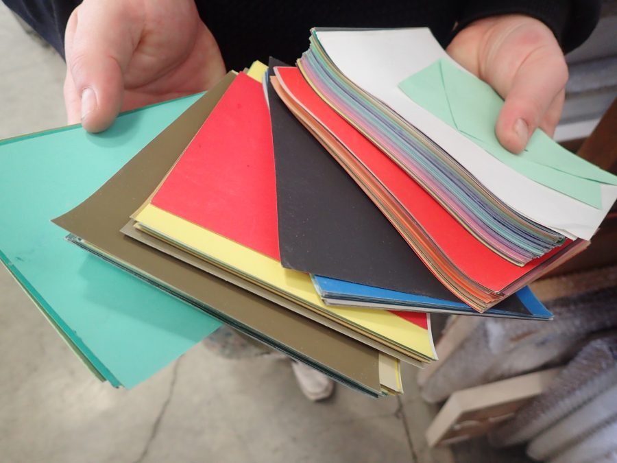
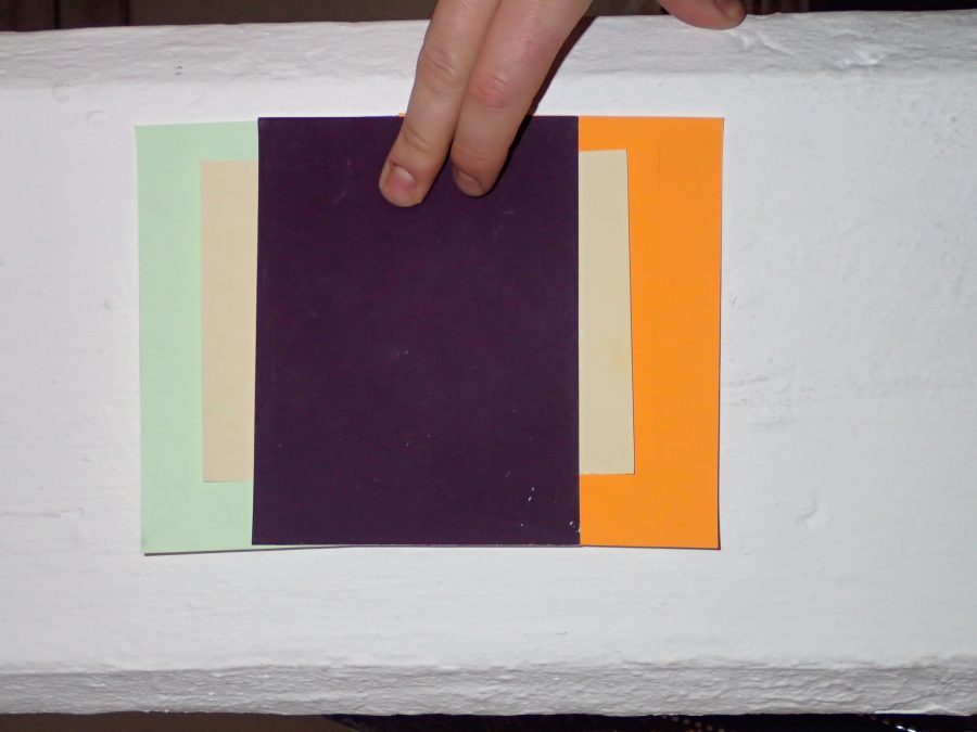
Eventually, van Schalkwyk decided to use a combination of dark grey, red violet, pastel yellow, yellow-orange and tinted green in his experimental prints at DKW. He will also be mixing the colours together “so that they can vibrate on a molecular level”, he says.
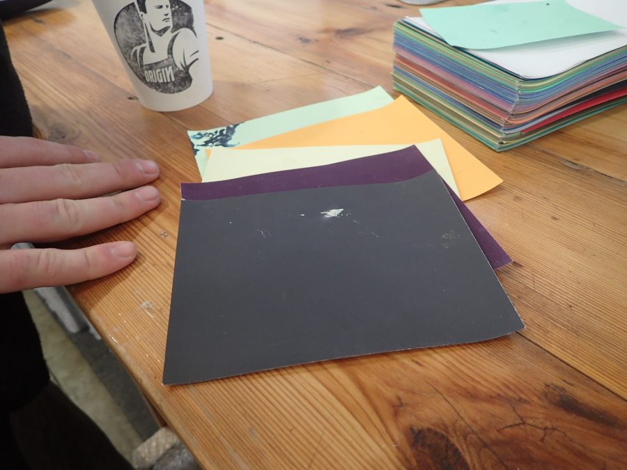
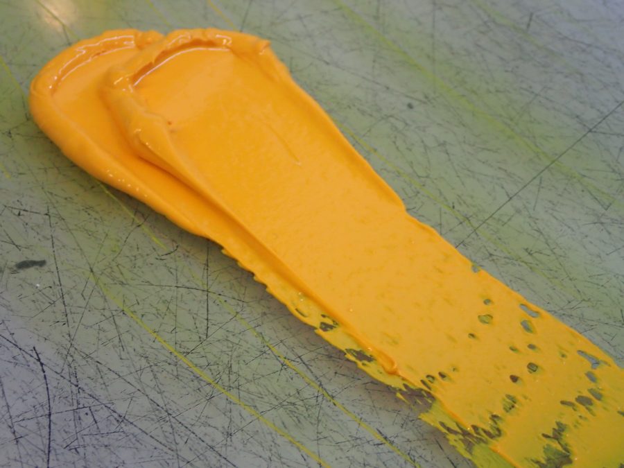
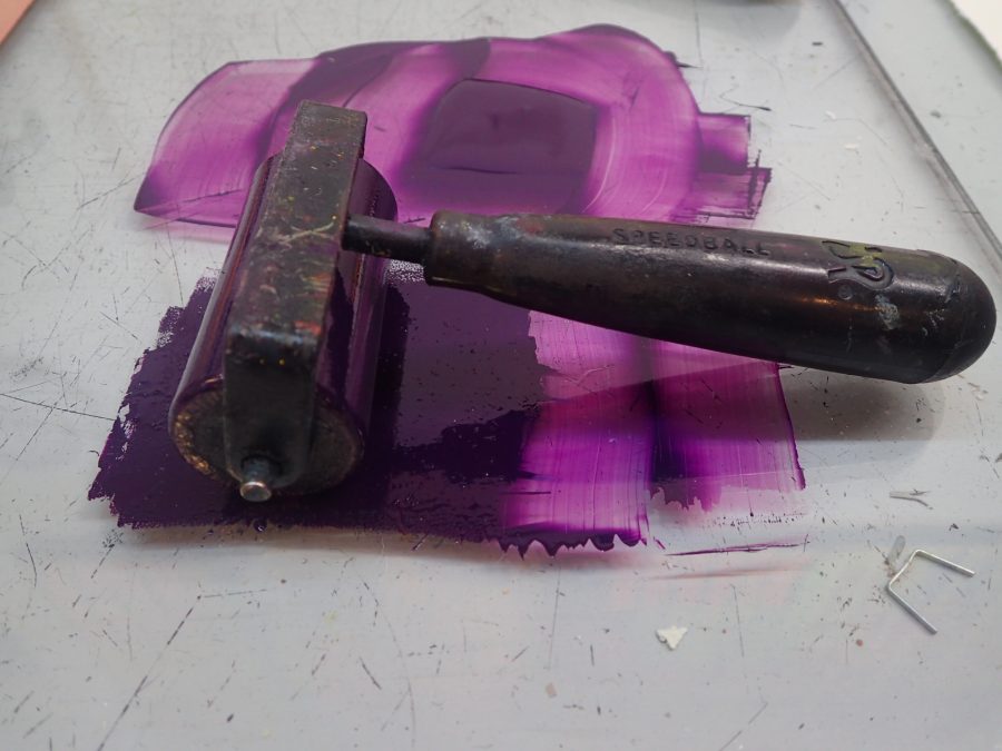
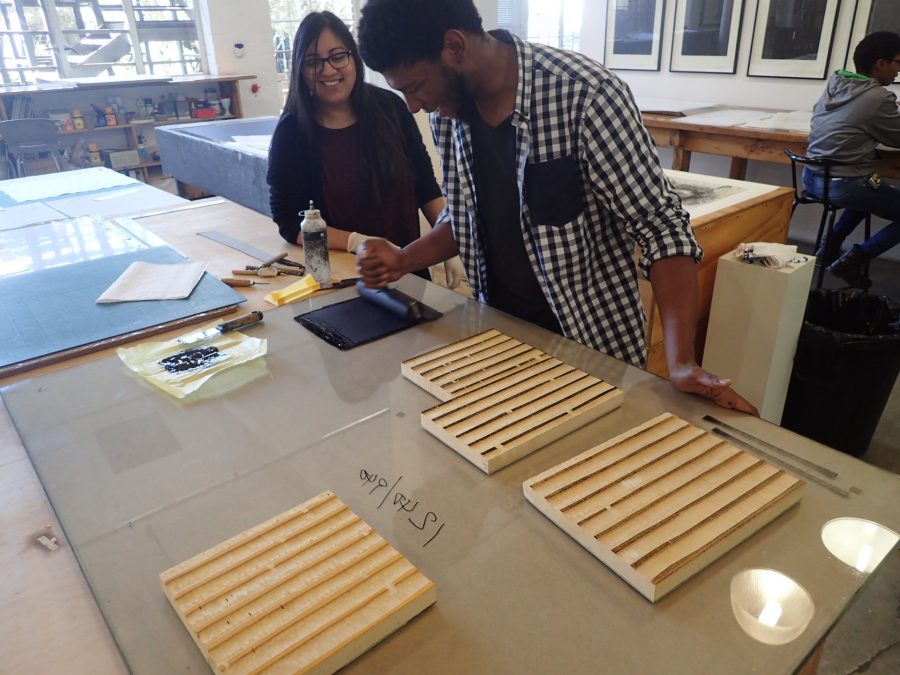
DKW printer Kim-Lee Loggenberg mixes the inks according to the bold range selected:
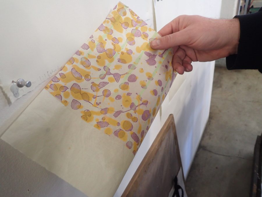
In his Cape Town studio, van Schalkwyk works with antique rice paper and lithographic ink, which he mixes with various mediums to achieve different thicknesses, textures and drying methods. An example of his recent work can be seen below:
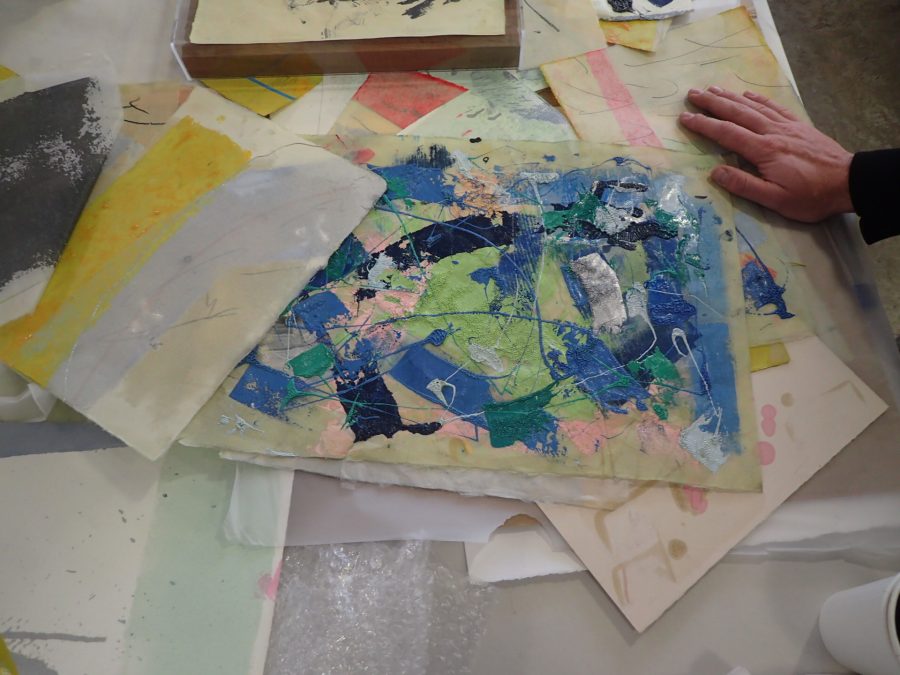
As can be seen in the image above, van Schalkwyk conducted various experiments according to pre-Renaissance painting techniques. This meant experimenting with mediums and varnishes – a process he enjoys because “it refreshes my interaction with the ink itself.”
Van Schalkwyk characterises his process as an “additive, building method until the image becomes saturated and can’t go any further. Then I glaze it in multiple layers, much like Rembrandt or Titian did with their paintings, to generate light.” He describes this as “walking a tightrope – once you lose the paper [gives in from the weight of the drawing materials], you fall. It’s a journey into the unknown.”
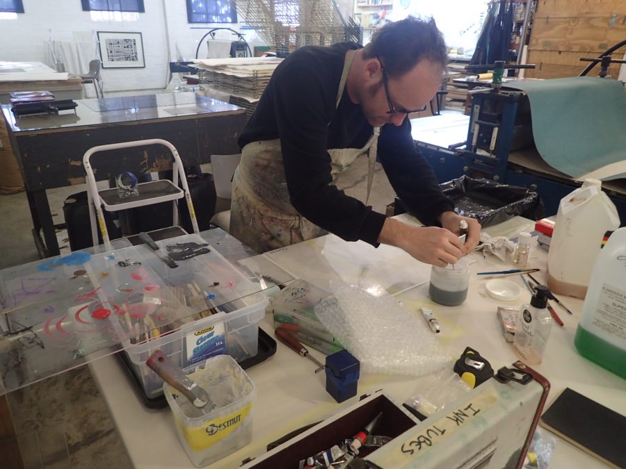
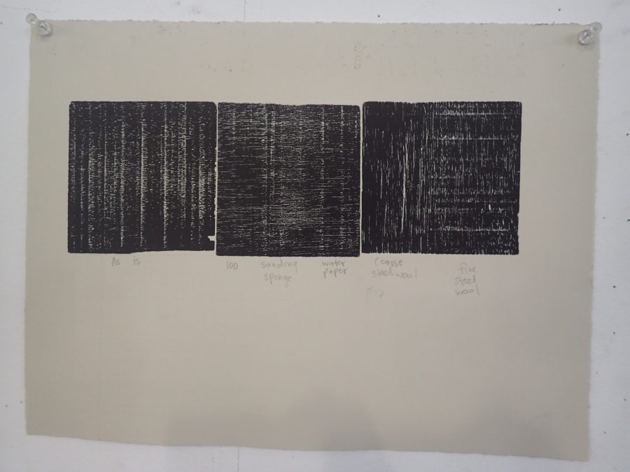
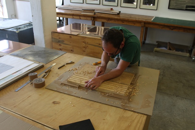
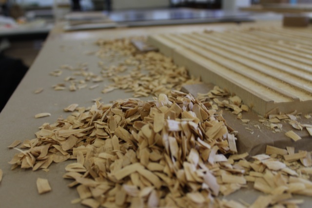
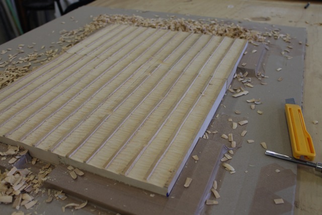
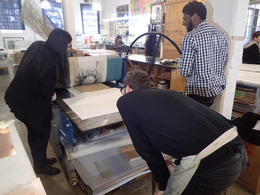
At DKW, van Schalkwyk is working in various mediums, which he will combine in layers. He is experimenting with much of the range that we offer, including sugarlift, aquatint, linocut and woodcut.
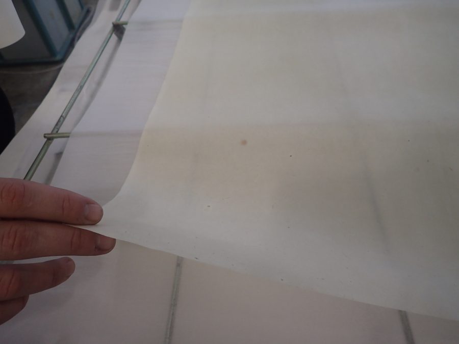
After colour, van Schalkwyk is most excited to be working with paper. He is honoured to be working with rice paper that Alice Goldin, the pioneer in SA printmaking who died earlier this year, left in the workshop some years ago. He is bringing his drawing methodology into the workshop by saturating the paper with marks as well as different printing techniques, but taking great care not to damage the paper in the process:
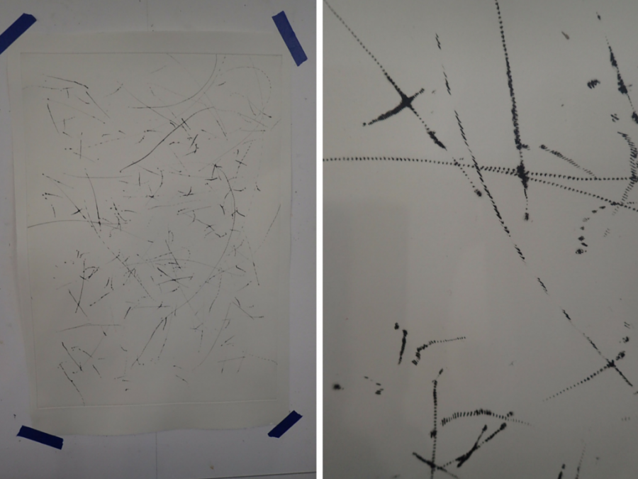
One of the reasons van Schalkwyk enjoys working in layers is to make his process visible to the viewer:
“It is important to my practice that people can see the development of the work. It’s like sharing a joy of discovery”, van Schalkwyk says as he shows us some of the early results of his prints where mark-making is key:
The philosophy of the avant-garde art movement, COBRA, has influenced van Schalkwyk when it comes to trying different methodologies for mark-making. For the artist, the movement legitimates “the investigation process of how things come into being” and getting to grips with “the essential building blocks”. As a result, he explains that “the species of art that interests me here is not working in figurative/known forms. I want to speak about abstract forms”.
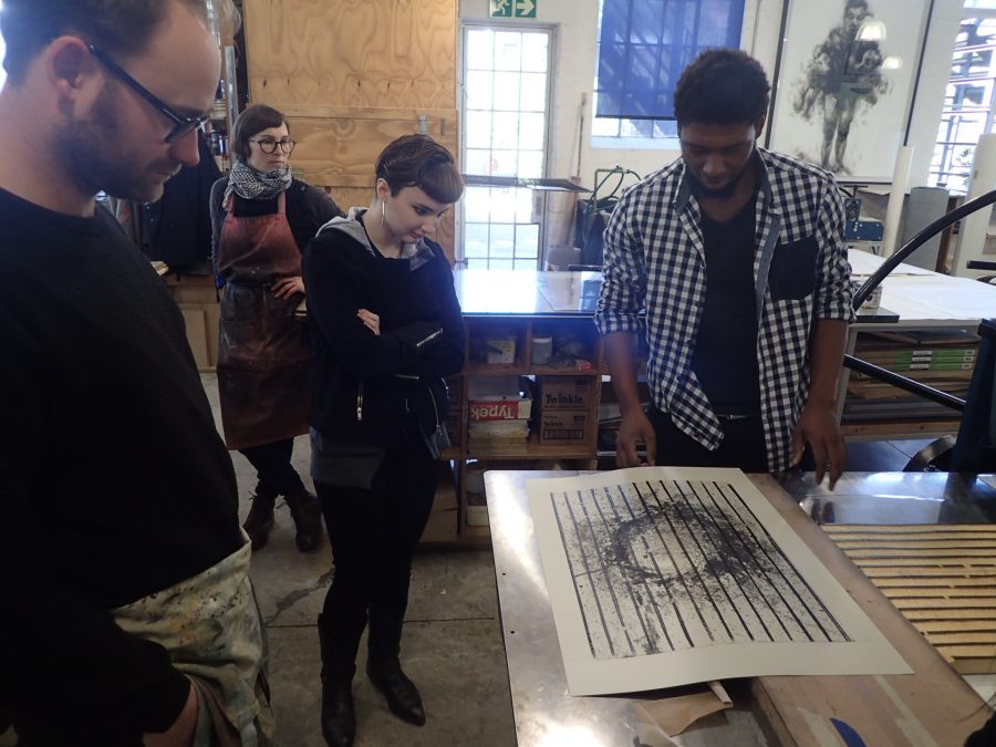
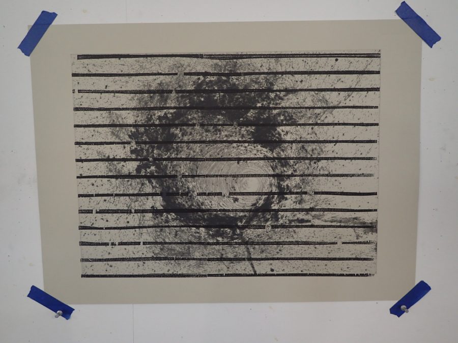
Van Schalkwyk’s printing experiments REVEALED..
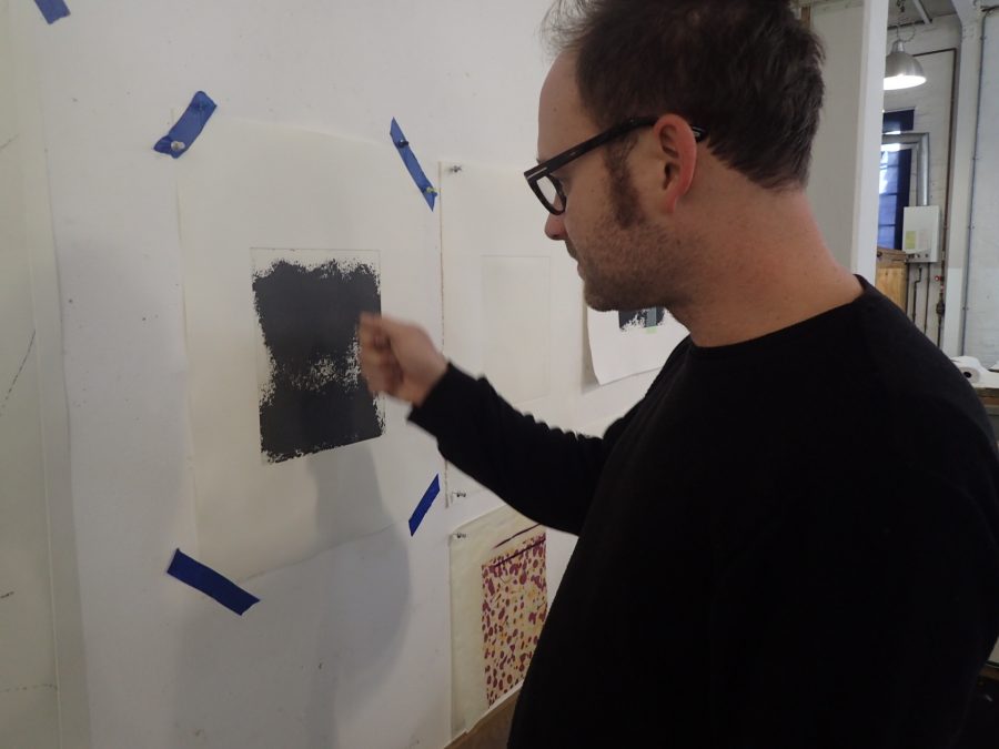
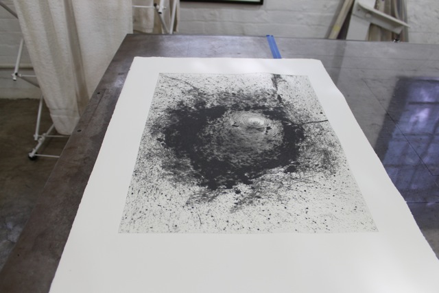
First, the artist points to one of of his prints in the early part of the layering process, referring to it as “a single gestural event”:
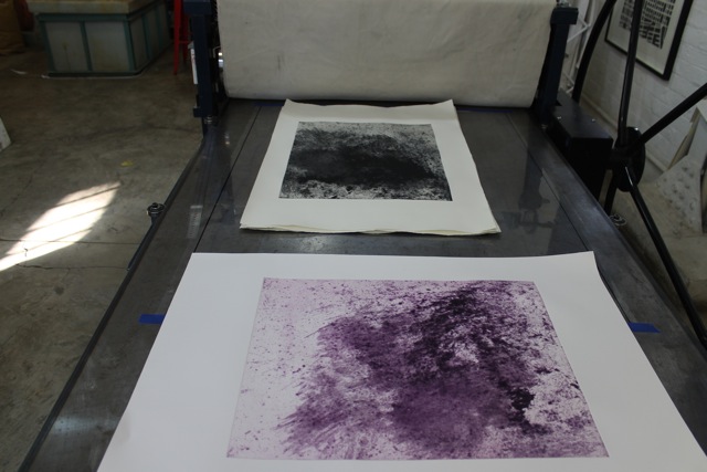
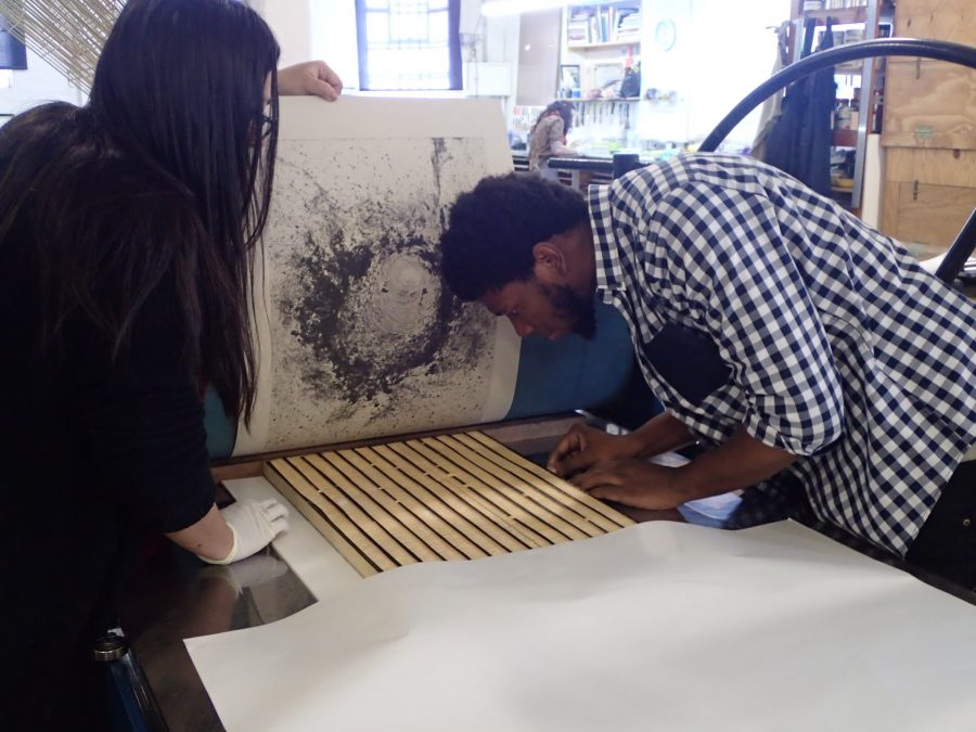
A thin layer of linocut was then applied to start building the process of saturation in terms of marks and layering of mediums:
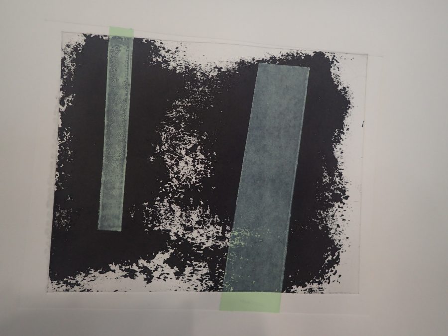
DKW also printed the work in violet:
For Van Schalkwyk, art must be practice-driven:”My work is led by experimentation … it would be incapacitating to lead with thinking. The answers come from doing.”
And there’s certainly no shortage of doing at DKW with Van Schalkwyk around…