It’s another scorching day at AOM and printer Kim-Lee Loggenberg is in the workshop bright and early, ready to roll.
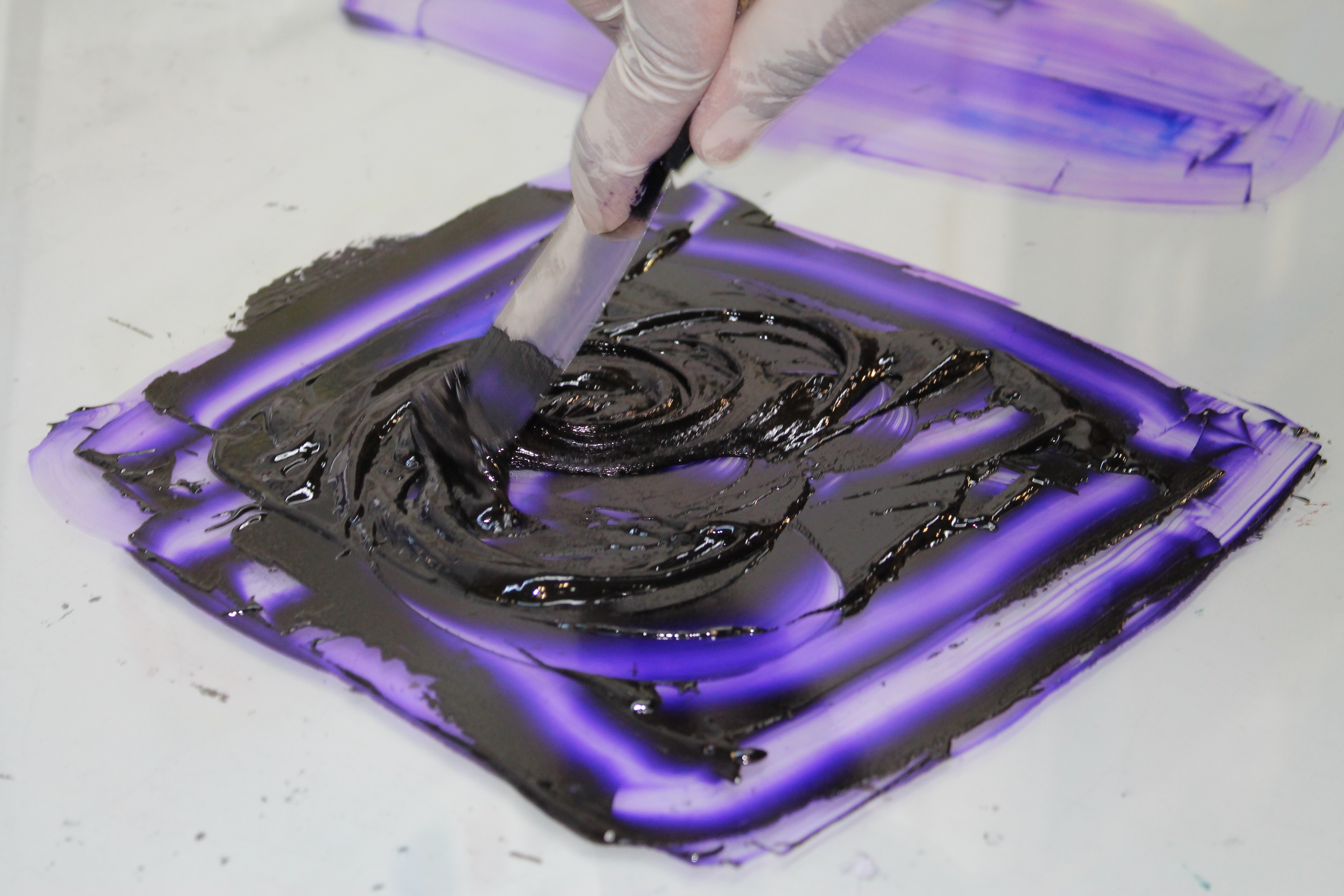
This week Kim-Lee is editioning Mischa Fritsch’s “Pointless”. As with printmaking in general, the process is very specific and demanding of a well-trained eye. She begins by preparing the ink, checking for hard, dried pieces to remove from the mix.

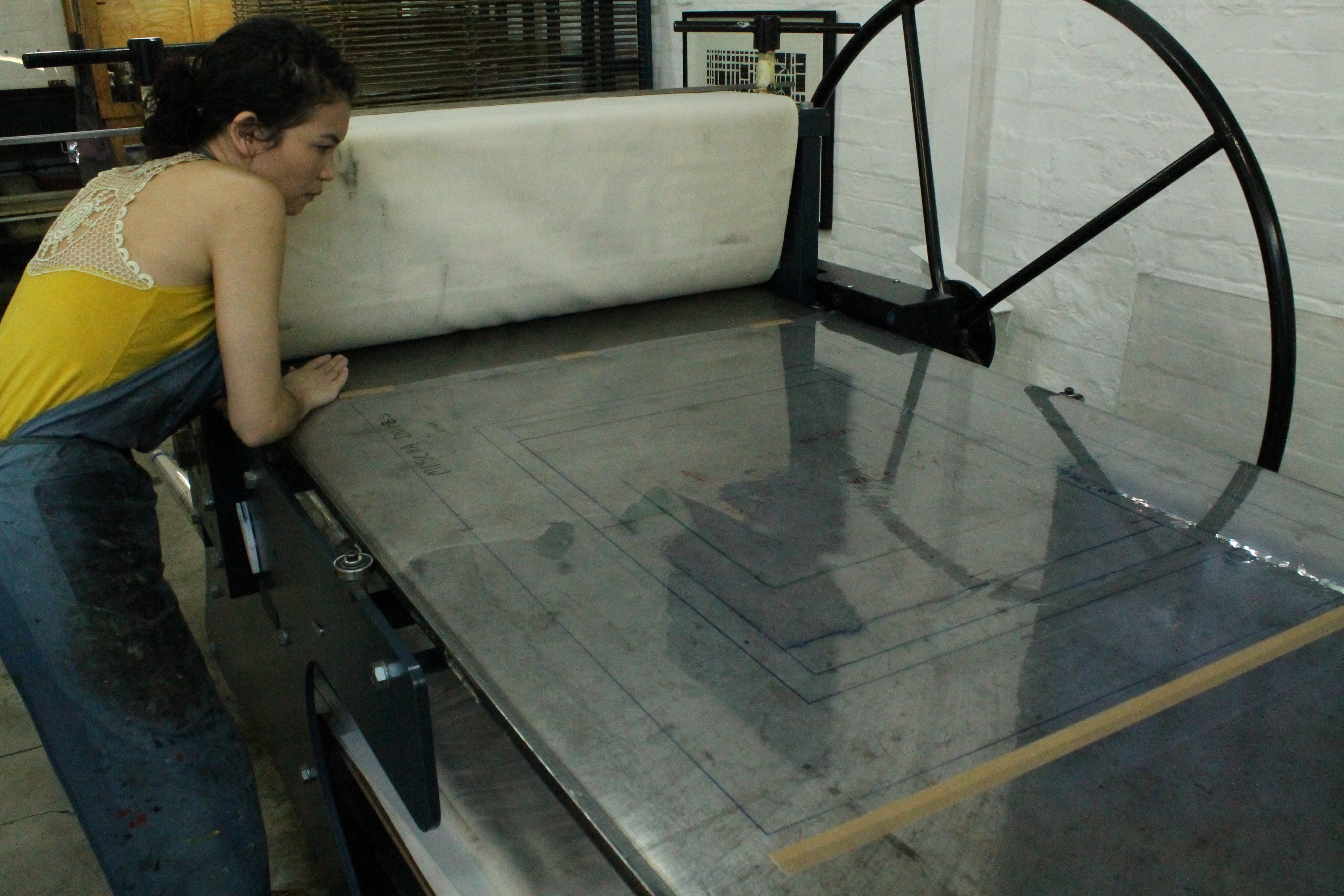
After that, Kim-Lee “registers” the plate. This requires high precision, as she marks out a number of barely visible lines on both the plate and the acetate (which is taped to the base of the printing press) so that each edition will be printed in exactly the same position and with the same margins.
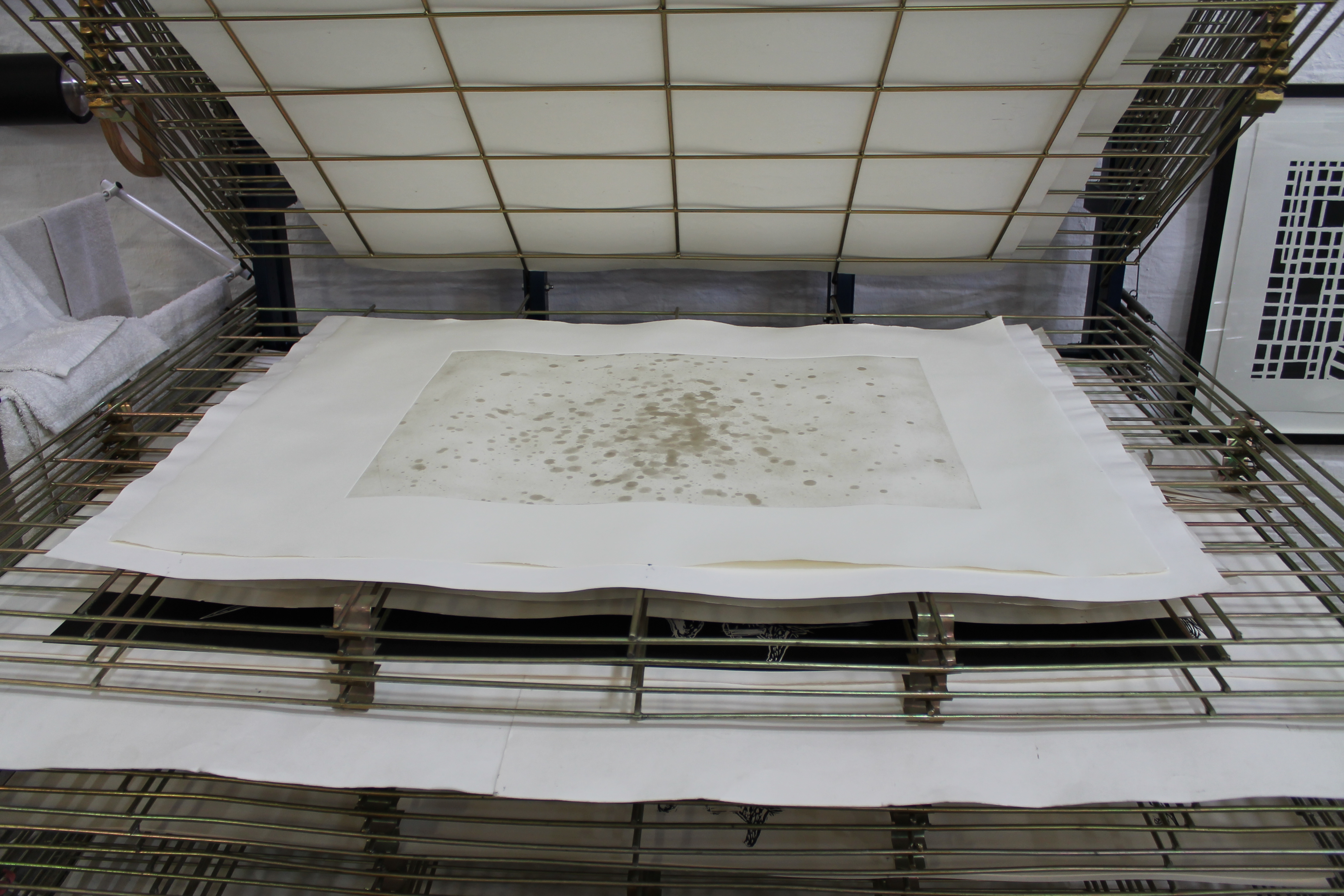
“What’s more”, Kim-Lee says, “is that with ‘Pointless’, the print is made with two layers – first gold, which takes about a week to dry, then black.” Today she is doing the black layer.
“And then there’s the paper”, she adds: “the more water the paper absorbs, the more it stretches. I time this part at exactly ten minutes because, in this profession, a millimetre matters. The paper must stretch to the same capacity for every edition so that no mark is inaccurately registered.”
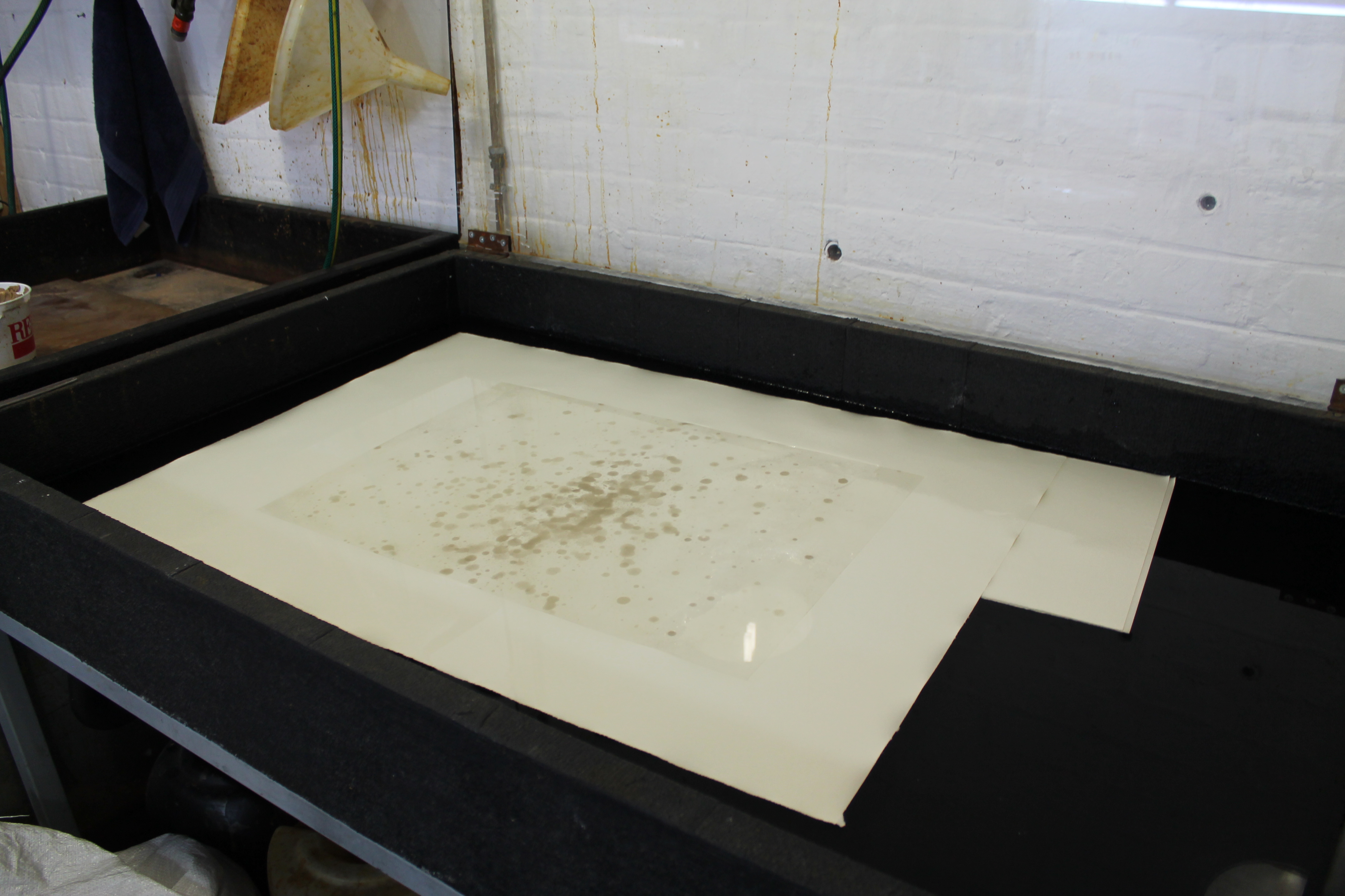
Kim-Lee also explains that the black layer is put on top of the gold layer, as opposed to the other way round, so as to “mute the shine of the gold dust which sits on the surface of the page once it dries”.
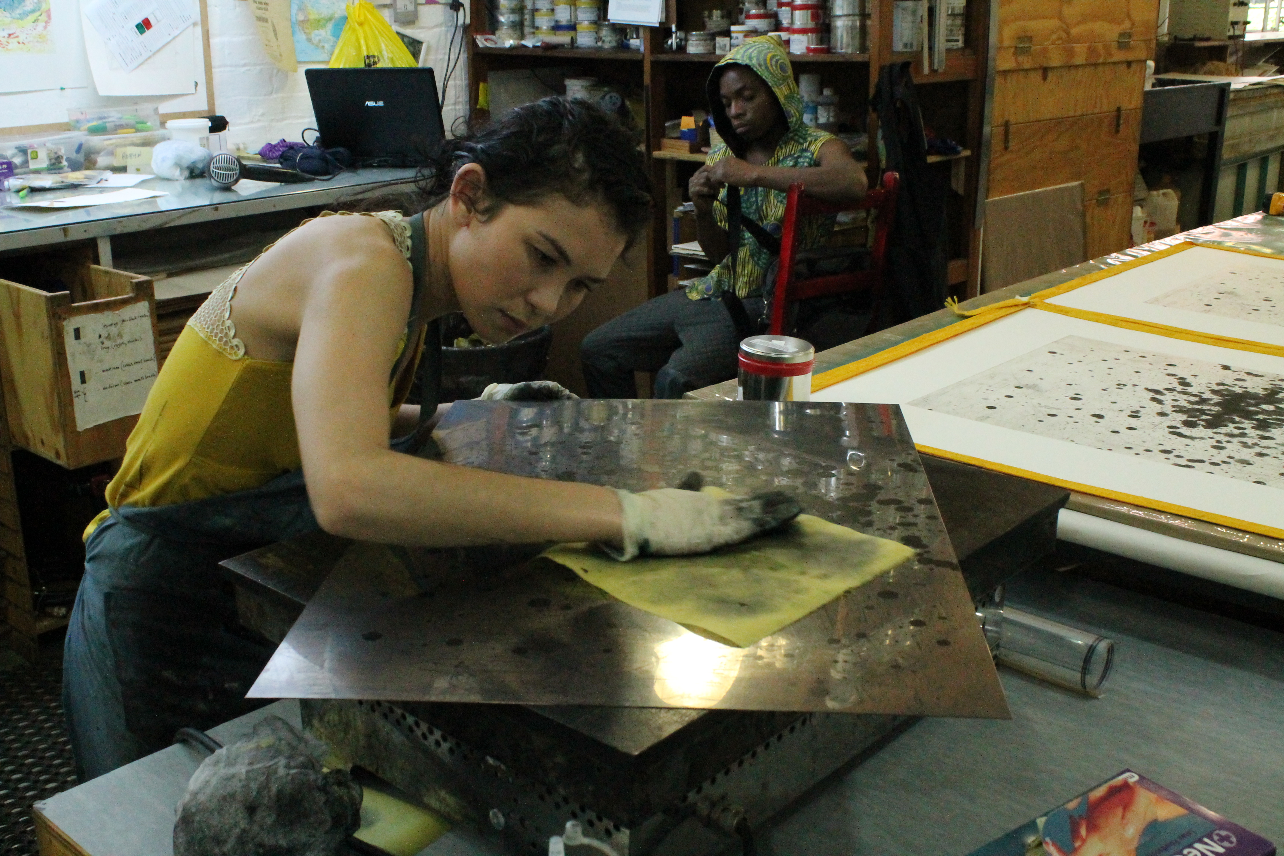
Between making each edition, Kim-Lee wipes the copper plate completely clean to remove excess residue so the next print is crisp. The point is to ensure the visibility of the very detailed lines etched into the plate.
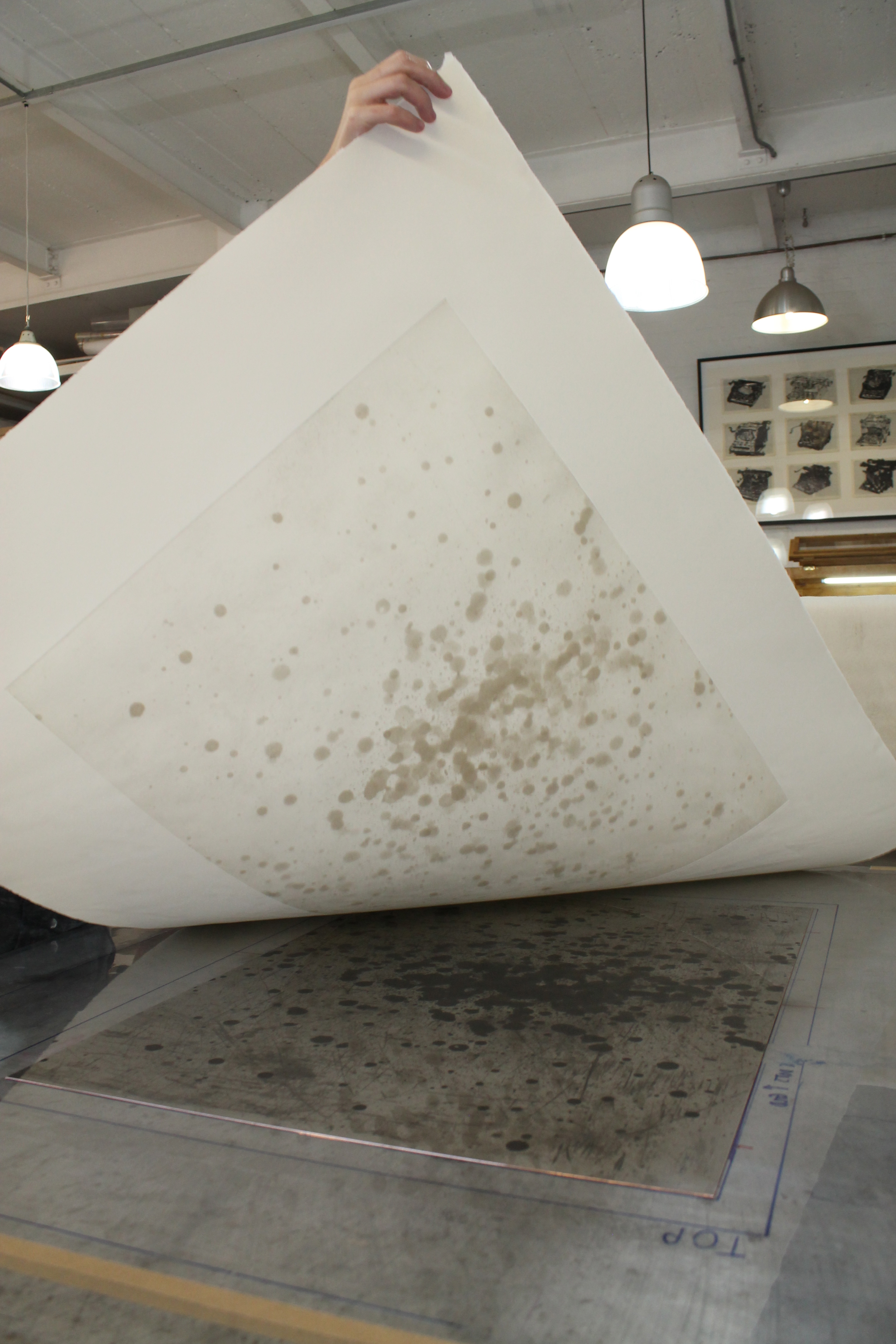
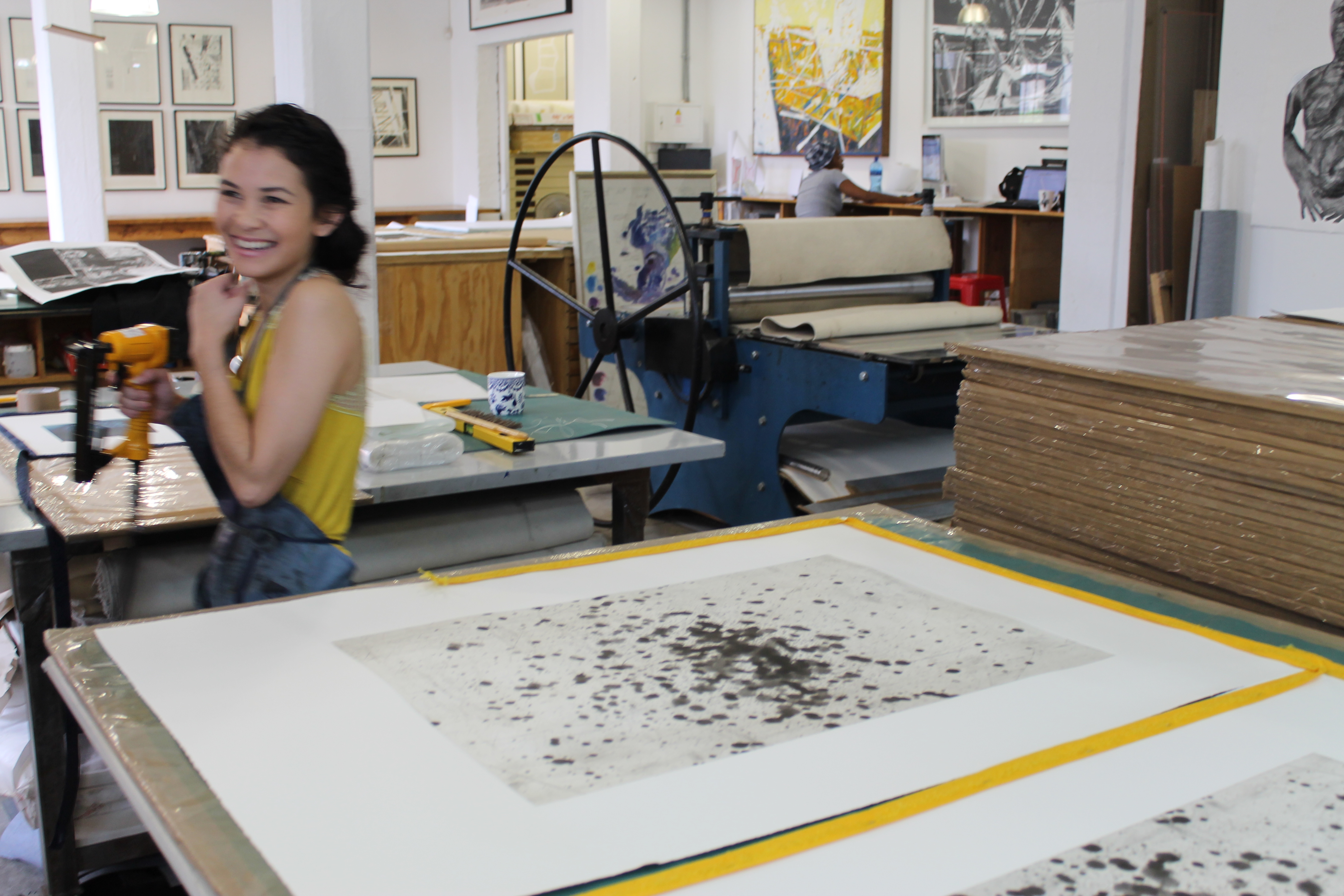
Working diligently beside Kim-Lee is Neo Mahlasela who is doing the final editions for Robyn Penn’s “Nine Views of a Cloud”. He shows me that, much like with “Pointless”, he is working with two plates to make a single print. He is carefully applying the ink and wiping it away in specific areas for a hazy precipitation effect.
For the top part of one of the plates, Neo makes sure that there is no ink added whatsoever by placing a precisely cut out paper shape on top of the area before applying the ink – “I call it the cloud hat”, he chuckles.
Notably, where the process for “Pointless” and “Nine Views of a Cloud” differs is in the methods used for layering the plates. With the former, Kim-Lee is hyper-exact so as to give the impression that a single plate has been used. With the latter, Neo is printing slightly off-kilter so the cloud looks like it has shifted.
So, what makes a good printer great?
I put it to Kim-Lee that any printer worth her salt has to be a perfectionist. Her reply was, “yes, 99% of the time you’ll find that to be the case.” She added that “printers tend to have very strict personalities – the kind of people who wear a simple, staple outfit every week” – presumably one that is perfectly aligned, cropped and flattened.
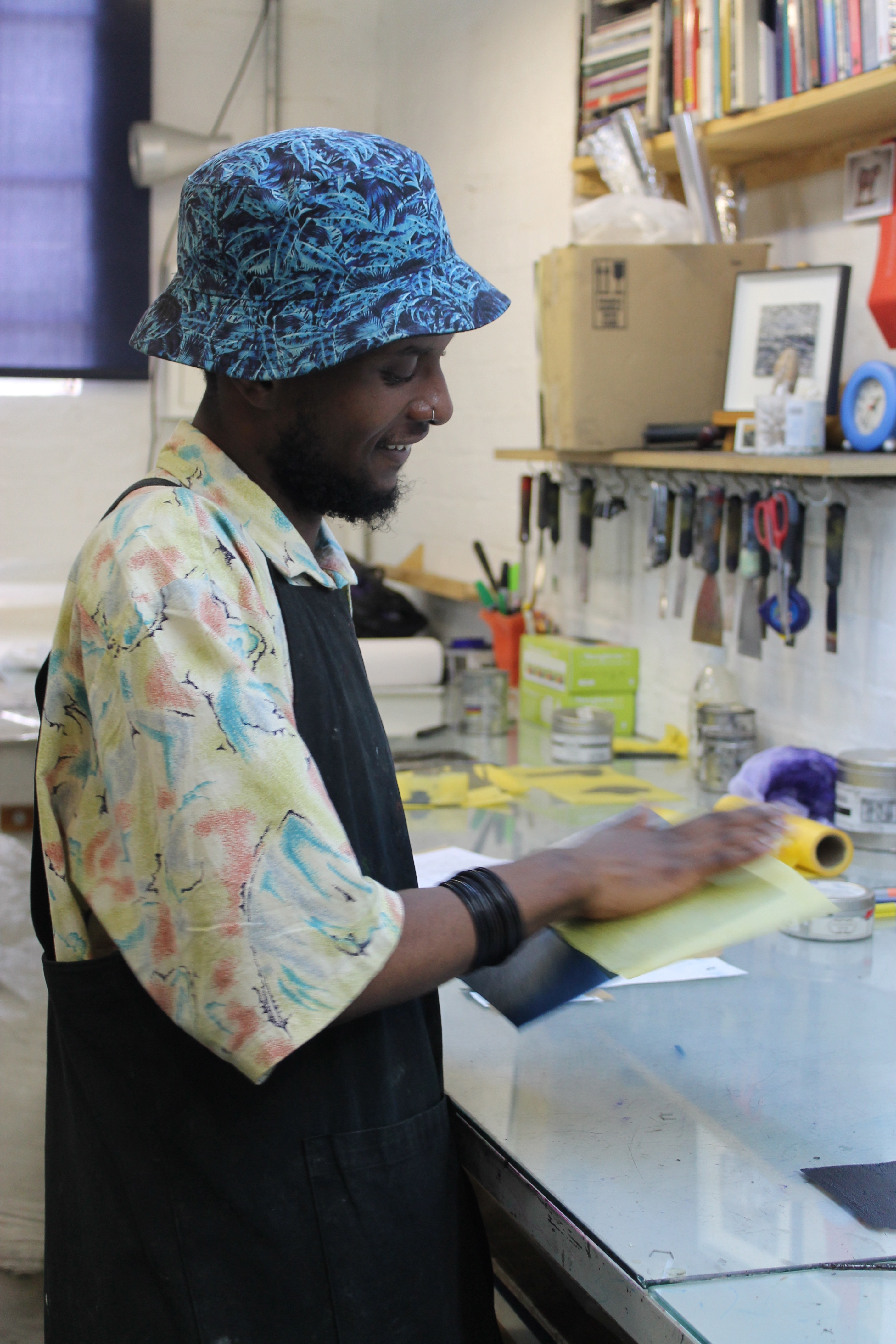
Fellow printer, Sbongiseni Khulu chimed in: “You don’t have to be a perfectionist per se”, he said, “but you need a strong eye for detail. If you’re a perfectionist you’ll never finish a project”.
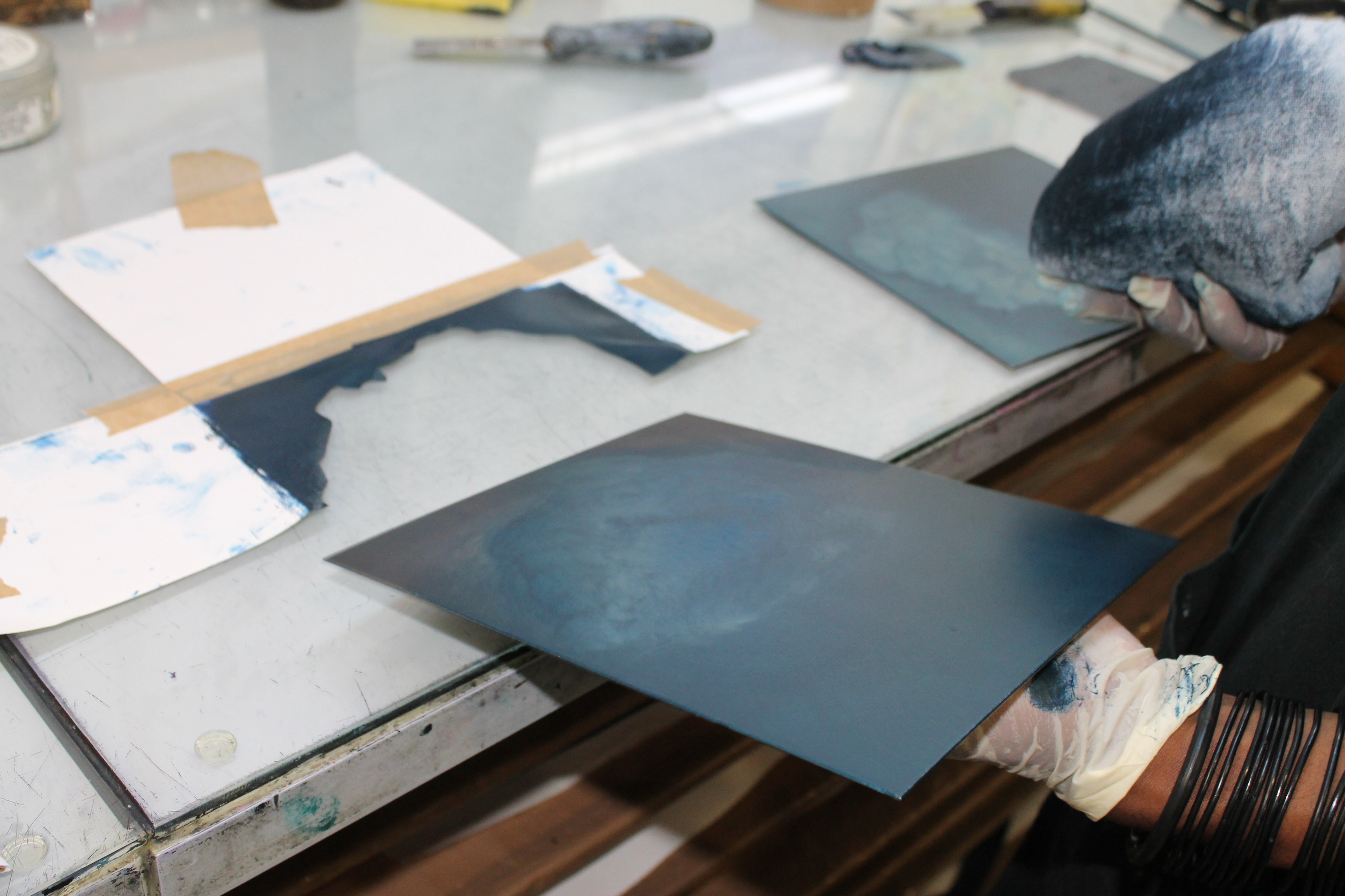
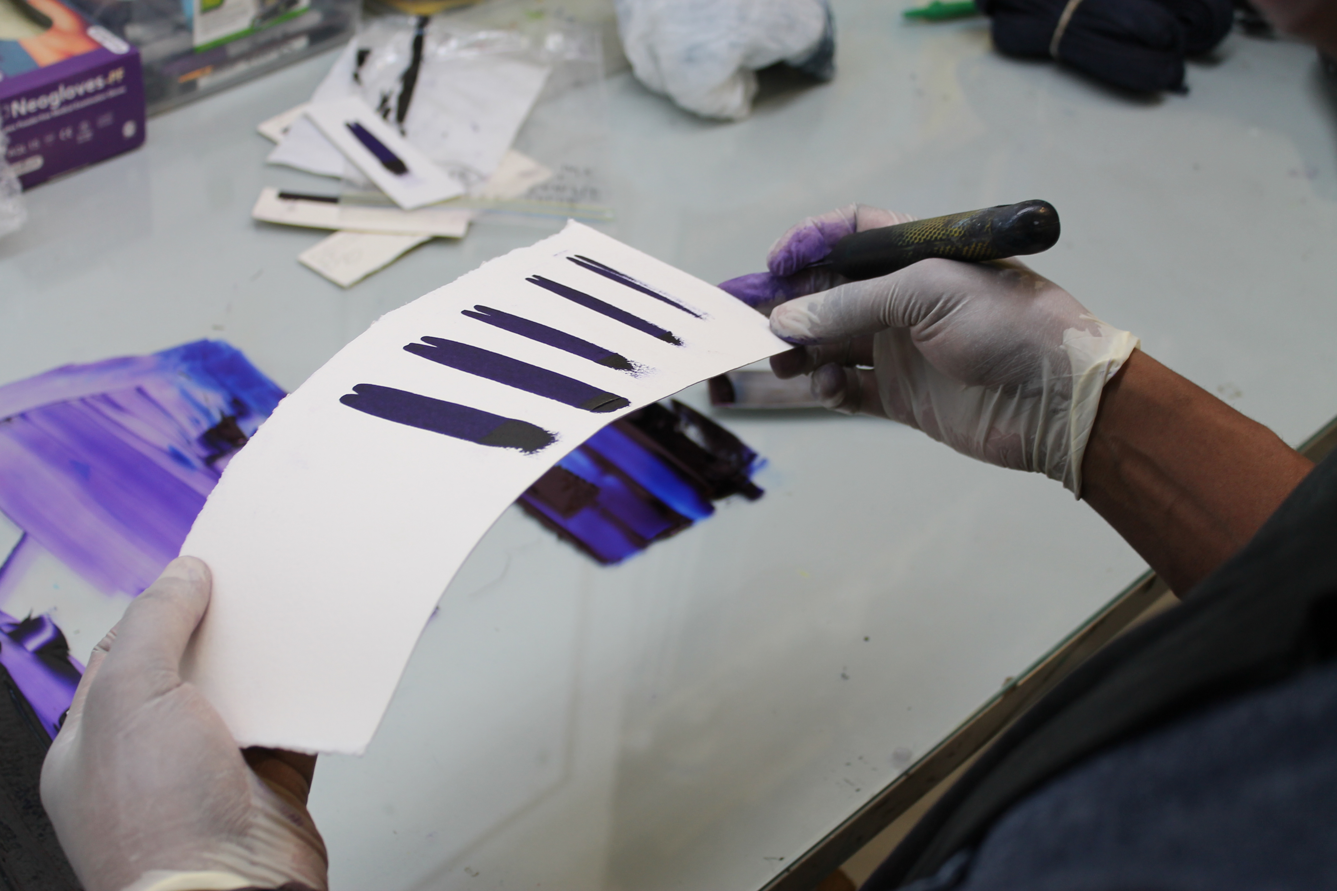
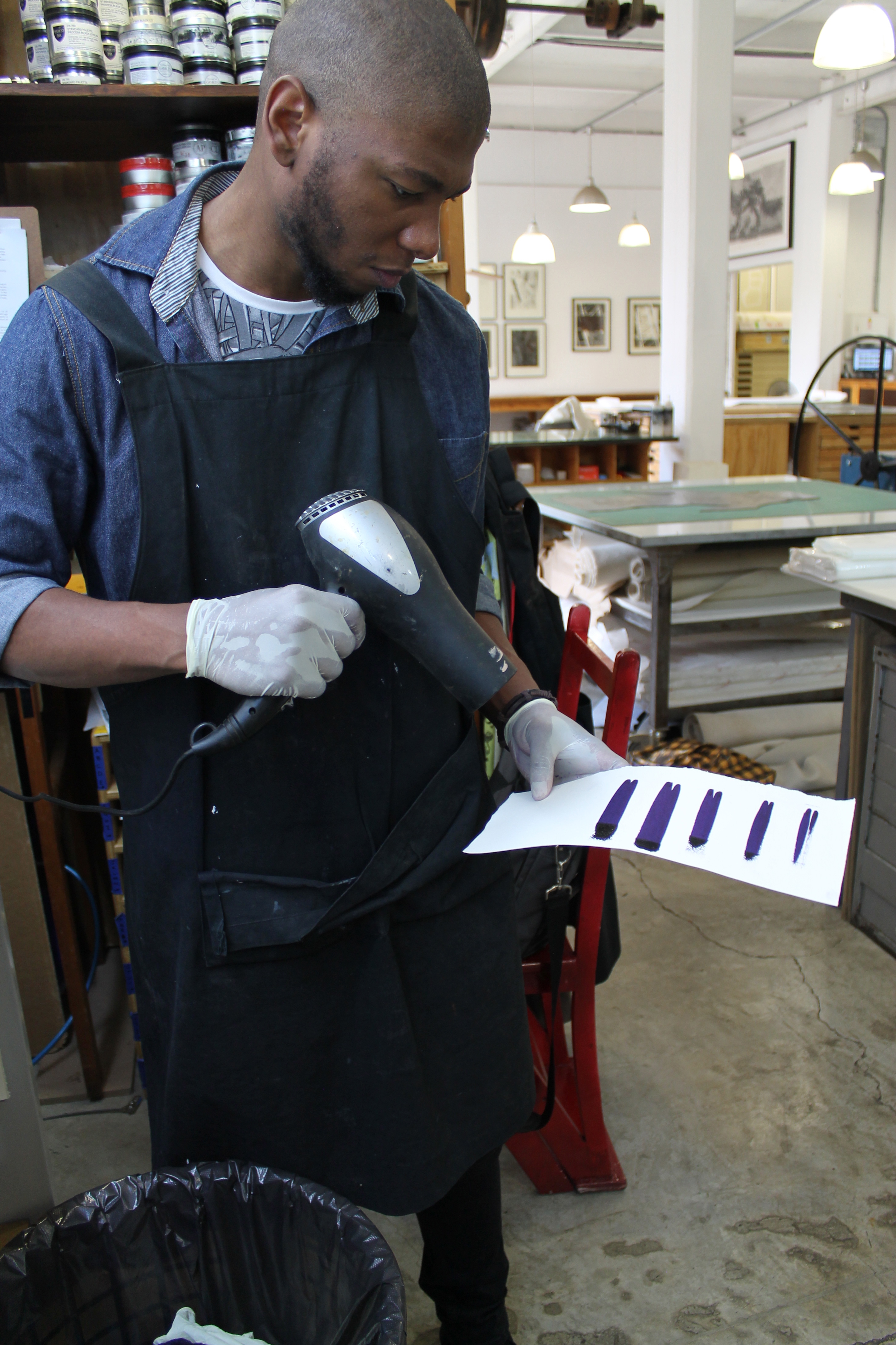
Meanwhile, Sbongiseni is hard at work trying to mix the perfect shade of violet to edition “Misregistered” by Mary Wafer.
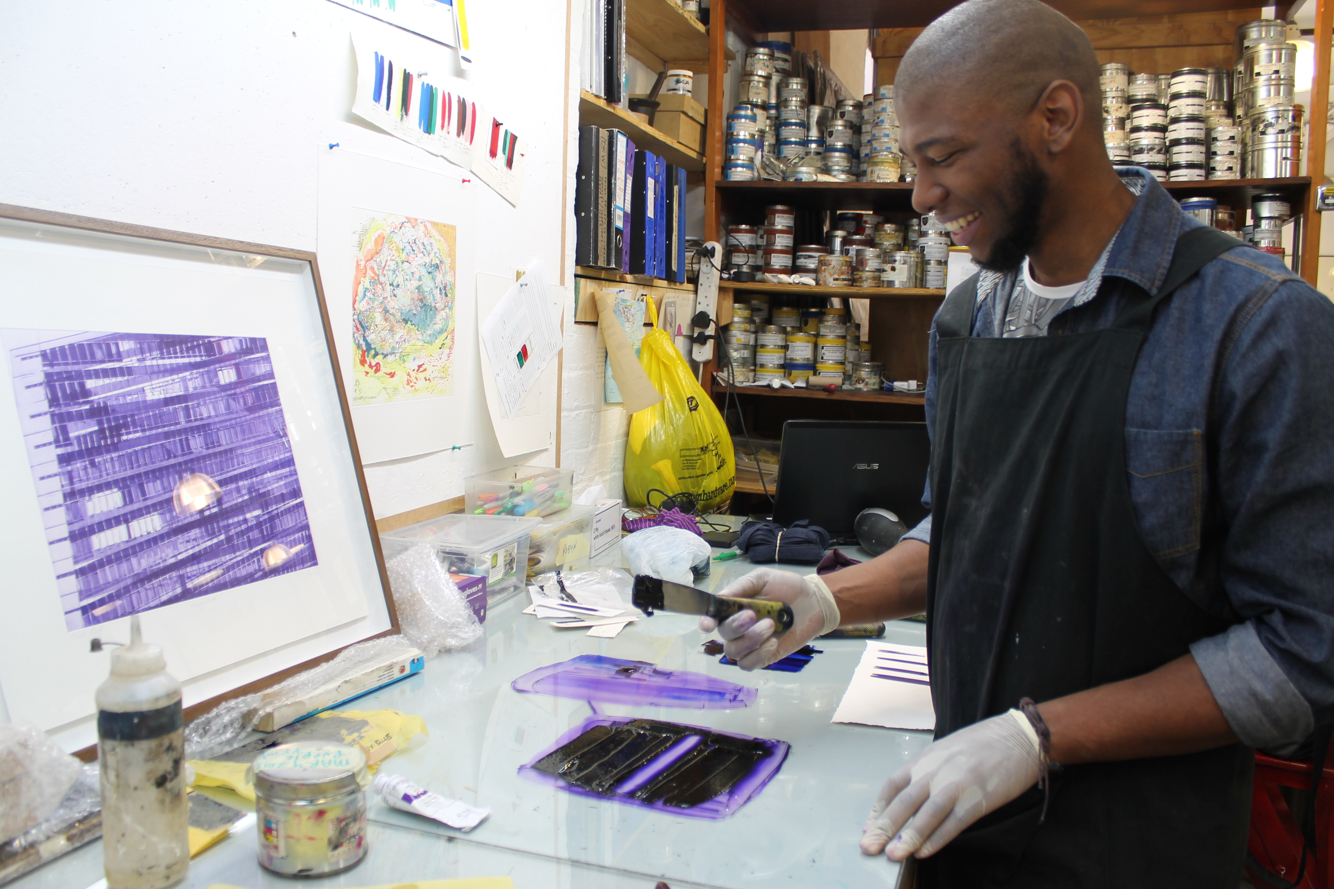
He does a number of colour tests. This requires mixing the ink and testing the most recent mix next to the sample colour, which has been preserved from when the previous print was made.
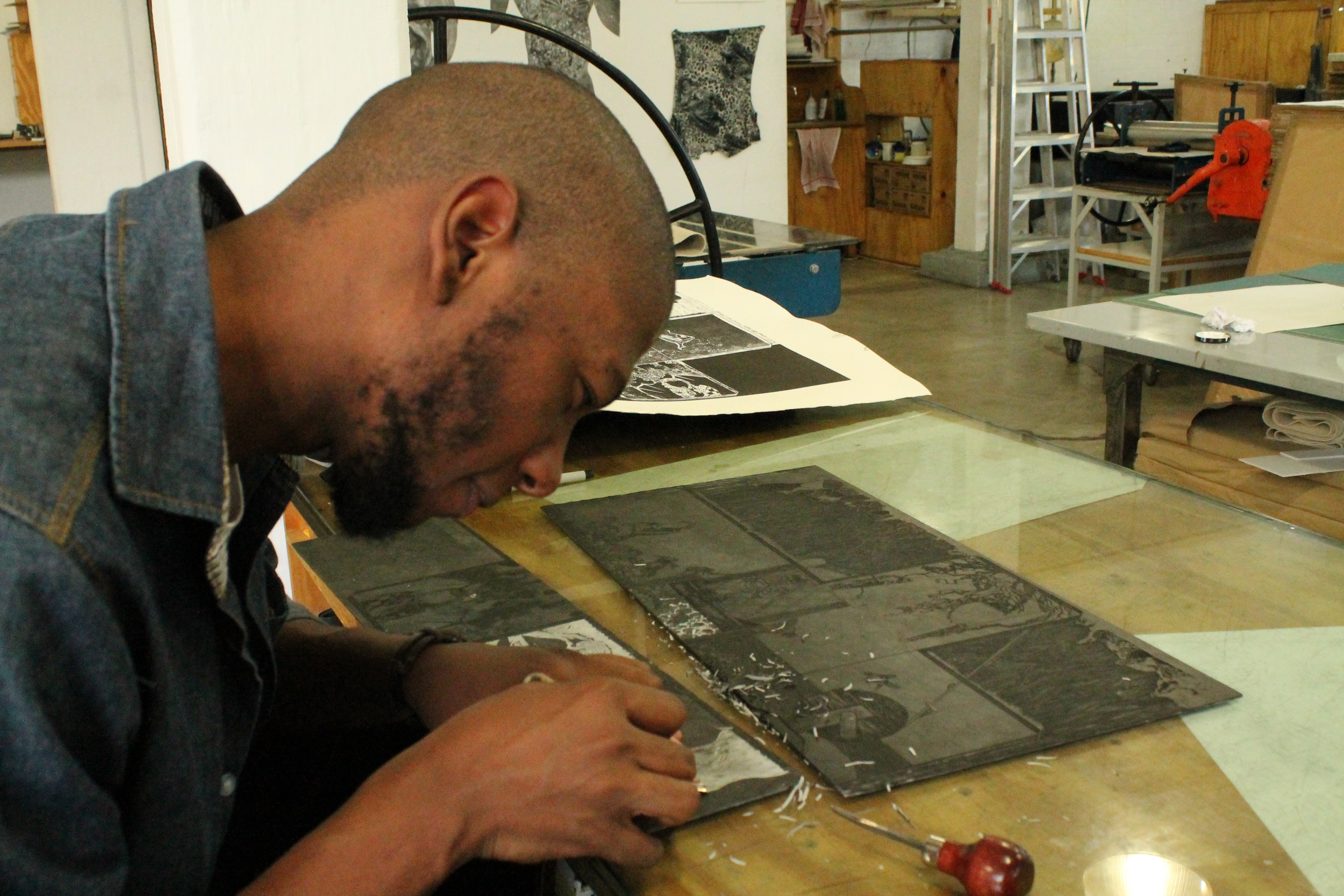
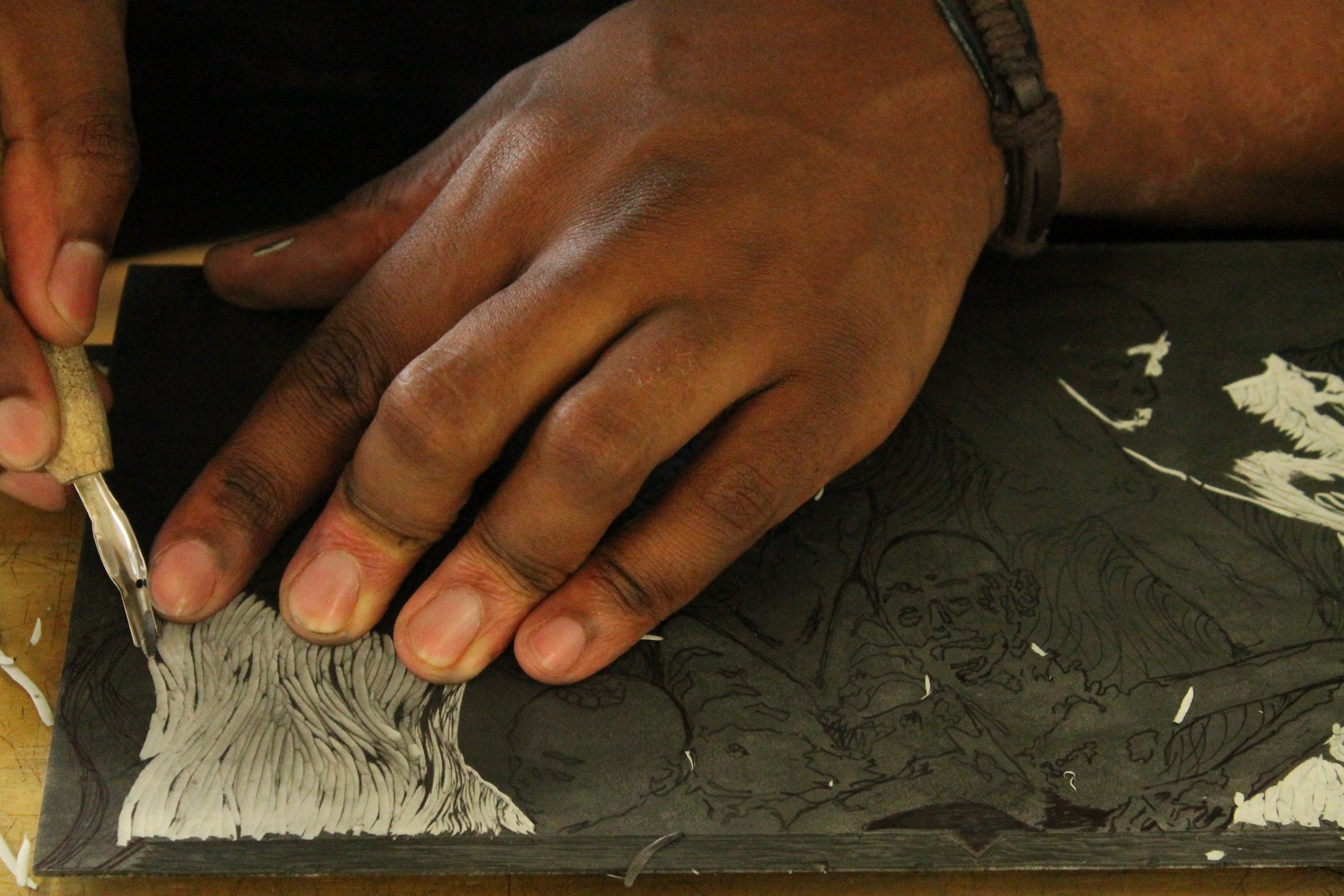
At lunchtime, Sbongiseni works on a linocut, which he has personally designed.
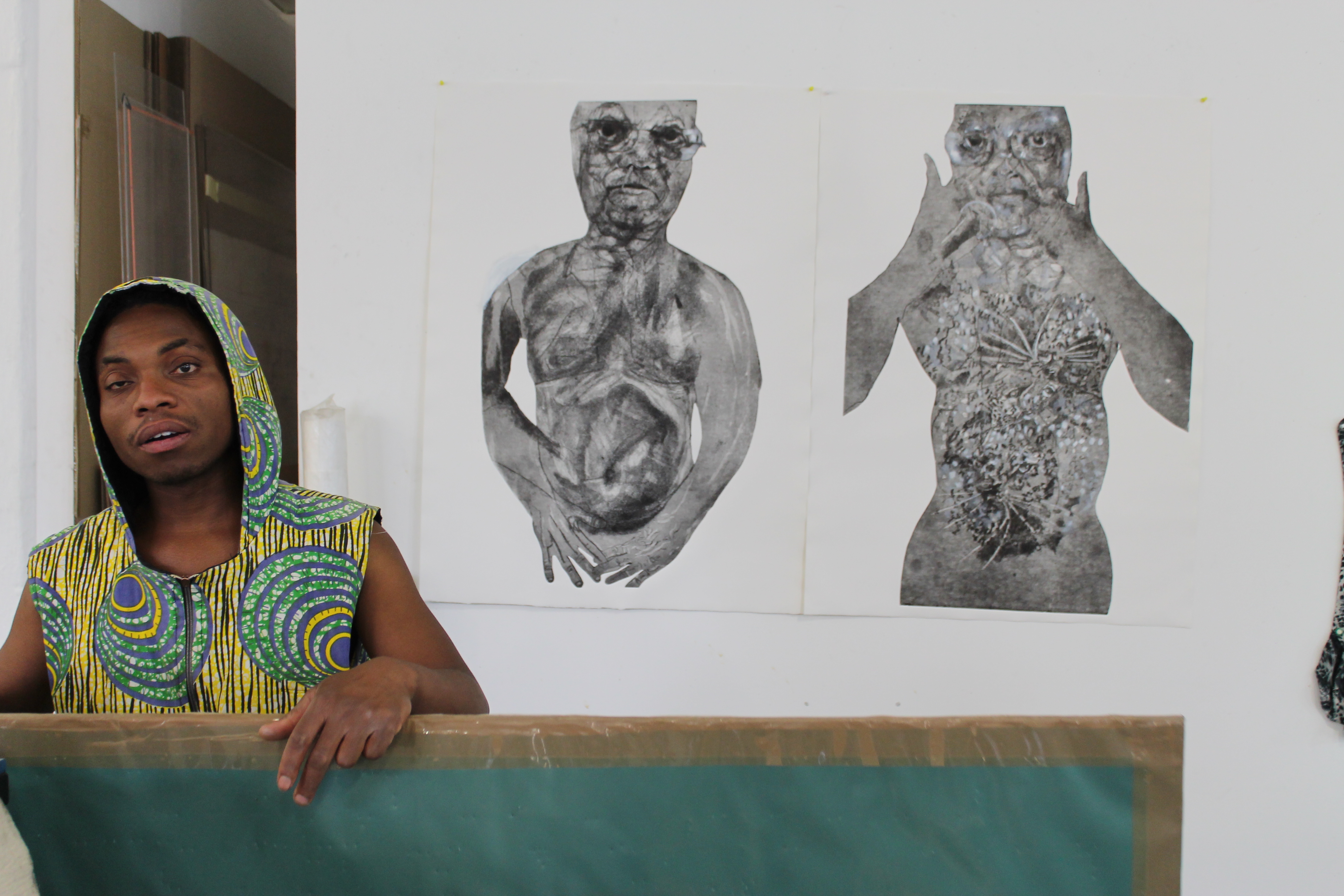
Meanwhile, intern Martin Motha is also developing a personal project. Once his prints are dry, he works into them with white pencil and paint. They are depictions of Jacob Zuma.
All in all, it’s been another hard-working week at AOM where we are in no short supply of creativity and dedication – and, it must be said, the non-perfectionists are rather few and far between.