04/08/16
Blogger: Jessie Cohen
This August, DKP host a show like no other.
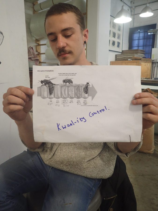
Kwaal-ity Control will take a critical look at the printmaking industry, probing the question of a printer’s ownership over the work they help deliver into the world, technically and conceptually.
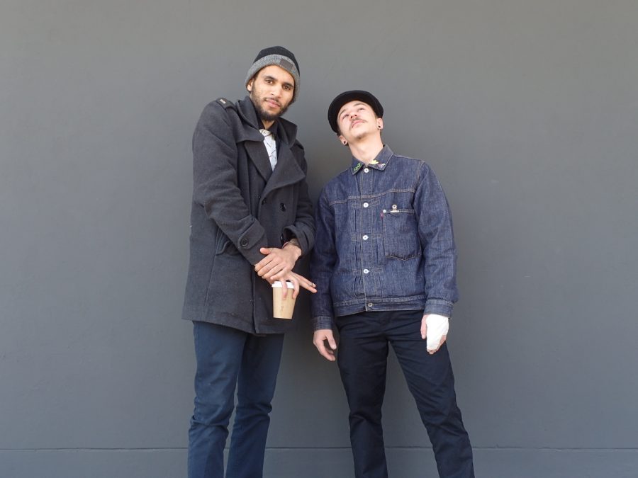
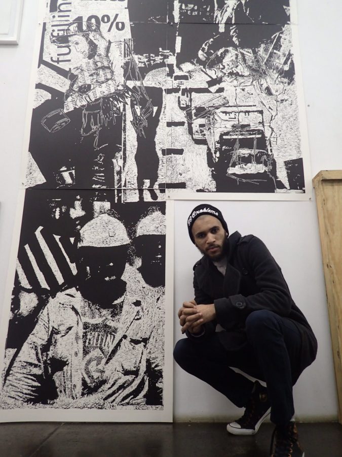
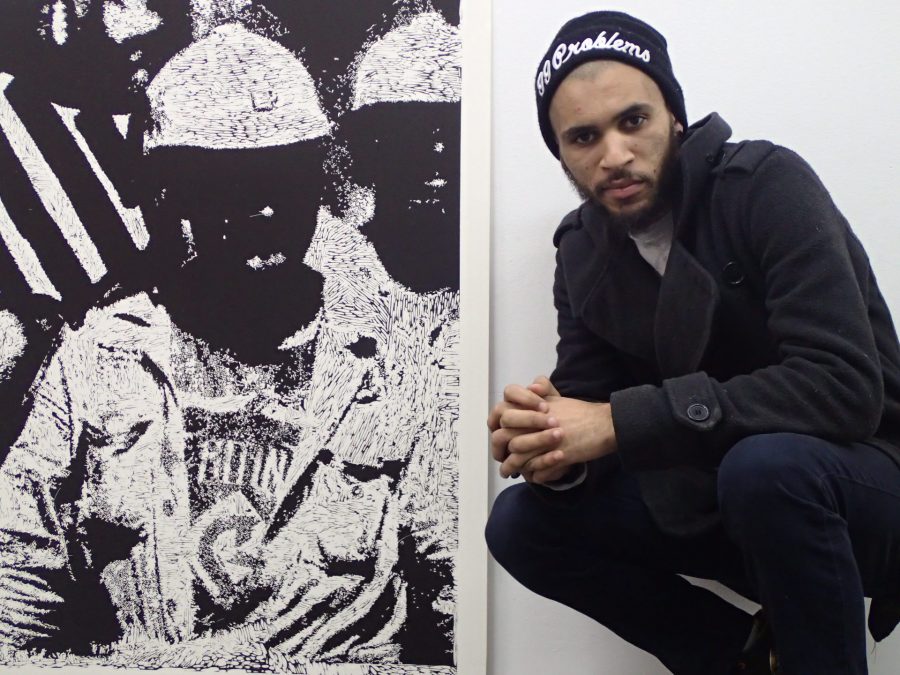
The artist-printmaker collective – Chad Cordeiro and Nathaniel Sheppard – will be exhibiting linocuts, monotypes and drypoints with one piece as large as 3.5×3.5m – pushing the gallery space to its very limit.
The dynamic duo recently carved William Kentridge’s woodcut, Mantegna, as part of a team of printers, which opened their minds to the many facets of printmaking, particularly carving technique.
In preparation for Kwaal-ity Control, the collective are hard at work, honing their conceptual focus and technical skill.
I met with them to get a sense of their creative journey in the run up to the show this September, which will be their first ever solo exhibition …
JC: What does the title of your show, Kwaal-ity Control, mean?
CC: It came from throwing ideas off each other, as we are constantly doing, and Kwaal-ity Control stuck. It is a play on the fastidiousness of being a printmaker and that, in the printmaking industry, every print needs to be “quality controlled” to ensure it is “perfect”.
Another dimension is the Johannesburg context.
We enjoy observing the mechanics of the city around us. The word “Kwaal” often appears on a sticker at the back of Johannesburg taxis accompanied by an image of a hand gesture that essentially means ‘haters gonna hate’. The word itself means ‘disruption to normal functioning’.
NS: Taxis are enormously important to running the city. It’s almost like you need the chaos to see that. We’re raising issues relating to the labour and economy of printmaking and how much ownership the printer has over the work they help create, as brains as well as hands in the process.
CC: We appreciate that artists need to work with institutions to get our ideas out there and DKW is all about collaboration. It is a supportive environment, which extends to technical and conceptual input from the printers which changes the work for the better. As printers, ownership needs to be taken back.
JC: Tell us about your shared practice…
CC: Our practice is very discussion-based. We bulldoze through conversations on race, class …. whatever. Our similarities and our differences on these subjects are visible in our work.
Sometimes we’ll talk for three weeks or do nothing but listen to Jazz before putting a single mark down. While studying at Wits, we learnt how important it is to have conceptually sound work.
NS: We’re conscious of our subject positions as artists in terms of gender, nationality and race.
JC: How would you describe your approach?
NS: We grab opportunities as they come. We’re treating this exhibition as if we are showing at the Tate Modern!
CC: We’re story-tellers, currently working on a graphic novel, so our art tends to be narrative-driven and illustrative in style.
NS: Our work has as much to do with the technical as the conceptual. We learnt a lot from the process of carving Mantegna in terms of mark-making.
JC: What are you exploring in your individual work?
NS: When Chad and I don’t collaborate, I paint. My work has to do with my personal placement in society, taking the form of pornographic/race-related paintings. I look at social issues in relation to white dominance over black bodies and vice versa – exploring the violence in that relationship.
I am a mixed-race male born in Washington DC, grew up in Chicago and partly in SA and I’ve lived in Joburg for seven years now. I’ve gotten to experience the city in all its glory and all its dark sides – seeing children get hit by taxis, drug addictions, women being verbally and physically abused. My art is about understanding my surroundings and how to place myself in the SA context.
CC: In the States you were identified as a black male, but here people see with you as coloured, not black. I remember you saying that you felt were robbed of something…
NS: Yeh, it sounds cliché – ‘I’m mixed-race and I don’t know who I am!’ – but it became a really serious question for me here in SA. How do I portray my honest view without coming across as an angry black man?
The collective recently took part in the group show A Labour of Love at Weltkulturen Museum in Frankfurt where they say that felt treated like “exotic African artists”. For their solo show, they are aware of their subject positions as artists inserting their voices into a complex and heated Johannesburg art world:
CC: “Now that we’re exhibiting in JHB, we’re being very considered – extra responsible! – about what we say as we’re conscious of how it might be received.”
Cordeiro and Shepperd are collaborating on every print bar two large linocuts. Before chatting about their individual projects, we look at their collaborative monotypes where they play with the concept of labour and self-worth:
For the moment, they call these works – “The Money/Bee Monotypes”
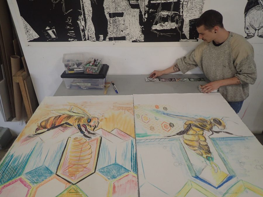
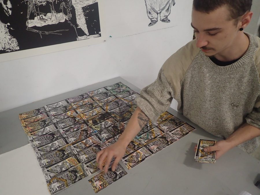
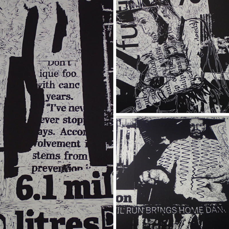
CC: We’re interrogating the linocut medium in simple ways like layering – conceptually and literally. With our money print, there was no calculated registration process as is usually done when printing. We printed the bee on top of the money imagery to create an image where the parts are more completed (the individual money images) than the whole. The layering process of one image over another suggests an interplay between the overlaid figure and the print itself – between the labourer and the artwork.
They cross-pollinate their imagery of money notes and bees to comment on the life of a bee as a metaphor for the life of a labourer:
“We’re working with the idea of the potential labourer as more alluring than the labourer himself and his output”, they say.
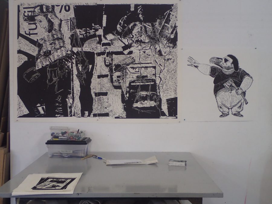
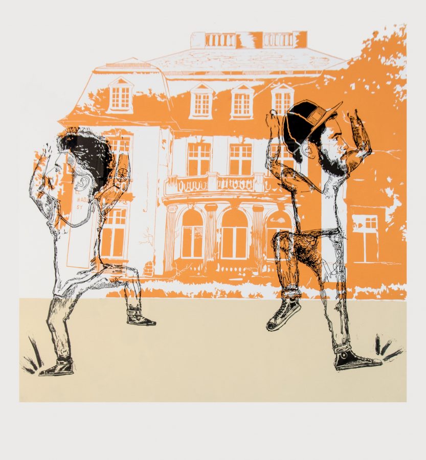
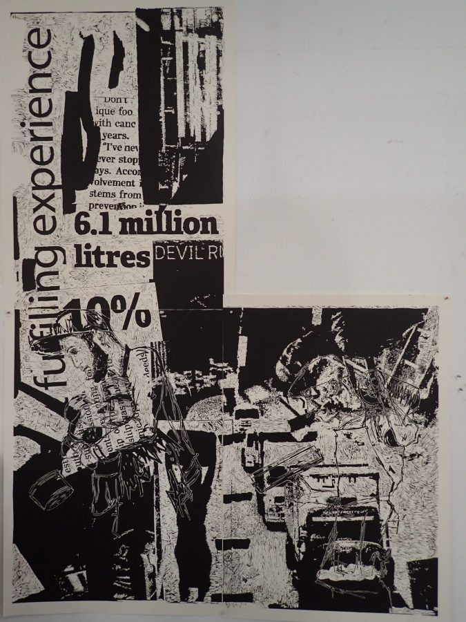
Sheppard’s piece, Empire Strikes Back (3.5×3.5m), is the biggest in the exhibition, stretching to the maximum height that the gallery allows. It is a response to DKW master printer, Jill Ross’s challenge to Sheppard to go LARGE.
For this epic number, Sheppard has honed his approach to creating tone, considering the economy of marks at every stage: “you have to teach yourself to carve according to how the eye reads the image from different distances”, he says.
Empire Strikes Back is an ode to printmaking but also a criticism of the power structures within the industry. The final print will depict three semi-visible figures – Sheppard, Cordeiro and DKW printer Sbongiseni Khulu – who are the core printers in the show.
Sheppard explains that “in Kentridge’s Mantegna woodblock, three figures walk towards Rome carrying items looted from conquered empires – a scene extracted from Mantegna’s The Triumph of Caesar. In The Empire Strikes Back, the figures walk in the opposite direction, as if they are striding away from Rome, away from the empire. They have not pillaged, but are leaving with tools and skills which they’ve earned through labour. In addition to the items carried by my three figures (rulers, rollers and ink) the backdrop immerses the figures in a sea of information representative of the labour that surrounds us and stretch beyond the confines of an art studio or workspace”.
The collective emphasize Khulu’s role in their projects, speaking appreciatively of his contribution as “always adding the final touch and helping us get to that finishing line” and they describe him as “the calm in our chaos”.
I spoke with Khulu to get his perspective…
JC: What’s it like working with Chad (Cordeiro) and Nat (Sheppard)?
SK: Well… when working with them I often find myself feeling like a kite dancing in a hurricane… if only because I am not just an artist they’ve worked with nor am I merely the printmaker they’ve come to trust, but a friend.
It’s funny how hurricanes work huh?
Though I’m no stranger to linocuts, I must say printing Chad and Nat’s plates has on more than one occasion proven to be a humbling experience – as is the cost of pushing the boundaries of any given matrix. I always welcome the opportunity to print their work, as it offers a subtle break from the repetitive and somewhat mundane nature of printmaking.
Some of Sheppard’s mixed media cut-outs include photocopies of personal bills and lease agreements as well as pages from a Strauss & Co catalogue “to mess with the tone of the piece”. His choice of collaged subject matter reminds us of the young artist’s use of artwork as part of his personal journey of self-defining within his context.
For Khulu, collaborating with Sheppard and Cordeiro has been an exciting challenge: “it’s a rollercoaster because they are tackling big projects in a short period of time so working with them is an interesting experience. Previously, we collaborated as printers on Kentridge’s Mantegna, during which time we’d butt heads and compete in our mark-making skills. Now, I’ve stepped into my printmaker hat to work as one creative unit towards a common goal – it’s about making sure everything is printed properly and has impact”.
“It’s about our love of the labour, of the printing process and fighting for a reason to keep this age-old practice alive in an age of digital which can imitate lino marks perfectly. We’re all about the process”, Sheppard says. As he speaks, Cordeiro grabs a carving tool and casually carves into one of Sheppard’s large lino plates. Sheppard glares at him sarcastically and checks the area he’s just carved. “Don’t be precious man”, Cordeiro says and keeps carving. One gets the sense that they have a truly relaxed and honest collaborative bond.
JC: Chad, tell us about your lino piece…
Cordeiro’s large print consists of one major figure – an anthropomorphised vulture:
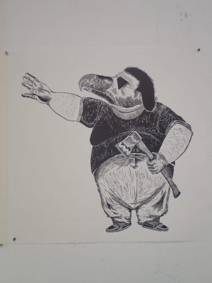
The vulture is a running motif in Cordeiro’s work. His other large lino print, which formed part of his contribution to A Labour of Love, demonstrates the motif:
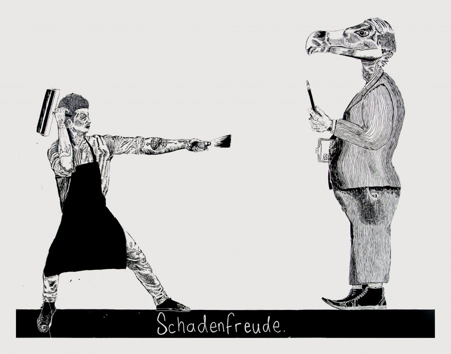
JC: Why are you working in the linocut medium?
CC: In order to push the medium and interrogate the culture of printmaking which has a hierarchy where intaglio tends to be valued above relief. Lino and wood are more accessible and cheaper than zinc and copper, so the former materials have become the medium of choice among the less privileged and were used to make South American revolutionary propaganda, which has influenced my style.
JC: Target audience?
NS: We want our show to be seen by people of widely different walks of life. We’re tapping our networks to bring everyone from ANC ministers to B-boys (street break-dancers). Chad is a B-boy himself.
JC: Tell us about your performative work which you plan for opening night…
CC: We’ll be printing signs that mark natural breaks in labour and will be responding to the people coming in. For example, if we see an old lecturer, we’ll print a sign saying “gone for a smoke”. The point is partly to show that the “distractions” are an important part of the work process because, even when we’ve not physically making the work, we are still making work in another sense – thinking about it and picking up ideas from all around us.
This September, Cordeiro and Sheppard step onto the South African art scene, hoping to“tip the scales and sway the system”.
Opening night is Thursday 1 September at DKP gallery in Parkwood, coinciding with First Thursday when JHB galleries stay open till 9pm.
Instagram: https://www.instagram.com/dgi.studio/
Follow the collective at: @thethird3 (Nathaniel Sheppard) @sensubeans (Chad Cordeiro)