ON VIEW: 30 May – 13 July 2013
OPENING RECEPTION: Thursday 30 May @ 6pm
ARTS ON MAIN SUPPORTING INSTALLATION:
Artist walkabout Saturday 25 May @ 11am
‘The traffic between fabric, representation and imagination fuzzies up epistemological and ontological distinctions and, in doing so, produces the city between, the imagined city where we actually live.’[1]
Early in his career, Stephen Hobbs recognised the need to develop his practice across the disciplines of artistic production, curatorial practice and cultural management. Through committed urban investigation and experimentation, focused primarily on Johannesburg since 1994, he has sustained a dialogue with urban space through video, installation, curated projects, photography and sculpture. Hobbs’ highly conceptual and multi-disciplinary creative enquiry looks to the city as a tool for understanding the complexities, contradictions and potentialities inherent in the relationships between people and the built environment. As indicated by his perennial fascination with Johannesburg, Hobbs is particularly interested in cities of the global South as spaces of dystopia, but is continually challenging conventional understandings of the concept. In Hobbs’ view, dystopia indicates abundance rather than oppression, informing spatial topographies that evolve and adapt at intersections of difference, complexity, opportunism, and irony.
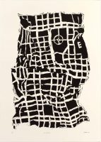
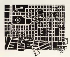
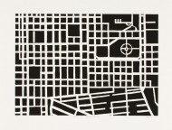
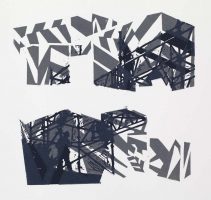
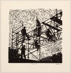
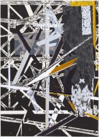
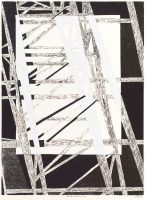
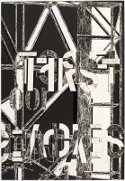
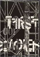
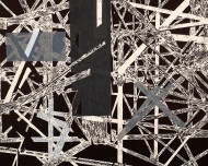
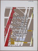
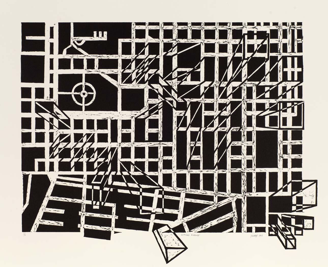
Be Careful in the Working Radius indicates a shift in and expansion of Hobbs’ practice. In this body of work, Hobbs distils and translates his mercurial urban practice into the formalism of the printmaking medium, and then pushes those same formal elements beyond themselves into three-dimensional iterations. Originated in collaboration with the David Krut Print Workshop (DKW), the exhibition comprises a series of editioned prints, made using combinations of woodblock and linocut techniques; unique works created from the trial proofs of the editions, altered through cutting and the addition of reflective tape; sculptural objects made by repurposing the woodblocks used for printing the editions; and a limited edition artist’s pop-up book.
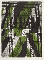
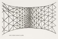
As a visual point of departure in the editioned works, Hobbs has referred to imagery of billboards and scaffolding – common tropes in his work – and in this case particularly wooden scaffoldings that he has come across while travelling in African cities. By reducing the reference images to abstract grid formations, he harnesses the significance of the billboard frame as a matrix upon which information is placed. With increasing proliferation of media platforms and information streaming into our lives on a minute-to-minute basis through photography, cinema, print, the internet and advertising, we have learned to perceive modern life through images. Hobbs references this visual culture literally using the billboard frame as metonym. However, paring down to abstraction allows for broader implications of this culture of perception through images. As Gyan Prakesh has put it: ‘Even if we do not always realise it, visuality is integral to our knowledge and practice. It is thus that the image of the city imperceptibly becomes the imagined space in which we live. Visuality saturates the symbols, values, and desires that make up urban society as an imaginary institution.’[2]
In the workshop, Hobbs’ graphic visual language emerges in print, filtered from images of the city: documentary photographs he has taken in developing cities all over the global South as well as images existing in his imagination, residue of years of video projection, public sculpture, photography, performance and urban intervention. In their reduced, abstracted form – in reality vertical planes that pierce the sky – the billboard matrices open up the potentiality for imaginings on the horizontal grid, as foundation for a kind of urban madness from which rectangles are extruded and cars and people hustle on the ground plane. Whereas Hobbs’ modus operandi up to this point has resided in the metaphorical implications of literally projecting images onto real spaces – the sides of buildings, the ruins of towns – in this body of work he has taken up the empty billboard frame as his screen, onto which to project ideas. His focus here has shifted from intervention to art object, from urban visionary to the city imagined.
The texture of the images produced through woodcut as well as the allusion of the woodblocks to the reference material has prompted Hobbs to approach the materiality of relief printing from a three dimensional perspective, revealing process through a sculptural interpretation of the blocks themselves. Moreover, the three-dimensionality of the grid turned skeletal building provides a visual model for the building of the city from the ground up over time, a process of constant development and regression, urban chaos enacted in more boxes and rectangles above the ground. The unique two-dimensional works – trial proofs that have been through various processes of reworking with new material, cutting, cropping and crumpling – function as a go-between for the editioned prints and the repurposed woodblocks.
The limited edition artist’s pop-up book functions as the binding work of the exhibition, encompassing Hobbs’ conceptual practice of engaging the field of architecture as a site for visionary thinking. The work itself is a form of paper architecture, concealing within its two dimensions extraordinary three-dimensional structures and mechanisms. The book was conceptualised with Ingrid Schindall, a printmaker specialising in book-binding and paper engineering, who spent some time at DKW between February and April. The work contains ten silkscreened, black and white double page spreads, six of which contain pop-ups of variable moving mechanics. The spreads include found text and handwritten mind-maps, stylised networks and city grids, scaffolding and empty billboard structures, blocked patterns and optical illusions, which team up with the imaginative wonderment of the paper engineering techniques to demand an absorptive process of looking. As a fictional urban environment between two covers, created in the visual language that emerged through the development of the prints, woodblocks and trial proof manipulations, the pop-up book is symbolic of the ‘imagined space in which we live.’
The decision to work only with black and white in the book also provides a visual link to dazzle camouflage, a zebra-like pattern used particularly on gunships in the early 1900s to fragment the visual field of enemy sites in combat situations. Although dazzle patterning became obsolete after World War I, Hobbs has mined the potential that such visual deception presents for aesthetic reflection on the dystopian city, in this case the complex and abstract nature of processing information in frenzied urban environments. In Hobbs’ practice as a whole, and in this case the visual language of his imagined city, the classic dualisms of utopia-dystopia, order-chaos, plan-counterplan are too static to capture the delirious urban dynamic in which he is most interested. For him, the empty billboard, the building in progress, and the illusory grid are more significant of the endless loop between material and imagination that constitutes the informal proliferation, the unruly evolution of the developing city.
– Jacqueline Nurse, April 2013
Click here for more information about and images of the pop-up book
Click here for Kate Arthur’s text on the development of the title
Click here for Stephen Hobbs’ text on the workshop environment
[1] James Donald, ‘The Immaterial City: Representation, Imagination, and Media Technologies’ in A Companion to the City, edited by Gary Bridge and Sophie Watson, Wiley-Blackwell, 2000.
[2] From ‘Imaging the Modern City, Darkly’ in Noir Urbanisms: Dystopic Images of the Modern City, Princeton University Press, 2010.