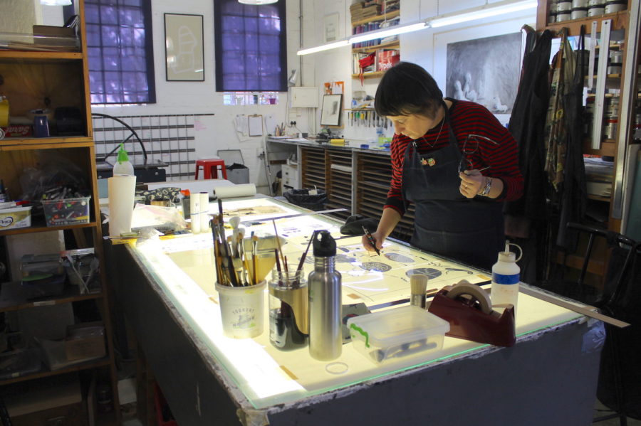
Maja Maljević’s latest exhibition, The Silence of the Change, has just opened at David Krut Projects, New York, featuring a selection of work from the Winter Files series that was created in collaboration with the David Krut Workshop in Johannesburg earlier this year.
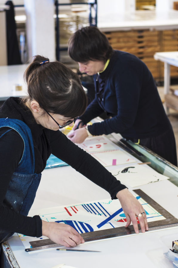
Winter Files marks a breakthrough in Maljević’s relationship with printmaking, prompted by a streamlined approach to the making process developed by Master Printer Jillian Ross and her team. This included the preparation of a number of elements in advance, as well as making all the different moving parts of the studio available to Maljević for the duration of the project. This level of support on the project resulted in a hive of activity that allowed Maljević to deftly translate her fast-paced and fluid method of painting into two-dimensional paper constructions. Each work is created using up to nine printmaking techniques on various kinds and colours of paper, with the addition of hand work. The process was made possible by the sustained collaborative relationship between the artist and print workshop over the past 12 years, and followed on directly from the previous extensive print project, Documents for the People, that was presented at Maljević’s well-received exhibition, Polytekton, which showed at David Krut Projects in Johannesburg in 2018.
Click below for more information about the exhibition in New York.
Here are some notes and images from the making of the series in the workshop.
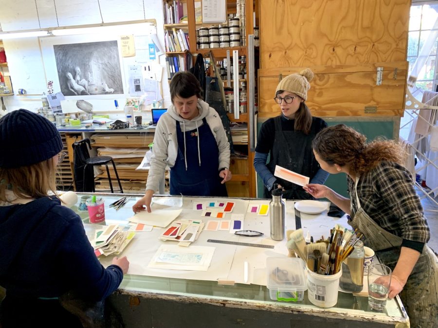
The project kicked off with Maljević working in the studio on some new hardground and softground etching plates. This is Maljević’s first time exploring softground and she took to the technique right away. The soft pencil-like marks contrast beautifully with the firm lines of the hardground plate.
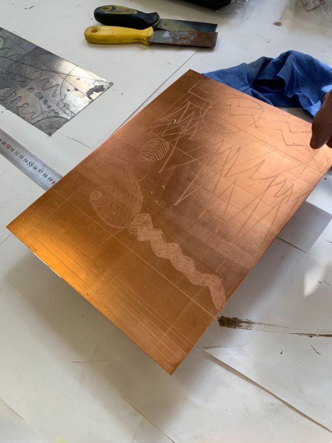
Copper plate with softground drawing 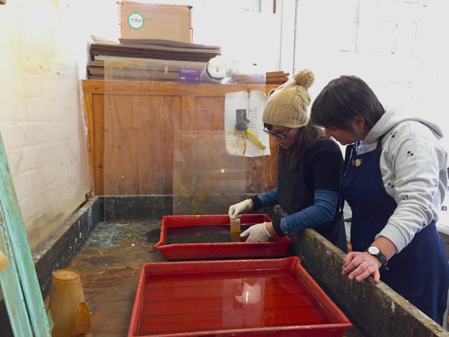
Maljević with Master Printer Jillian Ross etching the copper plate 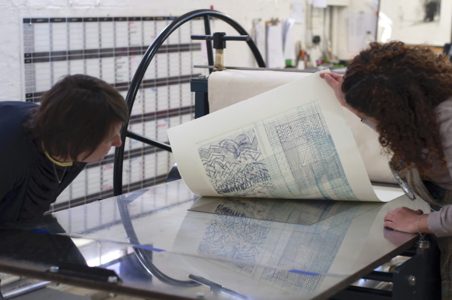
Majević with printer Kim-Lee Loggenberg printing the plates
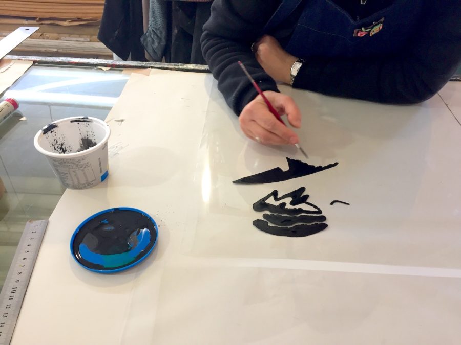
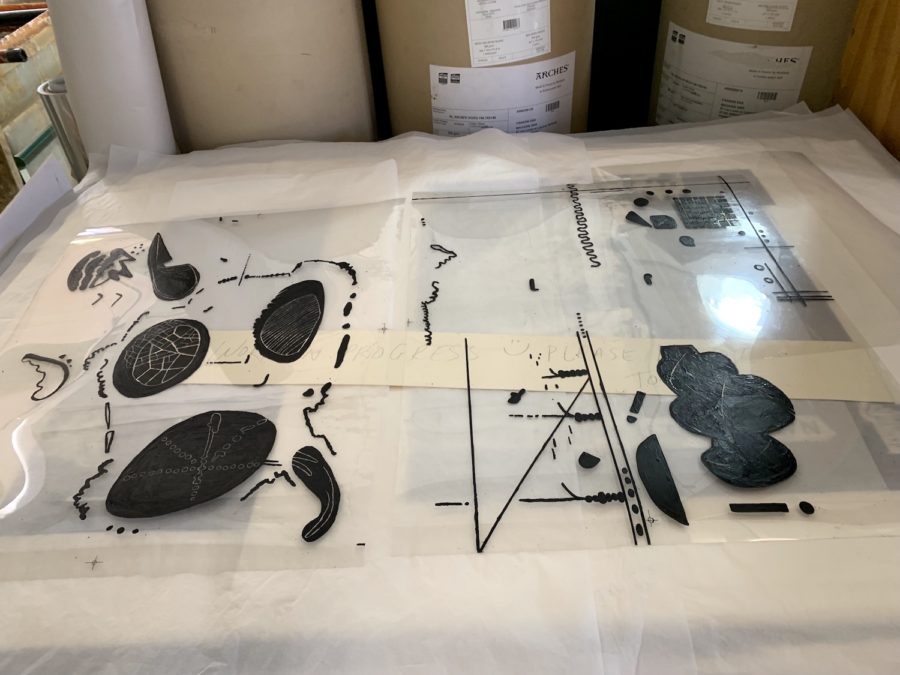
While these were being etched and proofed Maljević worked on some hand-drawn silkscreen positives. Working with ink on mylar, Maljević created organic shapes and lines working additively and reductively in different areas.
Maljević also hand-carved a number of new woodblocks. The team worked closely with her to proof different combinations and test colours. The woodgrain in these prints is delicate and clearly visible creating a texture in contrast to her usual flat colours.
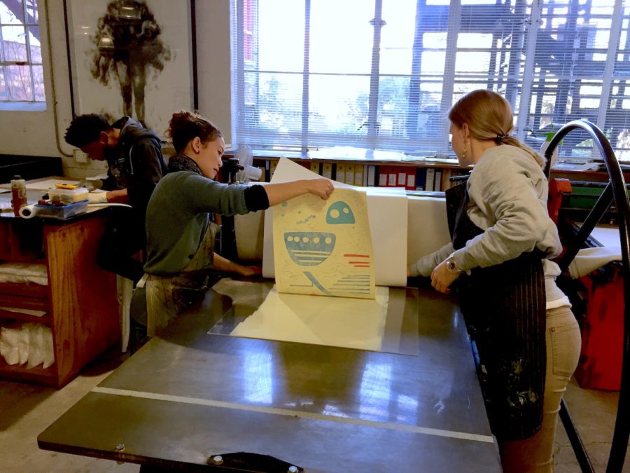
Printers Kim-lee Loggenberg and Sarah Hunkin printing the woodblocks 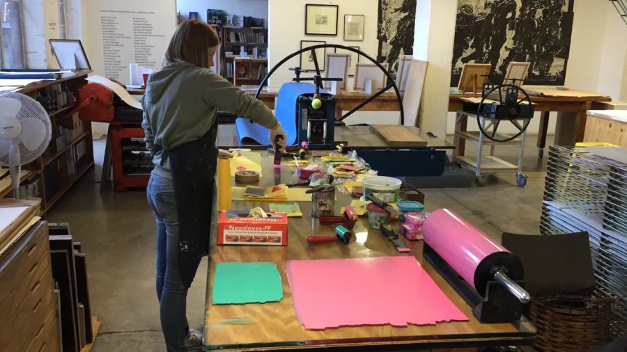
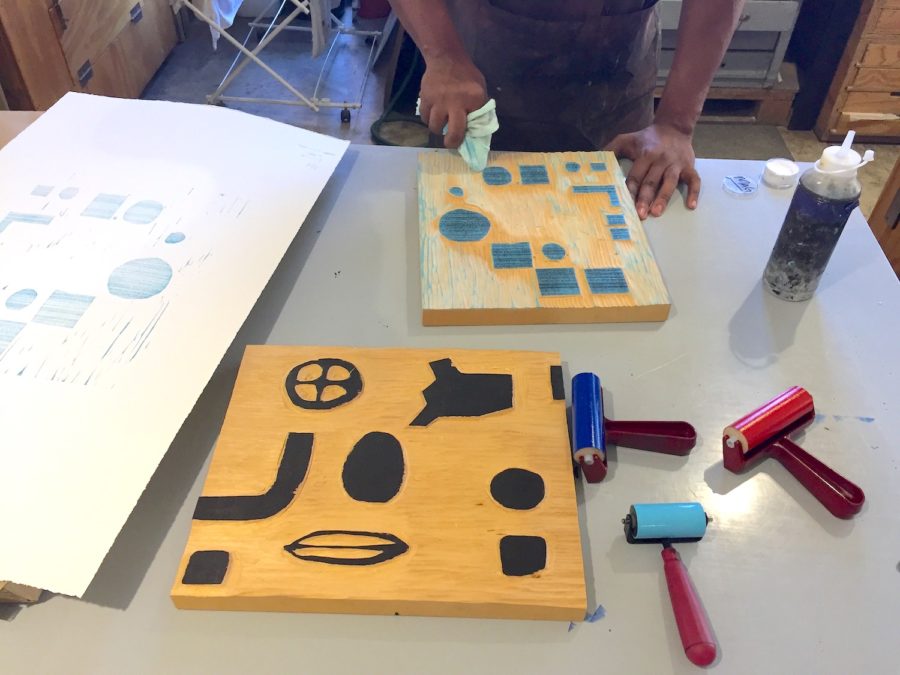
Printer Sbongiseni Khulu inks up the woodblocks
Although Maljević experiments and plays with colour, she is particular about the specific hues and combinations. Working closely with the team she picks and chooses from the multiple palettes developed for previous projects, adding and tweaking where necessary.
The etching plates were wiped up in intaglio to create delicate soft detail and tone on some of the larger and bolder woodcut and silkscreen prints. The hardground plate was inked in relief to create flat colours with delicate white lines.
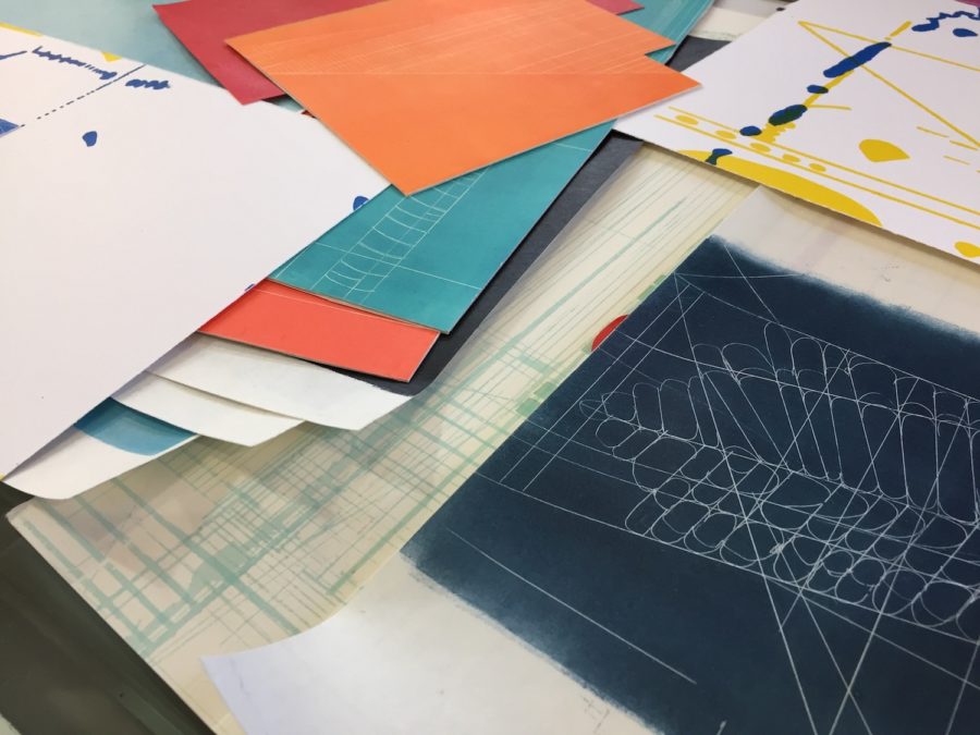
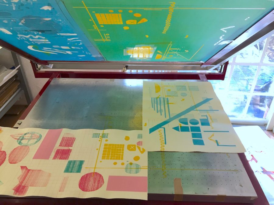
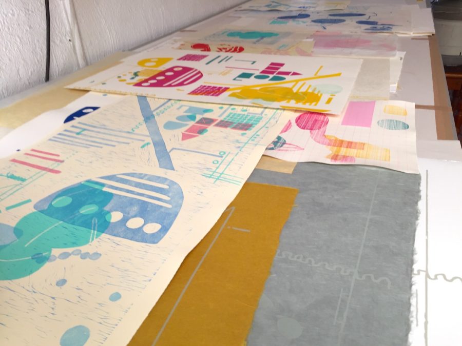
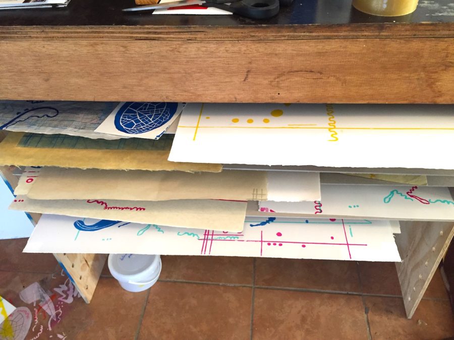
A large number of different papers were used to add texture and subtle tonal variations. The silkscreens were printed with printer Roxy Kaczmarek on larger sheets which then could be torn up and collaged, used for chine collé or alternatively as base sheets for larger more complex combination prints.
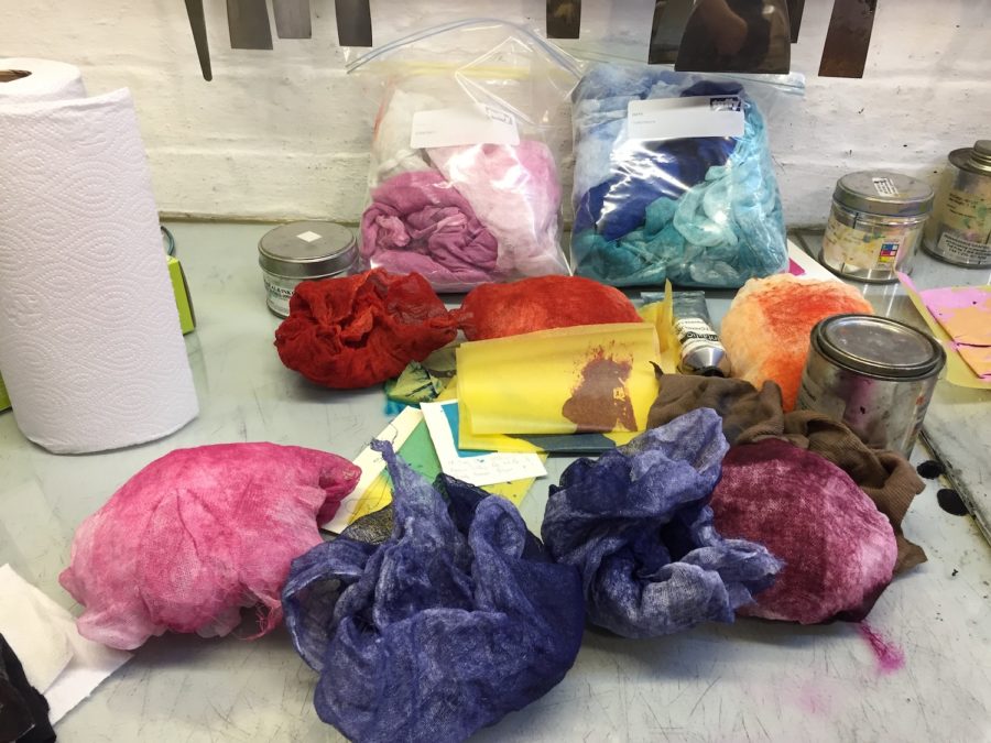
Stained Tarlatan used to ink up the intaglio plates 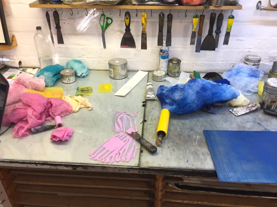
Ink and plates being inked up 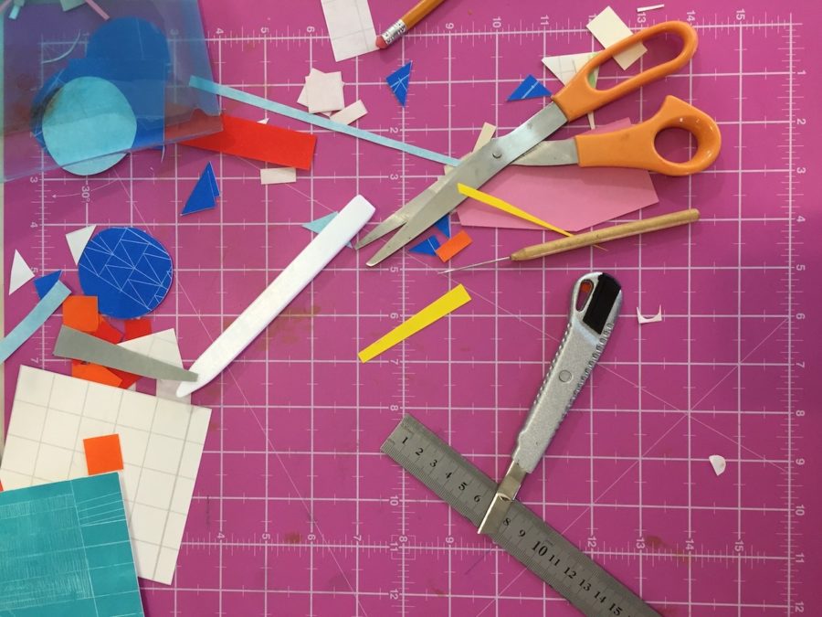
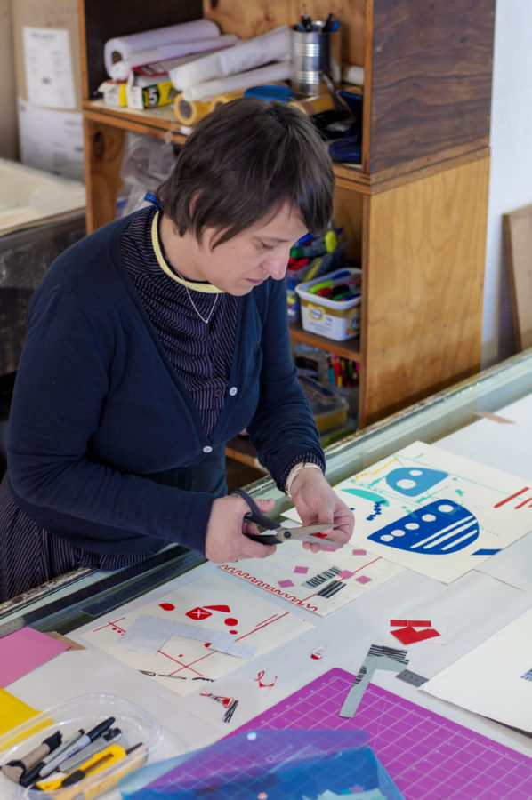
Tools and paper pieces used in Maljević’s prints
To bring some of the elements within the prints together some of them required a solid monotype layer creating tonal variation, pushing back some colours and enhancing others. Works on thinner papers could be used as chine collé to larger backing sheets, while archival adhesive backings were applied to many of the smaller pieces. These could then be cut up and collaged onto larger pieces. Maljević would then add finishing touches where necessary with hand-drawn lines, shapes and shading.
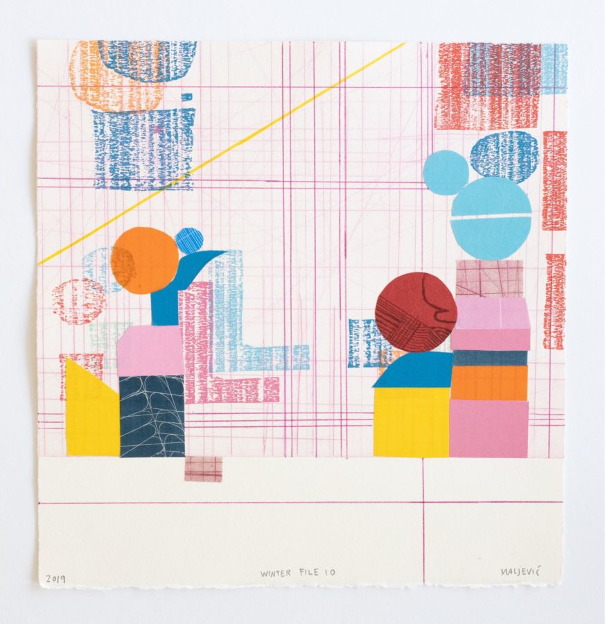
Size: 27.2 x 26.6 cm
As an example of how a work comes together, we can look more closely at Winter File 10. For this construction, the base layer was printed using an intaglio hardground plate of grid-like etching in pink. The next layer is the woodcut’s woodgrain texture, juxtaposed alongside solid monotype cut-out and collaged shapes. Building on this, Maljević collaged elements using other prints, including relief-printed hardground etching (dark blue with white), textured softground (red circle with dark marks) and fluffy drypoint marks (rectangle in pink on the right). Some of the solid monotype shapes were printed on thin papers so that they are transparent enough to see the lines below. The result creates the impression that the stacks of colours and shapes are about to topple at any moment, yet they are perfectly balanced on top of their grid.
Click below for more information about Maljević’s practice and how this project fits in.
