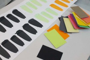
For many years, Van Schalkwyk has used Josef Albers’ colour system COLOR-AID to arrive at considered and very specific colour combinations for his artworks. Using lithography ink to make these drawings, he also carefully considers each sheet of paper he uses to produce such drawings.
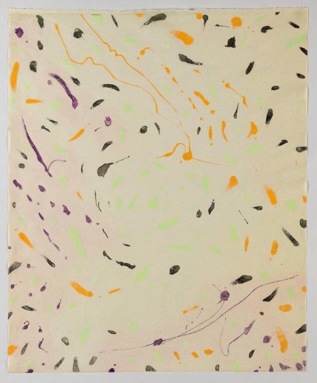
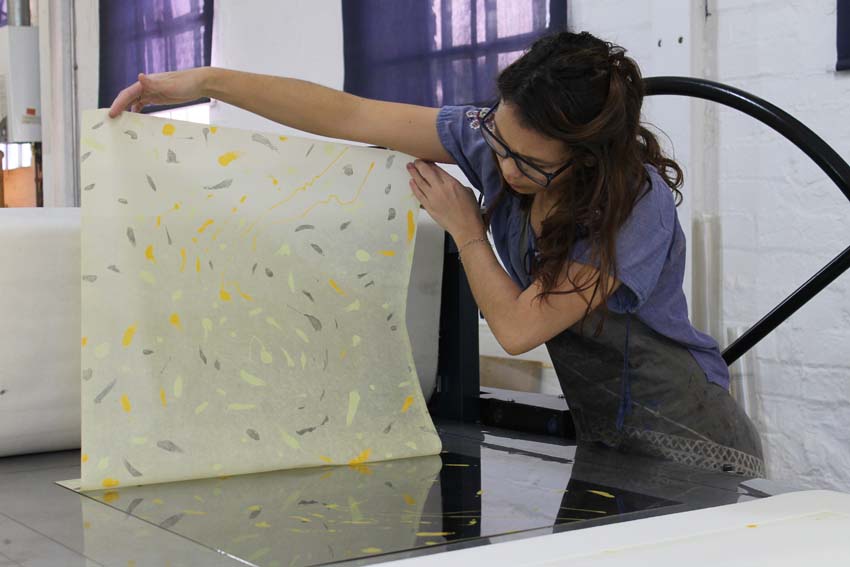
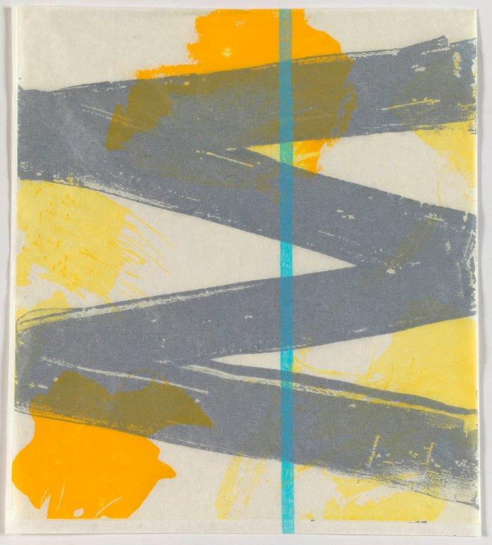
Waltz is a multi-plate deeply bitten, sugarlift aquatint etching printed onto a thin translucent paper*. The technique of sugarlift (painting with sugar) allows for gestural and painterly marks to be etched into the copper plate and plates were deeply bitten to hold a large amount of ink.
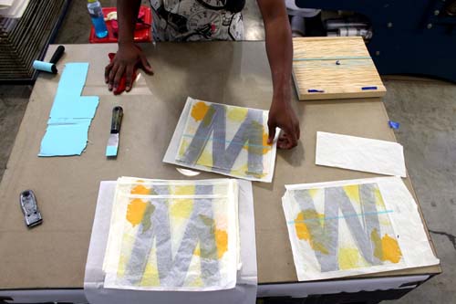
Key to making this image were the following steps:
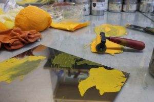
- 4 colours were pre-chosen for this collaboration.
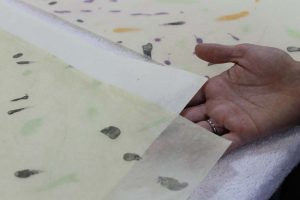
- Before being printed on, the paper gets a thin layer of transparent base to impregnate the fibers and give the paper transparency, luminosity and added strength (see image below).
- Each of the 4 colours is made on a separate plate. Registration for each of the colours used was essential. No one image could overlap.
- Two colours are printed on one side of the paper and the other two are printed from the opposite side. This allowed the ink to saturate the paper where printed and be seen from both sides of the sheet.
As its name suggests the gestural quality of the painted marks imply the movement of the dance. Being printed from both sides also alludes to the “partner”. See stop motion for movement.
*In 2010, the late artist Alice Goldin donated a large amount of rice papers to DKW. In the early 2000s, Jacob van Schalkwyk made a 16 mm film based on Alice Goldin’s work.
In December 2015, David Krut and Jacob van Schalkwyk spoke about the incidence of both of these facts and that van Schalkwyk’s collaboration scheduled for mid-2016 include this paper.
W highlights all of the above; it sticks (almost fully) to van Schalkwyk’s carefully considered colour selections for this collaboration, it utilizes the paper donated by Alice Goldin, and combines most sensitively his use of both gestural mark making and rigid line quality. This print was produced using the intaglio techniques of drypoint, sugarlift aquatint and a triple etched aquatint. This work gave Van Schalkwyk a chance to combine technical elements choosing to add woodblock for the line where one can see the beautiful grain of the wood.
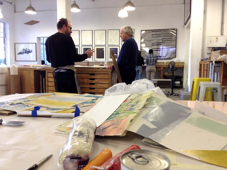
Master printer, Jill Ross and artist Jacob van Schalkwyk, have a common love for colour. Their “colour correspondence” went on for a year before the right combination presented and the collaboration could occur.
The printmaking medium has a tendency to hold tightly to elements of planning, whereas other creative mediums may be more organic. This is where the artist and Master printmaker relationship become interesting. Van Schalkwyk’s work is practice-driven, meaning his concepts often evolve out of experimentation and doing. Ross’s job is to facilitate this doing process without letting the planned element of print encroach on the artists creativity.
Van Schalkwyk’s recent solo exhibition Solo Project and Print Launch | DOLCEFARNIENTE was on show 9 March – 1 April 2017 at the David Krut Projects | 142A Jan Smuts Avenue, Parkwood, Johannesburg.