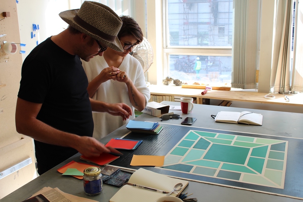
Upon visiting van Schalkwyk’s studio it is evident that his practice is particularly concerned with the formal element of colour. Whilst studying at New York’s Pratt Institute the artist spent an entire year focussed solely on the study and manipulation of colour. He shows us swatches of colour cards named, “color aids”. On each of these cards is a specific recipe for the exact amounts of pigment required to produce that precise colour.
Van Schalkwyk is quick to reference the esteemed Bauhaus and Black Mountain College professor, Josef Albers when discussing his investigation into this formal element. Albers delved proficiently into aspects of colour, publishing his 1963 theory titled, “The Interaction of Color” that was originally available in a limited edition of 2000, but now thanks to modern day technology can be downloaded as an app onto one’s smartphone. This particular theory on colour motivated that colours were directed by their own internal and deceptive logic. Albers’ is best known for his work as an abstract painter and theorist approaching his use of colour in a disciplined manner, emphasising the importance of composition. After this reference, Van Schalkwyk takes out a recent lithographic ink drawing made on paper sourced from St Cuthbert’s mill in Somerset, England. The drawing is articulated in a grid format with 24 separate geometric panels, each a different shade or tone of green. Directly underneath this grid, van Schalkwyk has embossed the ink pigment recipe for each tone evident in the drawing.
Another artist that van Schalkwyk reflects on is the Renaissance painter, Titian who throughout his life retained an interest in colour and was intrigued by the use of rare colours such as realgar and orpiment. Both these items were of significant trade value during the Roman Empire, used in the application of red paint.
Furthermore it is equally apparent that van Schalkwyk appreciates the emotional responses evoked through the application of colour onto a desired surface. When he was living in New York, the artist would frequently visit the Museum of Modern Art (MoMA) to gaze upon the large colour field studies created by the painter, Mark Rothko, often viscerally moved by the experience of such intense colour.
The Second Studio
After this interlude, van Schalkwyk takes us to his second studio where we are introduced to a studio filled with expressive mark making across a series of brown paper pages. These marks have been created through the use of a pole with an attached rope or ‘whip’. Instead of painting with a brush, van Schalkwyk in a uniquely performative action whips the black paint onto the surface of paper. The result is a series of expressive and alternating marks created within an abstracted framework. Each piece of paper in this series is a unique drawing. As a studio installation, this room is vibrant filled with an electric energy of creativity and visceral mark-making.
Picabia and Monet
Whilst visiting van Schalkwyk’s studio, the artist Francis Picabia is mentioned in passing. Picabia was a French Cuban artist associated with the Dada art movement during the 1920s. Picabia was seen as a misfit and a ‘loser’ within the realms of the art world at the time. New York’s Museum of Modern Art (MoMA) is currently showing a Picabia retrospective titled, “Francis Picabia: Our Heads are Round so Our Thoughts Can Change Direction” until 19 March 2017. Van Schalkwyk is intrigued by the way Picabia survived for many years by making copies of artworks in the style of Claude Monet.